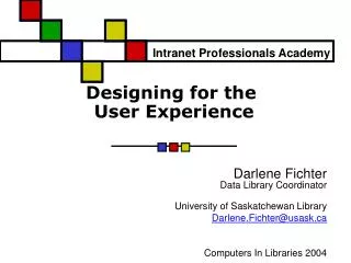
Designing for the User Experience
630 likes | 859 Vues
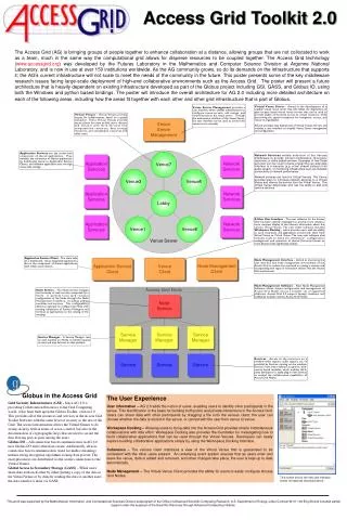
Intranet Professionals Academy. Designing for the User Experience. Darlene Fichter Data Library Coordinator University of Saskatchewan Library Darlene.Fichter@usask.ca Computers In Libraries 2004. Outline. User experience Web design Usability testing. User experience.

Designing for the User Experience
E N D
Presentation Transcript
Intranet Professionals Academy Designing for the User Experience Darlene FichterData Library Coordinator University of Saskatchewan Library Darlene.Fichter@usask.ca Computers In Libraries 2004
Outline • User experience • Web design • Usability testing
User experience • Defined as how a product behaves and is used in the real world • “Everything the user experiences should be the result of a conscious decision on your part” • Think about possible actions and user expectations Jesse James Garrett. The Elements of User Experience: User-Centered Design for the Web
Totality of the intranet • Jesse points out that the user experiences the "totality of the intranet" - not one piece separate from another. We rise and fall together.” Visible Interface Content, Architecture and Tools Invisible
Layers Surface – visual design Skeleton – interface, interaction, and information design Structure – IA, interaction design Scope – functional requirements, content Strategy – user needs, objectives Jesse James Garrett
Where does user experience start? • It’s all about your intranet audience
Primary characteristics of an intranet audience • Employees are focused on getting the job done • Typically expert users • Don’t want fluff • Diverse • Experience • Usage patterns • Nature of their work • Engineers • Financial analysts • Marketers • Customer support
Novice / occasional users • Intimidated by complex menus • Like unambiguous structure • Apples or Oranges, not both! • Easy access to overviews that illustrate how information is arranged • Maps • FAQs • Glossary of technical terms, acronyms, abbreviations • Visual layouts & graphics that trigger their memory • Tendency is to design for this type of user Adapted from Patrick Lynch and Sarah Horton, Web Style Guide. Yale University Press, 1999.
Expert/frequent users • Depend on speed and accuracy • Impatient with low-density graphics that offer only a few choices • Prefer stripped down, fast loading text menus • Have specific goals • Appreciate detailed text menus, site structure outlines, comprehensive site indexes, well designed search engines • Want accelerators – ways to bypass the fluff The majority of intranet users fall into this category, eventually Adapted from Patrick Lynch and Sarah Horton, Web Style Guide. Yale University Press, 1999.
What do intranet users want? • Research study by Head & Staley • Looked at 6 “research” intranets • Synopsys in Mountain View, Calif. • Fireman's Fund Insurance Company • Gale Group • Bechtel • Chevron • Gilead Sciences • Sun Microsystems • Started with survey to identify what information intranet users want Alison Head and Shannon Staley. On-the-Job Research: How Usable Are Corporate Intranets? Special Libraries Assoc. 2002
Design Touch Points Going from “general” to “specific” • Create profiles of key user groups • Managers, market analysts, other groups • Who are your major publishers • Who are your top users? • Identify the personality traits of user types • Analyze the tasks that they will perform Distributed non-profit Intranet – priorities very different from research Intranets
How well do intranets do? “Our research studies in a wide variety of corporations show very low satisfaction among users of corporate intranets. It's important that corporate intranet teams start focusing on the information content that end-users consider mission-critical.“ Anthea Stratigos, Outsell's CEO
Can employees find what they want on intranets? • 10 tasks • Overall 44% success rate Head & Staley
Determining visitor needs • Focus groups • User surveys • Observation • Usage reports • Questions • Web log analysis • Search log analysis • Formal assessment
Keeping the user front and center • Personas • Usability testing • Consult often • Invite comments and feedback
Visual design – scratching the surface • Builds upon the other layers • Concerned with look and feel • Visual elements • Color • Typography • Layout • Images • Menus
Design goal • Support the site’s message • Be appropriate • Have unity and variety • Aid the site’s functionality • Transparent to the user Good design is clear thinking made visible; Bad design isstupidity made visible. Edward Tufte
The message • What colors are associated with your organization and the material for your intranet? • Are the colors vivid, pastel, primary, saturated, cool, trendy, classic • What culture are you trying to create? • Formal, informal, engaging, playful • What images do you associate with the organizations, services or product?
Porfolio http://www.mrozekassoc.com/turnerdesignstudio/projects.asp
JPL Portal: Screen Shot of Inside JPL from Jayne Dutra’s presentationhttp://www.kmworld.com/kmw03/presentations/Dutra1.pps
Unity and variety • Consistency of visual design • Fonts, colors, layout, styles • Branding • Need both consistency and some variety to liven it up
Support function • Use color and layout organize information and facilitate groups and zones • Use it judiciously give prominence to important elements and draw the eye
Visual design pitfalls • Inconsistency • Set standards • Gratuitous use of design for design sake refusing to prioritize • Well balanced team • Dense text • Read the research, learn what works • Site wide vs. page level • 95% of the effort on the top page
Site level vs. page Level • Traditional design • Greatest emphasis is on site wide issues • Navigation • Content • Visual identity • For intranets, both matters • Micro-content cannot be neglected • Need to be concerned about information design not just graphic design
How users read on screens • How do people read on the screen? • Top to bottom • Left to right • Focus first on the micro-content • Scroll to the bottom • Only after failing - side menu - top menu
Reading • 25% slower on the screen compared to equivalent on paper
Research shows people don’t read • People who are looking for information don't read, they scan. • Most people will not read instructions or help pages • Even when this would benefit them • Less is more • Understanding is higher with fewer words are used
“Scanability” • Create page titles, headings and subheadings • Be consistent in designing titles/headings • Use font and/or color to offset headings • Be careful with emphasis • Bold or size, but not both • Eyes are tuned to small differences • No need to SHOUT at users • Use bulleted lists and links • Bullets when sequence doesn’t matter • Numbers when it does • Use lists when you have key concepts, not full sentences
“Scanability” tips • Lists speed up scanning • but slow down reading • Design for “scent” • Be concise & pithy • Use a much smaller word count than conventional writing • Write in pyramid style • Use parallel construction • Avoid jargon
Scanning mistakes and how to avoid them • Classic mistakes with links • Overused – everything is a link • Use long, descriptive links and headings • Enables users to eliminate items more easily • UIE’s research shows that links with 4 to 9 words are more effective then short links
Design trends • Portals and portlets • Manage syndicated, chunked content • Buckets or zones • Typography as design • CSS based templates • Fluid rather than fixed
Keep in mind • Gorilla in an Armani suit is still a gorilla The Inmates are Running the Asylum. Alan Cooper
What really works? The font is too small. The font is too big. The search box is confusing. The red is too red. Place controls above the box.
Need ways to measureWhat works • Usability testing • Log analysis • Feedback forms During web design and development stages, usability testing helps provide feedback on design ideas.
Ease of use Ease of learning Fitness for purpose An effective product What is usability? • Definition from Dorothy Kushner
Types of usability testing • Heuristic evaluation • Cognitive walkthroughs • Preference testing • Task Based testing • Field studies
Cognitive walkthrough • Performed by development team • Collective walkthrough of site • Assessment of whether the user has the information to confidently make the next right action
Assessing • How easy is the system to learn? • Can it be learned by exploration? • Is site elements support the user achieving their goal? Which don’t?
What’s required • Detailed description of the system • Prototype • Location of items on the screen and wording should be filled in • Representative tasks • Complete list of steps that need to be taken to complete the task • Indication of the user type and experience • Personas (user scenarios, user cases)
Document the problems • A recorder should note problems on the detailed task sheet: • By step in the task • Give a description of the problem • Note the severity