Download
1 / 23
230 likes | 257 Vues
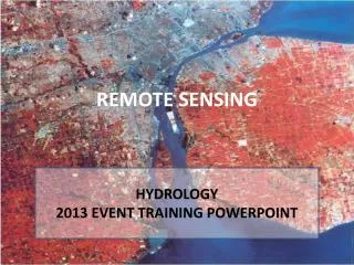
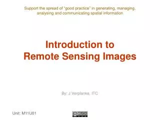
INTERPRETATION OF REMOTE SENSING IMAGES EXERCISE. Centre for Geo-Information Dept. Environmental Sciences Wageningen UR.

E N D
INTERPRETATION OF REMOTE SENSING IMAGES EXERCISE Centre for Geo-Information Dept. Environmental Sciences Wageningen UR
It is likely self-evident that the study of outer space - the Planets and the Cosmos - using remote sensors as the prime tool has a direct and vital bearing on how Man needs to understand the Universe beyond but will necessarily relate all that to life on Earth. One of the most famous of all pictures taken from Space - the view of Earth from above the Moon as Apollo 8 passed overhead at Christmastime in 1968 is reproduced here as a reminder that humankind's quest for knowledge now links between our planet and those beyond it in the Solar System and by inference most probably in other planetary systems in faraway galaxies. Wageningen UR 2010
Assignment: Study the following sheets in small groups and try to answer the questions raised.The objective of the exercise is to look at various types of remote sensing images and to gain a first impression of differences and similarities.With some of the images we will look more at the geometric aspects, with other images more at the thematic aspects.First answers for each sheet the question before moving on to the next one.In case things are not clear or when there are questions you may contact one of the supervisors.A sheet with answers will soon be made available at this website.
Question 1: This is an airborne recording of experimental fields at the experimental farm of Wageningen University. Are we dealing with a drunk driver or is something else the case? Do you have an explanation for the geometric distortion? Do you think we can solve this easily? Wageningen UR 2010
Question 2: Can you find corresponding points in the RS image on the left and on the map on the right? Can you say something about possible geometric distortions in the image on the left? Wageningen UR 2010
Question 2 (continued): Maybe you are able to answer the previous question more easily with the help of the circles. Wageningen UR 2010
Question 3: The image on the left has been geometrically transformed. What is your opinion about the geometry in the image in relation to the map on the right? What can you say about the thematic information of the image on the left in relation to the image before the transformation? Wageningen UR 2010
Question 4: Here you see two IKONOS images of New York. IKONOS is a satellite with a spatial resolution of 1 meter. Which geometric problem can you think of if you wish to compare both images very accurately? 30-6-2000 12-9-2001 Wageningen UR 2010
Question 5: Here you see an example of the SPOT satellite with a spatial resolution of 20 meter. Can you still recognize the individual buildings (look at the image ‘full screen’)? Which details can you recognize? Manhattan, New York 11 September 2001 11.55 hour local time Wageningen UR 2010
Question 6: Here we see an example of the commercial IKONOS satellite (launched 24 September 1999).What is the advantage of the panchromatic image?What is the advantage of the multispectral image? 1-meter panchromatic image 4-meter multispectral ‘true colour’ imageFour bands: Blue, Green, Red, and Near-Infrared Wageningen UR 2010
Question 7: SPOT and Landsat imagery is unable to distinguish between a barley field and an orchard. Not only can 70-centimeter imagery be used to differentiate between the two, but individual tree crowns of different ages can also be identified. Here we see a 2.8-meter multispectral QuickBird image, sharpened with 70-centimeter panchromatic imagery.Do you have any idea why the tree crowns look reddish? Wageningen UR 2010
Question 8: Here you see two images recorded with the VEGETATION instrument on board the SPOT satellite. The recording is made on 29 May 1999 with a spatial resolution of 1 km. On the left we see a recording in the red band (0.61-0.68 m), on the right we have a near-infrared band (0.78-0.98 m).Mention a couple of things that you may deduce from these images.Mention some characteristic differences between both images. Wageningen UR 2010
Question 9: Here are a series of images covering NDVI variations across the 48 U.S. states on a monthly basis from March through December 1990, along with a July 1991 image that can be compared with the July 1990 image. The "greening" of the country and regression during the Fall are easily traced.Which colour represents the vegetation (red or green)? Wageningen UR 2010
Question 10: Here you see a so-called thermal image (recorded in the thermal-infrared during daytime on a sunny day). We see bare soil with differences in moisture content. The dark parts match low temperatures. Are these the dry or the wet parts? The small squares are made of plastic: do you have any idea what colour these may have? Wageningen UR 2010
Question 11: The Nighttime Lights of the World dataset contains the first satellite-based global inventory of human settlements, derived from nighttime data from the Defense Meteorological Satellite Program. It has the unique capability to observe thermal emissions present at the Earth's surface, including cities, towns, villages, gas flares,and fires. What are the most densely populated areas for the various contients? Wageningen UR 2010
Question 12: Do you have any idea what the image below represents (what type of information does it give)? Wageningen UR 2010
Question 13: Here you see two airborne images. One is an optical image, the other is a radar image. Which one is the radar image (left or right)?What do you think the circles are? Wageningen UR 2010
Here you see a picture of a so-called central pivot irrigation system. This is e.g. commonly applied in the western United States en it causes the circles which may be observed from an aircraft. Water is pumped to the centre of the circle and a large broom rotates around this supply point. Wageningen UR 2010
C A B Question 14: Here you see a detail of the previous two images.Do you have any idea what the stripes at A are and what causes them to appear on the image (remember that a radar looks sideways, in this case from the left)?Do you have any idea what the stripe at B is?What do you think the stripes at C are? Wageningen UR 2010
Question 15: It is known that sea waves near the coast can provide information on sea bottom topography, when conditions are suitable (moderate wind and strong tidal currents). As a result radar images can be used for a so-called Bathymetry Assessment System (BAS).Below we see an image from the ERS-satellite of part of the province Zeeland in The Netherlands.Why shows the water darker tones when going more inland? Wageningen UR 2010
A B Question 16: Below we see two images of the San Francisco area.In radar, some features have tonal signatures quite unlike those in optical images. A good example is the San Francisco Airport (at circle A in left image), which in radar is quite black but would have various shades of gray in most Landsat bands. Can you explain this? Landsat-TM false colour composite image ERS-1 radar image Wageningen UR 2010
A B Question 17: The more obvious difference is the distortion in the shape of features that have a strong three-dimension expression, such as mountains. In Landsat images, the mountains near San Francisco appear "normal", that is, they have slopes on either side of the mountain crests that are similar in slope angles (e.g. at circle B in left image). But, in the radar image one slope side seems stretched out and the opposite slope appears shortened; this is a hallmark of radar imagery known as layover. Can you explain this layover effect? Landsat-TM false colour composite image ERS-1 radar image Wageningen UR 2010
Question 18: One property of radar pulses gave rise to an extraordinary image acquired from SIR-A (Space Shuttle Imaging Radar) in November 1981. The color scene to the left is a Landsat subimage of the Selma Sand Sheet in the Sahara Desert within northwestern Sudan. Because dry sand has a low dielectric constant, radar waves penetrate these small particles several meters (about 10 ft). The inset radar strip trending northeast actually images bedrock at that general depth below the loose alluvial sand and gravel which acts as though almost invisible. It reveals a channeled subsurface topography, with valleys that correlate to specularly reflecting surfaces and uplands shown as brighter.What frequency band did SIR-A use? Why is this better suitable for this type of application than e.g. the ERS-1? Wageningen UR 2010