Relations and Categorical Data
Relations and Categorical Data. Target Goal: I can describe relationships among categorical data using two way tables. 1.1 cont. Hw: pg 24: 20, 21, 23, 26, 27 - 32. Now we will look at describing relationships between two or more categorical variables. Ex. Gender, race, occupation.

Relations and Categorical Data
E N D
Presentation Transcript
Relations and Categorical Data Target Goal: I can describe relationships among categorical data using two way tables. 1.1 cont. Hw: pg 24: 20, 21, 23, 26, 27 - 32
Now we will look at describing relationships between two or more categorical variables. • Ex. Gender, race, occupation
To analyze categorical data, use counts or percentsof individuals that fall into various categories.
Example : Education and Age • Table presents Census Bureau data on the years of school completed by Americans at different ages.
Two Way Table: Describes Two Categorical Variables • Row and column variable: least to most • Marginal distributions:totals that appear at the right and bottom margins for each individual variable. • Round off error: There is round off error depending on groupings.
Percents • To describe relationships among categorical variables, calculate the appropriate percents from the counts given. • Percents:are often more informative than counts.
The percent of people 25 years of age or older that have at least 4 years of college is:
Tip for deciding on what fraction gives the percent you want: • Ask, “What group represents the totalthat I want a percent of?” • Can be tricky!
Exercise: Percents • Give the marginal distribution of ageamong people 25 years or older in percents, starting from the counts in table 4.6. • Which totals do we use?
Find each one and the total: • Age 25 to 34: 37,786/175,230 =21.6% • Age 35 to 54: • Age 55+: • Total = 100.1% due to rounding 46.5% 32.0%
Exercise: Using Percents to Make Bar Graph • Using the counts in table 4.6, find the percent of people in each age group who did not complete high school.
Percent of people in each age group who did not complete high school. 4,474/37,786 = 11.8% • age 25 to 34: • age 35 to 54: age 55+: 11.2% 25.4%
Draw a bar graph that compares these percents. State briefly what the data show. (3 min) • Conclusion: • The percentage of people who did not finish high school is about the same for the 25 - 34 and the 35 – 54 age groups 11.8 and 11.2 % respectively. • But, the percentage almost doubles to 25.4% for the 55 and over age group.
Marginal distribution: compare each variable separately. (Denominator is the grand total.) Conditional distribution: refers to only “people” who satisfy a certain condition (age 25-34). • Look only at column (or row). • Column (or row) total is the denominator.
Result: comparingconditional distributions of “education” in different “age groups”describes the association between age and education. • Bar graphs to compare the education levels of three age groups. • Each graph compares the percents of three groups who fall in one of the four education levels.
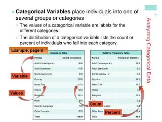
Example, p. 13 • Two-Way Tables and Marginal Distributions Analyzing Categorical Data Examine the marginal distribution of chance of getting rich.
Example, p. 15 • Two-Way Tables and Conditional Distributions Analyzing Categorical Data Calculate the conditional distribution of opinion among males. Examine the relationship between gender and opinion.
You will be asked to express the Conditional Distribution Describes the value of that variable among individuals who have a specific value of another variable.The conditional dist of ______________ among _____________. hw. 29) What percent of females thought they were going to be married in the next ten years.The conditional dist of _________________ among ___________________________.
Organizing a Statistical Problem • As you learn more about statistics, you will be asked to solve more complex problems. • Here is a four-step process you can follow. Analyzing Categorical Data How to Organize a Statistical Problem: A Four-Step Process State: What’s the question that you’re trying to answer? Plan: How will you go about answering the question? What statistical techniques does this problem call for? Do: Make graphs and carry out needed calculations. Conclude: Give your practical conclusion in the setting of the real-world problem. See pg. 18 for an example. Hw question on 4 step process.
Looking Ahead… In the next Section… • We’ll learn how to display quantitative data. • Dotplots • Stemplots • Histograms • We’ll also learn how to describe and compare distributions of quantitative data.

