Download
1 / 24
260 likes | 535 Vues
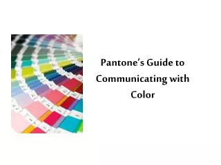
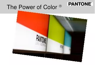
The Power of Color . “if you’ve got Barbie boxes being printed down in Hong Kong, you can’t just say, ‘Make them pink”. Communicating Colour.

E N D
“if you’ve got Barbie boxes being printed down in Hong Kong, you can’t just say, ‘Make them pink”
Communicating Colour • How would you describe the colour of this rose? Would you say it’s “yellow,” sort of “lemony yellow”, or maybe a “bright canary yellow” colour?
Communicating Colour • Your perception and interpretation of colour are highly subjective and, quite often, very different from someone else’s. Also, eye fatigue, age, and other physiological factors can influence your colour perception. • As a result, it is difficult to objectively communicate a particular colour to someone without some kind of standard. Once this standard is determined, there must be a way to compare one colour to the next with accuracy.
Speaking Colour (I) • Each colour has its own distinct appearance based on three elements: HUE, SATURATION VALUE.(Used to be Hue, Saturation Brightness) • By describing a colour using these three elements, you can accurately identify a particular colour and distinguish it from any other.
Speaking Colour (II) • Hue: Colour and hue are synonymous and can be used interchangeably. Red, yellow and blue (RGB) are the primary colours. Green, orange and violet are the secondary colours and tertiary colours are a mixture of two secondary colours. • Saturation: The vividness or dullness of a colour describes its saturation or CHROMA. In other words, it indicates how close the colour is either to grey or the pure hue. • Value: (Brightness) The lightness or darkness of a colour is called its value. Lighted values are tints, darkened values are shades and medium value colours are described as mid-tones.
Light Source Measuring Colour • Today the most commonly used instruments for measuring colour are spectrophotometers, densitometers and colorimeters • All three instruments measure reflected or transmitted light in various ways and are used in different applications. • Often, measurements are taken using the L*A*B standard which identifies the three attributes of a particular colour. Eye
Reproducing Colour • Colour Gamut. Depending of the format, we are limited to the amount of colours we can reproduce. • For example, RGB display monitors can produce many of the colours we can see, but they cannot reproduce them all. • The colour range, or gamut, that can be printed using process inks (CMYK) is even more limited.
Printing in the 1950’s • Every ink manufacturer had their own ink reference book and printers were dealing with different ink companies. • Inks reacted differently to different materials thus affecting the colour. • Printing materials, procedures and processes affected colour.
History of PANTONE (I) • In 1963, Lawrence Herbert created an innovative system of identifying, matching, and communicating colours to solve problems associated with producing accurate colour matches in the graphics art community. • His insight that the colour spectrum is seen and interpreted differently by each individual led to the innovation of the PANTONE MATCHING SYSTEM (PMS), a book of colour standards in fan format. It is the only world-wide standard for specified colour from design through to print.
History of PANTONE (II) • To complete the loop and ensure colour consistency within the print industry, ink licensees regularly submit samples to PANTONE for quality control. • PANTONE also develop core colour technology and maintain the integrity of Pantone-licensed products from companies such as Adobe, Hewlett-Packard, Epson, DuPont and Kodak Polychrome to name but a few.
History of PANTONE (III) • Over the last 47 years, PANTONE has expanded its colour matching system concept to other colour critical industries, including digital technology, textiles, plastics, architecture and contract interiors. It continues to develop communication tools for a variety of industries and aggressively adopts new technology to address the colour needs of design and production professionals. • PANTONE has operations in USA (New Jersey), Latin America, UK (Kent), Germany (Stuttgart) , China, India, Japan & Hong Kong.
History of PANTONE (IV) • Acquired 2007 by X-Rite Inc., an American colour measurement technology company • Now the largest global colour company • Market leaders in every industry where colour is mission critical or important • Print, Textile, Packaging, Auto, Photo, etc.. • 360 Degree Color Supply Chain Ownership
The palette of the design world (I) • Each year, innumerable products and services are sold by PANTONE and it’s hundreds of licensees in over 100 countries in the graphic arts, textile, apparel, interior, plastics, architectural and industrial design markets.
The strength of the Pantone brand has even generated new and exiting consumer opportunities.
PANTONE The Colour of Ideas Thank You
PANTONE Solid Colours • Features • Both PANTONE formula guide and chip book contain 1114 PANTONE solid Colours (PANTONE MATCHING SYSTEM PMS), along with their ink mixing formulae in both parts and percentages. • Icons are shown beneath each colour that can be achieved in CMYK four colour process printing. • 2 versions: Formula guide (c,u,m) and Printer edition (c,u) • Benefits • Accurate visualisation of final print result. • Designers can preview appearance of colour which eliminates guesswork. • Printers have essential on-press control. • Saves money and helps avoid mistakes. • Sending chips ensure that client and printer talk about the same colour.
“My PANTONE solid colour does not look the same when produced as a four colour process (CMYK)”
PANTONE Products - Process Colour • CMYK Products • PANTONE 4-color process set coated/uncoated EURO • PANTONE color bridge guide coated EURO • Hexachrome Products - six colour process printing • PANTONE solid in hexachrome guide • Hexachrome is six colour process printing using light cyan and light magenta in addition to traditional CMYK (Cyan, Magenta, Yellow, Black)
Solid and Process Colours • PANTONE solid Colours (PMS) are made up from a combination of 14 basic colours, while process colours are made up of just 4 colours; CyN, Yellow, Magenta, and black (CMYK) • Many solid colours cannot be reproduced effectively in CMYK • Four colour process printing is popular due to the range of colours that can be reproduced against cost (only running a standard four colour press). • In order to achieve some solid colours using a CMYK print process, printers need to create and run an extra plate, 2 extra plates, 3….!!
PANTONE color bridge guide • Features • PANTONE color bridge guide contains 1,089 solid PANTONE Colours (PMS) side-by-side with their closest four-colour process simulation. • Screen values are supplied for each CMYK colour. • European Inks and print process are used. • Includes HTML and RGB values • Benefits • Only 60% of the PANTONE solid colours (PMS) can be reproduced adequately using the CMYK process system. Designers and printers can make cost saving decisions on whether a process colour is adequate or whether a fifth colour is required. • Values for color bridge can be downloaded from www.pantone.co.uk (in myPANTONE).
PANTONE Products - Speciality Products • PANTONE tints coated/ucoated • PANTONE pastel formula guide coated/uncoated • PANTONE metallic formula guide coated
PANTONE pastels and metallic • Features • 154 pastel colours, along with their ink mixing formulae. Each colour is printed on coated and uncoated stock. • 301 metallic colours on coated stock, • Available also as loose-leaf chip books with tear out colour chips for easy colour specification. • Benefits • The current growing trend of implementing the decorative effects of metallics and the subtle look of pastels ensures the popularity of these two publications. These guides provide accurate visualisation of final print result. • Enhances shelf appeal of products and influence consumers’ perceptions of quality
PANTONE hexachrome • Hexachrome is the new standard for printing. An ultra high quality six colour process system consisting of enhanced CMYK plus PANTONE Hexachrome green and PANTONE Hexachrome Orange. Hexachrome’s colour gamut is much closer to the RGB gamut and can simulate almost 90% of the Solid PANTONE MATCHING SYSTEM colours as compared to about 60% achievable in four colour process printing. It is ideal for printing high impact visuals like packaging for example. It also saves money by reducing the need to print in CMYK plus one, two, three or even four extra spot colours.