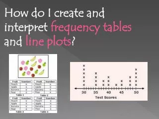
How do I create and interpret frequency tables and line plots ?
100 likes | 349 Vues
How do I create and interpret frequency tables and line plots ?. Activator. Click to activate…. Vocabulary for Flip Book. Frequency Table – a table that displays the number of times each item or category occurs in a data set.

How do I create and interpret frequency tables and line plots ?
E N D
Presentation Transcript
How do I create and interpret frequency tables and line plots?
Activator Click to activate…
Vocabulary for Flip Book Frequency Table – a table that displays the number of times each item or category occurs in a data set. Line Plot – a number line diagram that uses X marks to show the frequencies of items being tallied.
Example of a Frequency TableHow many books did you read this summer? students
Making a Frequency Table Create a frequency table with data from the class. What is your favorite food? Spaghetti, Mac and Cheese or Chicken How many TV’s do you have in your home? 0,1,2,3,4,5 We can use our data to make a line plot.
Completed Line Plot When the items being tallied are numbers, a line plot can be used to visually display numerical data. A line plot uses X marks above a number line to show the frequencies. The X marks above the number line show the frequencies. XXXXXX XXXXX XXXXX The Number Line shows the number of books read. XXXX XX 1 2 3 4 5 6 7 Number of Books Read
Making a Line PlotCreate a line plot with the TV data you gathered.
Variability in Data Distributions • Outliers-Unusually high or low values in a distribution. • Clusters-A group of data values with higher frequency than surrounding values. • Gaps-Areas in the scale where there is a lack of data values.
Ticket out the Door • Create a frequency table and line plot from the information below. • How many pets do you have? • Data: 3,4,4,4,5,0,1,2,2,1,4,4,3,2,2,1