Investigating Horror Film Conventions: Trailer, Poster & Magazine Analysis
40 likes | 80 Vues
Analyzing the use, development, and challenge of conventions in horror film media products - trailer, poster, and magazine. Explores sound, editing cuts, suspense, actor portrayal, storyline hints, and professional elements. Poster includes star power, storyline hints, and professional design elements. Magazine showcases eye-catching masthead and cover design.

Investigating Horror Film Conventions: Trailer, Poster & Magazine Analysis
E N D
Presentation Transcript
In what ways does your media product use, develop or challenge forms and conventions of real media products?
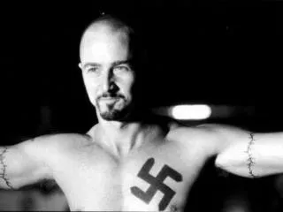
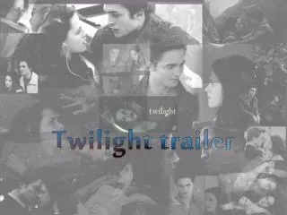
Film Trailer • To produce our trailer, we were mainly inspired by “Haunting in connecticut” trailer (Shown above). We wanted to create a similar storyline, but at the same time we wanted to challenge its conventions by creating our own ones. Our aim was to make it realistic so the audience can identify with it and to create suspense as in my questionnaire SUSPENSE was the kind of films the majority of my audience would like to watch. • Like any professional horror film trailer you see in cinema’s, my product relies on mostly the sounds adding tension to the trailer to make it more realistic and appealing towards the audience. For instance the women in black trailer, my product has a rhyme throughout which is the underline of the music so it clicks together. In the women in black they show the music being an effective part that will suspense the audience. • My product consists of several different editing cuts to add suspense and tension, most of these are very sharp cut scene’s to help hold together the particular movie genre. Also like other film conventions we also put a film company at the start, reviews of the film throughout by what the fil is shown in, magazines, how popular it has become, helping the audience keep up to date with information on the film. • This sudden cut of the clip surprises the audience and the sound which is used also adds to this sense of fear. loud, sudden audio is used to scare the audience, this tends to be synch with the clips, either as one starts or as one ends. A series of longer clips are also used in this clip to ensure the audience can understand what they are watching and gain a basic understanding of the story line, this is important when it comes to a horror trailer because many fast clips (Montague of sequence) therefore it is vital that the audience have a understanding or even a slight understanding of what is happening as they need to be attracted to the film.
Film Poster • My poster definitely uses the conventions of real media products as I included all the typical elements that should be within a film poster. A slogan has been used to give the audience a clear indication of the narrative or genre of the film. Also what the storyline may be. This will give the audience a good idea of what the film is likely to be about. Famous stars/actors have been used to give the film prestige. Furthermore, after the audience have seen who is in it they may be more encouraged to go and see it because of that particular actor/actress. The two masks either side of the two actors look suspicious and can appeal to my target audience. This can also make the audience ask questions about possible storylines. Actor relationship-This gives away some of the storyline, the idea that the two characters in the middle are very close. A credit block has been used to make the poster look more professional and believable. This follows forms and conventions of a normal film poster. The one worded title gives the audience an idea of what type of film it is. As it’s called ‘Captivity’ the audience would suggest that it is an action/thriller film. My film poster follows forms and conventions of a real film poster through what I have applied to it. This includes; the slogan complements our film genre of action/thriller. This also gives our target audience a good idea of what the narrative or any storyline may be. The audience can relate to a person they know and think about what they would do in possible situations that the film poster asks. The slogan gives away a lot about the narrative and genre of the film. Any audience can therefore decide whether they will enjoy the film as it gives away clues about the film genre. However, if a certain audience prefers a different genre e.g. romance, they may still be interested in my film as the key image conveys that the two people may be in love. This gives our film poster flexibility as it can interest all different types of people but mainly people with an interest in action/thriller movies. As I’ve got a credit block at the bottom of the page, this makes my film poster look professional and follows forms and conventions of a normal film poster. • This poster is to advertise the film, but also shows who the films is directed by, who stars in it and who the special effects are by. But it does still look modern. Color: red, black and white colors are used. The eye particularly stands out because it’s a focus of the poster making it very eye-catching. This draws the eye in to look at the surrounding detail in the poster also. he poster depicts a horror film.
Film Magazine • The masthead of the magazine is presented in large, capitalized red font, which makes it very eye-catching against the light yellow background. The feature photograph on the front cover is also covering up some letters of the masthead, suggesting we have made it a popular magazine and we are confident that the magazine's popularity will over come this. The headline for the main article with in the magazine is situated over the top of the feature photograph and in the centre of the page where is will be most likely to capture the audience‘s attention. The title of the featured “Never Forgotten" has been capitalized, again making it more eye-catching. The name of the actor playing this starring role (Haydn Fear) is located above this main headline. If the audience are fans of this particular actor, this line plus the feature photograph will persuade them to buy the magazine. • Another conventional feature of this magazine front cover is the use of plugs to give the audience an insight into what other articles can be found within the magazine. These snippets will persuade the audience to buy the magazine to find out more about these other articles. • The magazines strap line "Best Preview Issue Ever!" has been placed justabove the magazines masthead. The fact that this sentence is • exclamatory will create excitement amongst the audience and convincethem that they should buy this magazine because it is 'the best'.