Displaying Distributions With Graphs
Displaying Distributions With Graphs. Section 1.1. A Picture is worth a thousand words. First three rules for describing data: Make a picture Make a picture Make a picture. Categorical Data.

Displaying Distributions With Graphs
E N D
Presentation Transcript
Displaying Distributions With Graphs Section 1.1
A Picture is worth a thousand words • First three rules for describing data: • Make a picture • Make a picture • Make a picture
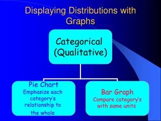
Categorical Data • The following table displays the sales figures and market share (percent of total sales) achieved by several major soft drink companies in 1999. That year a total of 9930 million cases of soft drink were sold.
Creating a Bar Graph • Title your graph • Label axes • Horizontal Axis is the categories • Vertical Axis can be • Counts (Frequency) • Proportions (Relative Frequency) • Percents • Scale your axes • Draw vertical bars to represent counts, proportions, or percents
Creating a Pie Graph • The most accurate way to create a pie graph is to use a computer. However pie graphs can be created using estimation, or by using a protractor and using the appropriate number of degrees to create the graph.
Bar Graphs show a bar that represents either the count, proportion, or percentage of each category. Bar graphs may or may not show all categories. Pie Graphs show how a “whole” divides into categories using either the proportion or percentage. To use a pie graph you must include all the categories that make up the whole.
Further Resources • Practice of Statistics: pg 8-9 • Homework 1.1: #2