Download
1 / 11
110 likes | 205 Vues
Analyze the correlation between variables with scatter plots derived from Gaussian and Uniform distributions. Use R-Code functions like plot(), runif(), rnorm(), and lm() for regression analysis in this informative exploration.

E N D
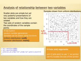
Analysis of relationship between two variables Samples drawn from uniform distributions Scatter plots are simple but yet very powerful presentations of two variables and how they are related. Two sets of random variables contain the coordinates of the sample points. x2(k) =0.32 R has built-in random number generators: Samples can be drawn using functions Uniform distribution: runif() Gaussian distribution: rnorm() + x1(k)=0.65 R-Code: plot() arguments: pch=3 tells plot() to use ‘+’ as symbol cex=0.3 scales the size of the symbol
Analysis of relationship between two variables Samples drawn from Gaussian distributions Scatter plots are simple but yet very powerful presentations of two variables and how they are related. Two sets of random variables contain the coordinates of the sample points. R-Code: plot() arguments: pch=3 tells plot() to use ‘+’ as symbol cex=0.3 scales the size of the symbol
Analysis of relationship between two variables: Albany monthly mean temperature anomalies and New York Central Park temperature anomalies 1950-2010 Albany NY Central Park Whenever two variables are sampled along a ‘physically meaningful’ dimension such as time, repeated controlled experiments, or geographic coordinates, we can define pairs of data. These pairs form a 2-dimensional coordinate system => Scatter diagram.
Analysis of relationship between two variables: Albany monthly mean temperature anomalies and New York Central Park temperature anomalies 1950-2010 R-Code: x is a vector with Albany temperature anomalies y is a vector with Central Park temp. anomalies. Elements in the vectors x, y at position k share the same time coordinate and form a data pair. Plotting a point symbol ‘+’ requires 2 coordinates: The x-coordinates comes from vector x The y-coordiantes comes from vector y
Analysis of relationship between two variables: Regression lines are the simplest functions that we can try to fit with the data. In this example the relationship between the two temperature time series is obviously linear and can be well fitted by a linear regression line. R-Code: x is a vector with Albany temperature anomalies y is a vector with Central Park temp. anomalies. The function lm( y ~ x ) {lm short name for ‘linear model’} is used for ‘Ordinary Least Squares Regression Analysis’
What does it mean when two variables are forming a scatter surrounding a linear regression line? Vectors in R: y<-c(x1,x2,x3,…xn)
What does it mean when two variables are forming a scatter surrounding a linear regression line? R-Code: Another common notation for vector dot products
What does it mean when two variables are forming a scatter surrounding a linear regression line? Another common notation for vector dot products
A note on how to look at differences in the mean of two samples
A note on how to look at differences in the mean of two samples Equivalent to the R notation as seen in graph: abs( mean(x1) – mean(x2) ) / sqrt ( sd(x1) * sd(x2) ) • In this example mean(x1) = -1 and mean(x2) = +1; sd(x1) = 1 and sd(x2) = 1 • The equation gives a value of 2. That is the difference is 2 times the length of • the (geometrically averaged) samples standard deviations.
With the function par() we can manipulate The plot appearance in many ways (see help(par)) The function is usually called at the begin of a script, or Right before a plotting function. For example to split the plot window into a 2x2 panel of subfigures: par(mfrow=c(2,2)) NOTE: You must call par(mfrow=c(1,1)) again to get the single-figure mode back. R-coding: