Mobile-First Responsive Design Strategy at Duke University Libraries
70 likes | 195 Vues
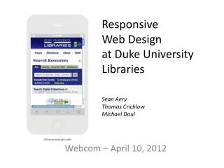
On April 10, 2012, Sean Aery, Thomas Crichlow, and Michael Daul presented their approach to mobile-first, responsive design at Duke University Libraries. They emphasized the efficiency of implementing responsive design for new projects rather than retrofitting existing resources. The strategy aims to focus on key content areas with significant user traffic while leaving underused areas unchanged. Testing involved using SDKs for iOS and Android and gathering feedback from staff with mobile devices. This adaptive approach recognizes and incorporates global mobile usage trends.

Mobile-First Responsive Design Strategy at Duke University Libraries
E N D
Presentation Transcript
ResponsiveWeb Designat Duke University Libraries Sean Aery Thomas Crichlow Michael Daul Webcom – April 10, 2012
Our Approach • Mobile first, responsive design for new projects • More efficient than retrofitting a responsive design on existing resources • Retrofit existing resources • Focus on content of key resources where usage patterns justify the effort of retrofitting a responsive design onto existing designs • Leave it alone • If we can’t justify the effort to retrofit a responsive design, we leave it alone
Global Trends Source: http://gs.statcounter.com/#mobile_vs_desktop-ww-monthly-201003-201203
Devices: Global (Fall 2011) Source: http://gs.statcounter.com/#mobile_os-ww-monthly-201108-201112
How We Test • SDK for iOS and Andriod • User Group – Staff who have mobile devices • http://www.responsinator.com/
