Visual Design, Info Design
Visual Design, Info Design 12 May 2010 Visual Design Grid Color Typography Visual Design : The Grid A grid orders the elements on a page – whether the page is literal (paper) or figurative (a screen) Paper (print) – size is known, fixed


Visual Design, Info Design
E N D
Presentation Transcript
Visual Design, Info Design 12 May 2010
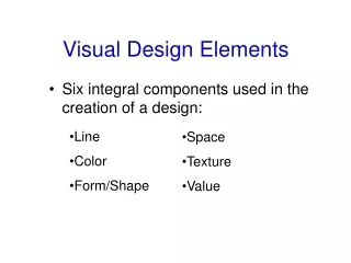
Visual Design Grid Color Typography
Visual Design : The Grid A grid orders the elements on a page – whether the page is literal (paper) or figurative (a screen) Paper (print) – size is known, fixed Web (screen) – size is unknown, layout may be fixed or fluid
Visual Design : Golden Ratio (1/3) The Golden Ratio (or the Divine Proportion, Golden Mean, Golden Rectangle, etc) is a visual representation of a number called Phi (pronounced fi) … it’s found throughout nature -- in space, physics, DNA, math, art, architecture (see Greek or Egyptian works) The Golden Ratio is a measurement between two segments of a whole. If line “A” has two unequal parts, “AB” and “BC” – the golden ratio, 1.618 [actually 1.618033988749895], is achieved where A/B = B/C
Visual Design : Golden Ratio (2/3) Source: Design and the Divine Proportion
Visual Design : Golden Ratio (3/3) Source: Design and the Divine Proportion
Once you start splitting a golden rectangle by the ratio, you can keep sub-splitting it down forever. The spiral this produces exactly matches the growth of the Nautilus shell in nature. The Nautilus Shell Source: Anyone for thirds?
Visual Design: Rule of Thirds Simplified Golden Mean Symmetrical design is, usually, boring. Most designs can be made more visually interesting by mentally dividing the area (page, photo) into thirds vertically and horizontally and placing the most important elements within those thirds. Examples: photos1, photos2
Color Importance • 80% of the brain is devoted to processing visual information • The two categories: form and color
What is color? The visual effect caused by the spectral composition of light which is emitted, transmitted or reflected by objects [Color Logic for Web Design, p 7] The experience of color is always relative to context – relationship to adjacent color can cause noticeable differences in visual perception See Color Perception (in 3000 Words) In William Bechtel and George Graham (eds), A Companion to Cognitive Science, Blackwells, 1998. http://www.ucc.uconn.edu/~wwwphil/ccompan.html
Color Models • Sir Isaac Newton developed the first color wheel in 1666 • Computer monitors use additive color model : RGB • Projected light • Printers use subtractive color model : CMYK • Reflected light
Color – Three Primaries • Red: #ff0000 or #f00 in CSS • Blue: #0000ff or #00f in CSS • Yellow: #ffff00 or #ff0 in CSS
Color – The Secondaries • Orange: #ff9900 or #f90 in CSS • Green: #00ff00 or #0f0 in CSS • Purple: #ff00ff or #f0f in CSS
Color – The Tertiaries • Yellow-Orange: #ffcc00 or #fc0 in CSS • Red-Orange: #ff6600 or #f60 in CSS • Red-Purple: #cc00cc or #c0c in CSS • Blue-Purple: #9900ff or #90f in CSS • Blue-Green: #00cccc or #0cc in CSS • Yellow-Green: #ccff00 or #cf0 in CSS
Color Harmony Analogous color: side-by-side on color wheel Complementary color: opposites on the color wheel Triads: where the points of an equilateral triangle touches the color wheel
Additive & Subtractive Color From http://www.sanford-artedventures.com/study/g_color_wheel.html
Attributes • Hue – the specific color • Saturation – intensity • Value – brightness • Color Principles Lecture – Relative Value (Part1, 11.11)
Color Theory: Chevreul (1/2) French Chemist (1776-1889) • Highly contrasting colors used in sufficient quantities will make each appear more brilliant; when used in small quantities the eye blends and creates a new, duller color.
Color Theory: Chevreul (2/2) • When colors are not analogous and not complementary, one will give the other a complementary tinge • Colors that are adjacent to one another tend to optically mix to create a new color
Color Theory: Bezold Effect Changing only one color can significantly alter appearance
Color Theory: Albers (1/2) L: r102/g102/b104; R:r153/051g/153b; C: r153/g102/b204 Perceived hue will change based on surroundings; Bauhaus (1888-1976) Three colors below (and next) appear to be four
Color Theory: Albers (2/2) L: r153/g204/b000; R:r204/255g/153b; C: r051/g204/b102
Color Theory: Movement (1/2) • Depending on the background, warm colors tend to “advance” and cool colors “recede” • Thus, pick your colors for visited/not visited links with care • Also be aware of cultural meanings (green = “go” so might not be a good choice for “went”)
Color Theory: Movement (2/2) Which color advances?
Harmonious Guidelines • Use a limited color palette • Experiment with harmonies – match with tone • Dynamic, strong contrast = edgy, attention-getting, energizing • Subtle, low contrast = fluid, low key, sophisticated
Typography • The art of arranging type, designing type and modifying type glyphs. • Serif and sans serif • Limited web palette • Monitor inconsistencies • Readability • There is an optimum line width, and it is determined by the number of characters in the line. A general rule of thumb is 2–3 alphabets or 52–78 characters (including spaces).
Design Examples URLGreyHot – navigation Portfolio 1 – overall (see samples) Portfolio 2 – grid, typography Business – broken grid Inspiration: ZenGarden, DailySlurp (color)
Visual Design : Resources Feeling Your Way Around Grids Design Grids For Web Pages Designing Blog Theme Templates
Color Resources Choosing Effective Color Schemes Why Color Matters Tool: Color Harmony Chooser Browser Safe Palette
Typographic Resources Web Design is 95% Typography The Elements of Typographic Style Applied To The Web Five Steps To Better Typography
Recap: Genres (1/2) • Individually: • Find three sites that you believe best epitomize the genre you worked on last week. Feel free to develop a “sub-genre” – such as “news” as a subset of “media.” Also, try to find at least one that categorically fits but visually breaks the genre. • Identify what “makes” this genre immediately self-apparent – regardless of entry point • Identify content types found in this genre
Recap: Genres (2/2) • Regroup– discuss – reach consensus. Try to agree on one or two example sites. What do they have in common? • Color? • Type? • Grid? • Page width?