Design Basics for the Information Designer
Design Basics for the Information Designer Chapter 3 Introduction What does the future hold for the computer industry? What new advances will present themselves in the year 2002 and beyond? Coming together of the left side (logic) of the brain and the right side (creativity)

Design Basics for the Information Designer
E N D
Presentation Transcript
Introduction • What does the future hold for the computer industry? • What new advances will present themselves in the year 2002 and beyond? • Coming together of the left side (logic) of the brain and the right side (creativity) • Need to be able to: • Develop your imagination, • process non-linear ideas, • organize and speculate • Create unique and interesting solutions to visual problems that captures the audience’s attention. • Learn the basic vocabulary and techniques that graphic designers utilize • Know that there are some rules that work
Why Do This? • More and more of the interaction with computers is being performed via a browser • The traditional operating system is relatively unchanged since the mid-1970s. • The current “Office” metaphor was in the original Xerox Palo Alto Research Center’s vision for human/computer interface design • To experience individualized interfaces created by unique individuals • This is the future of the point-and-click interface.
Caveat Emptor • This freedom is exciting on the one hand but disconcerting on the other • There is NO CONTROL over the look and feel! • It goes against the strict standards imposed by Microsoft and Apple • But…the current hodge podge of visual information is becoming tedious. • Hopefully the next generation will bring a visual clarity to the Web
A Possible Solution • Acquire traditional fine arts fundamentals. • Team up with graphic design artists • Theories and related exercises or problems are constructed to allow the student to discover the visual vocabulary of visual design. • Encouraged to explore visual communication concepts and the principles of design. • This approach allows personal expression in the solving of complex communication problems of interface and Web design. • Important to develop thoughtful choices based on some of the rules learned here and in other courses related to human behavior, interface design, and communication. • Suspend judgment and respect the rules enough to really examine and understand them
Vocabulary and principles • Design is not just whimsy or arbitrary • Great artists, visionaries, are very good at applying the rules • Make it seem as if there are no rules. • Know when to break the rules • “Creativity is in how you break the rules.” Finnegan • Must learn and know and apply the rules first • The rules: • Principles and vocabulary of the visual language • There are no right or wrong choices
Vocabulary • Point-- A point is just that, a single identifiable x,y coordinate in space. It has no breadth or length. It is the beginning and end of a line or the place where they meet or cross. • Line -- A line is made up of an infinite number of points. It is also the path a point would make if a point moved through space. It forms the edge of a plane. • Plane -- A plane is made up of an infinite number of lines. It is also the area a line would scribe if it traveled through space. If a plane traveled through space, it would describe an area of volume that we would represent with a three-dimensional symbol, though the third dimension doesn’t truly exist in two- dimensional design. • Path--The direction in which a point, line, or plane travels.
Vocabulary • Shape--The organization of points and lines to form recognizable named regular or irregular images in the field of perception. • Size--physically measurable (2 inches) or relative to other shapes described in terms of largeness or smallness • Texture--referring to the surface attributes of a shape. Texture often appeals to the sense of touch (based on past associations of the observer) as well as to the sense of sight. • Color--the characteristic of a shape that makes it stand out from its surroundings.
Vocabulary • Shapes tend to have an inside, an outside, and an outline. • A shape generally looks as if it is either occupying space or is a hole in occupied space. • positive (occupying) space and negative (a hole) space. • Which part of a composition becomes positive or negative depends on how the observer perceives the form • We tend to perceive darkness as occupying space and the lighter values as the hole surrounded by occupied space.
The Stroke and Fill Attributes of a Shape • Using only black and white • six possible states the composition can have. • It can be have a white outline with a white fill on a white background, resulting in the form disappearing. • It can have a black outline with a white fill on a white background. • It can be a black outline with a black fill on a white background. • It can be a black outline with a black fill on a black background again, resulting in the shape disappearing. • It can be a white outline with a black fill on a black background. • It can have a black outline with a white fill on a black background. • It can have a white outline, with a white fill on a black background.
The Intersection of Multiple Forms • Some of the terms are Boolean operations. • In a given composition with two shapes, the shapes can be: • apart, each occupying space separate from the other • touching, where only a single point is shared by both shapes • overlapping, which requires one shape to have a stroke of a contrasting color • transparent overlapping, in which both shapes have a stroke of a contrasting color and their intersection is filled with a contrasting color • union, in which the overlapping shapes are filled and have a stroke of the same color. A new form is generally created and perceived in a union. • punched, in which one shape is used like a cookie cutter to carve away part of the other shape. • Sometimes referred to as subtraction. • Intersected, in which only the part shared by both remains • Coincident, in which the two shapes both are the same color and size and appear as one or in which the larger shape totally covers the smaller shape, leaving the perception of only one shape. • This choice still involves two shapes to start with but involves the choice to cover one shape with the other by moving them into the same space.
The Intersection of Multiple Forms • With the use of additional colors, the choices become infinite. • It is the conscious making of and manipulation of these choices that add zest to a design. • We as designers can choose which of the above behaviors we will use or change our minds part way through and follow a different set of rules. • With additional information, we can create very complex rule sets, almost like programs or batch files, in which we explore organizing visual information. • There is no right or wrong, only choices -- make some and go with them.
Gestalt PrinciplesOverview • The study of information perception, Gestalt psychology • The study of how humans perceive and group information • Assigning value relative to other information presented in the same field of view • Developed grouping principles. • Help artists and designers understand how humans perceive the visual field of view. • The overriding idea is that the whole is greater than the sum of the parts. • Unity in design • The patterns that are formed by the parts take precedence over the individual parts.
Gestalt Principles • Figure and ground (sometimes called field) • Refers primarily to the frame that exists around everything • Provides a context for the perception to focus on. Be careful not to create ambiguous focus. (Face/Vase illustration) Paper, the computer screen, browser window are all frames Shouldn’t be ignored when designing for the screen. Part of the perception field
Grouping principles • proximity, similarity, continuation, and closure • hierarchy of perception to these grouping principles. • Firstly, importance is assigned to objects that are in close proximity to each other • Similarity is given greater weight than proximity • Items that form a continuation or the perception of a continuation take precedence over items that are similar or close to each other • Closure is the overwhelming principle-it attends to the need for humans to complete the visual field Closure
Definitions of the Primary Grouping Principles • Proximity-- Objects/items appear to be associated just because they are close to one another. • Similarity -- In the visual field, our brains (through the use of our eyes) can pick out things that are similar to one another • Repetition of similarity can be a strong design choice. • Continuation--Continuation is the principle of leading the eye to where you want the viewer to focus. Also to make recognizable patterns with parts and pieces. • Closure--The innate need to close gaps and complete shapes
Definitions of Other Principles • Upright and horizontal • Alignment • Grid systems • Use the edges of forms on a page or screen to align other objects in the composition, • Allows design to be more cohesive • Direction • addresses the horizontal and vertical alignment of forms in the frame. • Breaking the logical directional expectation can also be useful in guiding the user to a particular point in the visual field.
Non-Gestalt Principles • Balance, symmetry, and asymmetry • Balance refers to the visual balance of all the items in a composition • Symmetry-equal visual information on either side of an axis • Asymmetry-unequal visual balance
Principles • Repetition, rhythm, and pattern • Repetition is an example of grouping similar forms • satisfy the user’s perceptual need for a sense of order and wholeness. • Most powerful when the variables of size, shape, texture, and color are equal. • Variations of those same attributes can be quite stunning, as when an oversized letter is used both as a background and as a drop capital at the beginning of a paragraph. • Rhythm is sustained repetition • Pattern is simply the expression of this rhythm over a continuous area • Strongest when color, texture, and contrast are equal
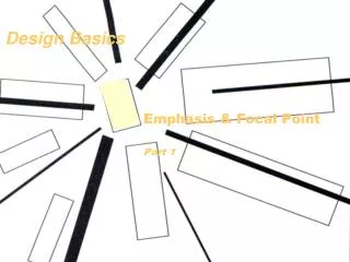
Principles • Color, texture and contrast are used to create • Emphasis • focus • hierarchical importance • pure aesthetic appeal • Value is the lightness or darkness of a form
Using Color/ The Aesthetics of Color • Color Wheel/Color Schemes • Primary Colors • Generally, the three primary colors can go together well. • The primary colors are red, blue, and yellow. • Secondary Colors • Achieved by mixing two primaries together. • The use of those two primaries and their secondary color would create a usable palette. • The secondary colors are green, orange, and violet. • Tertiary Colors • Orange red, yellow orange, yellow green, blue green, blue violet, and red violet • This group of colors includes the mixture of a primary with a secondary color.
Color continued • Complementary Colors • Complementary colors are the colors that are exactly opposite each other on the color wheel. • Split Complements • This is the color on the wheel that is directly to the left or right of the pure complement. • Analogous Colors • Analogous colors are the four colors on the wheel that are right next to each other
Color continued • Limit Your Palette/Choose It Before You Begin • Use the color schemes above. • Extraneous use of color, like using too many typefaces, is the mark of the amateur. • Contrast • Make sure your colors are far enough apart in terms of lightness and darkness • If all of your colors share the same value, the legibility and readability go way down. • Warm and Cool Colors • Organize colors based on their warmness or coolness. • The color wheel can be divided into warm and cool colors, • The reds, oranges, and yellows -warm • Blues, greens and purples falling -cool • Within each hue, the colors are warmer or cooler in relation to each other. • Use Tints and Tones to Create Unity • Adding white or lightness-tinting • Adding black or decrease the lightness-shading • Ensures that colors go together.
Typography • Typography is an area of design that should get a devoted amount of study • Readability • principal job of type • Learn about it so you can talk articulately and specifically about type with graphic designers • Type Terminology • Font--all the characters of a typeface, including punctuation, accents, fractions, and so on. We mistakenly use this term when we mean type family or typeface. • Type family-- range of typeface designs that are variations of one basic style of design(Helvetica bold, light, light italic, condensed, and so on) • Stroke-- the main line of a character • Thick/thin -- the contrast in the thickness of the curved strokes • Condensed type-- typeface with an elongated or narrow appearance • Expanded/extended type--- wider version of a typeface’s standard design • Tracking-- adding or decreasing the same amount of space between all the letters • Kerning-- adjusting the space between letters • Base line-- imaginary line on which the base of a line of type (excluding descenders) rests • x-height-- creates the impression of the font’s size
Measuring Type • Point-- standard unit of typographic measurement (72 points = 1 inch) • Pica-- typographical measurement equal to 12 points (1 pica = 12 points, 6 picas = 1 inch) • Picas are actually easier to work with than inches when converting or calculating. • 6 points = .083 inches, but 11 inches = 66 picas. • The points and picas measurement system has its own notation. • 3 picas, 4 points is written as “3p4” • Linespacing or leading • the space between lines of type. • Slugs of lead were used to separate lines of type. • Measured in points • Leading is equal to your type size plus 2 points. • 12-point type + 2 points of leading = 14 points of total space. Warning: Web design using HTML 3.2 does not allow specification of units. Units even when specified in CSS will not necessarily display or print in actual size.
Using Type • If the typeface has a large x-height • increase the leading. • Small x-height • decrease the leading. • Increase or decrease leading dramatically for a special effect. • Negative leading will cause type to overlap.
Typeface Classification • Type is traditionally categorized in the following way: • Oldstyle • Transitional • Modern • Sans serif • Serif • Script • Decorative • Uncial • Black Letter • Grunge category
Serif Typefaces • Serifs are the “hands” and “feet” of a letter form • Lend stability • Provide continuity and flow to • Either oldstyle, transitional, or modern. • Scientific study has shown that serif faces at smaller sizes (body text size as in the text you are reading now) are more legible and readable by the human eye. • Serifs lead the eye from letter to letter. • Body copy should always use serif faces • The type on this slide is a serif typeface
Sans Serif • Typefaces that don’t have “hands” and “feet” • Good for headings • Contrast with Serif faces
Decorative, Script, and Specialty Typefaces • Reserved for titles, headlines • To be used at a size greater than that of body text,
Monospace • In contrast to proportionally spaced type • Digital typeface takes care of the kerning (spacing) • Typewriters had letterforms that were a fixed width and a fixed space apart • This is monospaced type. • There are digital typefaces that mimic this • There is XHTML code to request monospaced type on a Web page
Platform and Browser Differences and Type Handling • Type is different sizes on the Mac & PC • Macintoshes display type at 72ppi • PCs display it at 96ppi.
Type Use Basics • Use fonts that are available on both platforms • Arial • Verdana • Trebuchet • Times Roman • Most Macintoshes now utilize the basic Microsoft typefaces • Best to specify alternatives, and Family
Type Use Basics • If the type is not available on the machine-you should make your heading a graphic • Overuse of typefaces is the mark of the amateur. • Utilize different weights of the same face. • Some typefaces come designed with a bold or ultra bold version and an italic version. • Use margins and white space to aid in readability of the text on a page. • Remember not to set text type too large.
Type Use Basics • Smaller sizes with additional leading are generally more readable than larger sizes with tight leading • Be careful using a typeface with delicate thin strokes. It gets lost on screen, and the type becomes difficult to read. • Be sure to make choices that are high contrast such as: serif vs. sans serif and light vs. heavy. • The kerning of type most often needs to be adjusted in headlines
Type Use Basics • Too much space between characters shows up more noticeably. • Monitor your line length. • Related to type size. • Lengthen or shorten lines as needed. • Shorten your line length if the typeface has a very large or small x-height • If the typeface is a sans serif • Or reversing type out of a dark background. • This tends to make type look smaller, so you should increase the type size by 1 point so that it appears the same.
Type Use Basics • No blinking text! • Always use the text alternative with graphics. • The user’s browser preferences control text font choices • Cascading style sheets help with control • The other way around the HTML limitations is to design your text as a graphic.
Chapter Summary • The history of design/design theory • Thousands of years old, • Tradition is still intact today almost in its entirety. • Computers and their use in this field in some ways complicate the task but • Mostly complement the architecture of visual information. • The computer makes things more efficient • Revisions and multiple iterations of an idea. • They make output less messy (no glue!) • Changes on the fly possible. • To use computers in the field of visual design requires learning non-computer techniques in order to understand the discipline • Then applying the computer as a tool • Even traditional designers do a lot of work before they pick up a paintbrush or palette knife • So, too, should the architect of information in the electronic era.