Design Basics
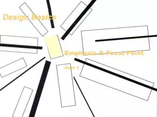
Design Basics. Emphasis & Focal Point Part 1. Emphasis. How do you tell the viewer where to look ? How do you make what’s important, stand out … jump out…be obvious? How do you graphically establish focal areas? …and relief areas ?. Emphasis, Graphic Impact, Focal Areas, & Focal Point

Design Basics
E N D
Presentation Transcript
Design Basics Emphasis & Focal Point Part 1
Emphasis How do you tell the viewer where to look? How do you make what’s important, stand out…jump out…be obvious? How do you graphically establish focal areas? …and relief areas?
Emphasis, Graphic Impact, Focal Areas, & Focal Point there are several terms for similar concepts Emphasis — a sense of prominence, importance, significance. Graphic Impact — the quality of a “loud”, attention-getting graphic. Focal Area, Focal Point — a region that draws and (at least briefly) sustains attention. (also ‘visual weight’)
Emphasis, Graphic Impact, Focal Areas, & Focal Point The basic rule of perception that effects emphasis is……that which is different, stands out. Different from what?Different from the norm…from whatever is common, whatever dominates. Fig: Pg: Artist/Designer: Title: Medium: Design Basics Emphasis, Graphic Impact, Focal Areas, Focal Point & Visual Weight
The basic rule of perception that effects emphasis is……that which is different, stands out. Which designs have the most well-established focal area(s)? Why? What design choices create that emphasis? Fig: Pg: Artist/Designer: Title: Medium: Design Basics Emphasis, Graphic Impact, Focal Areas, Focal Point & Visual Weight
Fig: Pg: Artist/Designer: Title: Medium: Design Basics Which designs have the most well-established focal area(s)? Why? What design choices create that emphasis? Emphasis, Graphic Impact, Focal Areas, Focal Point & Visual Weight
Fig: Pg: Artist/Designer: Title: Medium: Design Basics Which designs have the most well-established focal area(s)? Why? What design choices create that emphasis? Emphasis, Graphic Impact, Focal Areas, Focal Point & Visual Weight
Fig: Pg: Artist/Designer: Title: Medium: Design Basics Which designs have the most well-established focal area(s)? Why? What design choices create that emphasis? Emphasis, Graphic Impact, Focal Areas, Focal Point & Visual Weight
Emphasis Tactics Emphasis via contrast: that which is different, stands out. (norm and anomaly) Emphasis via directional cues: all roads lead to Rome. Emphasis via isolation: this is a sort of contrast—a figure disturbs an otherwise undisturbed field. Emphasis by Position/Placement: Central axes, law of 1/3’s, etc. By Correspondence/Repetition: The eye finds, and jumps to, distinctly similar forms. Fig: Pg: Artist/Designer: Title: Medium: Design Basics
Emphasis Tactics By Correspondence/Repetition: The eye finds, and jumps to, distinctly similar forms. -- the color of the background echoes/repeats the shadow colors in the orange. Fig: Pg: Artist/Designer: Title: Medium: Design Basics
Emphasis Tactics By Correspondence/Repetition: The eye finds, and jumps to, distinctly similar forms. The radiating triangle wedge shapes in the sliced orange are echoed by triangular geometric shapes in the background. Fig: Pg: Artist/Designer: Title: Medium: Design Basics
Emphasis Tactics Emphasis via directional cues: all roads lead to Rome. Many lines/contours lead our eye toward the focal point of this design. Fig: Pg: Artist/Designer: Title: Medium: Design Basics
Emphasis Tactics Emphasis via contrast: that which is different, stands out. (norm and anomaly) Emphasis via directional cues: all roads lead to Rome. Emphasis via isolation: this is a sort of contrast—a figure disturbs an otherwise undisturbed field. Emphasis by Position/Placement: Central axes, law of 1/3’s, etc. By Correspondence/Repetition: The eye finds, and jumps to, distinctly similar forms. Fig: Pg: Artist/Designer: Title: Medium: Design Basics
Emphasis Tactics Emphasis by Position/Placement: Central axes, law of 1/3’s, etc.
Emphasis Emphasis via Isolation:—a figure disturbs an otherwise undisturbed field. “Whitespace”doesn’t have to be white. Graphic design has traditionally been produced on white paper — thus the white background field is the dominating field. Graphics that are isolated by lots of “whitespace” will easily draw attention…emphasis! Note: “whitespace” is one kind of “relief space.” Fig: Pg: Artist/Designer: Title: Medium: Design Basics
. Emphasis by Isolation (Whitespace): Isolation provides another kind of contrast—a figure disturbs an otherwise undisturbed field. — A “thing” disturbs an “emptiness” — an object contrasts with a void.
Emphasis via Isolation When there are few competing disturbances in the field, a single contrasting figure will draw attention—a disturbance will stand out as prominent and significant. This is why “white space” or relief areas are so powerful and necessary.
Emphasis : . • The shadow-shape disturbs the clean background (green grass) shape, but it serves to create a shape that “leads in” or “points to” the foot. • The shadow also “anchors” the foot to the ground — connecting or orienting the foreground figure and the background plane. • Without the shadow, the foot seems to float above the green.
: . Emphasis: foreground-background competition • A busy background will compete with the foreground — diminishing its impact.Here the foreground (foot) is big and simple enough to hold its own despite background competition. • Notice that the bold shapes lying in the background serve to flatten the “grass” into more of 2D pattern rather than a 3D field extending back into space.
: . Effect of modeling/shading • The image has depth — an illusion of a 3rd dimension. The flower overlaps the foot. The foot is hollow (volumous). The foot is nearer than the field due to overlap. The horizon is a bit obscured, suggesting a bit of aerial perspective. • The foot needs the modeling (the shading on the right side) in order to help it fit into this dimensional scheme. Without shading, the foot feels more like a flat, cut-out shape.
Norm & Anomaly When a pattern is broken, whatever breaks the pattern stands out. The upper, fairly regular pattern is broken by a single void. Thus the text therein draws our attention. The empty/relief/dark field below is broken by a single white square—and text fields. Fig: Pg: Artist/Designer: Title: Medium: Design Basics
Norm? Anomaly? To make something stand out, make it different(introduce contrast). Different than what? Whatever is normal. What’s normal? Whatever you, the designer, establish as the norm. Norm & Anomaly
Isolation rather than size A tiny graphic feature draws your attention. Why? It is isolated within a (mostly) unbroken field (“white space”) It doesn’t matter how big your “important” graphic is, its how you set it up…its what you surround it with. (and relief space is a good thing to surround it with)
Isolation rather than size The isolated slide also suggests that your slide (your artwork) can stand out too. (form expresses content)
Emphasis by isolation Here “white space” is black. In layout parlance, “White space” is any undisturbed, constant background area that allows other graphic elements to stand out.
Emphasis by isolation The starkly illuminated portrait (aided by dark clothes & dark undisturbed background) shouts “look at me!”
Emphasis by Directional Elements The shadow edge leads us into the face and down to the hand…and then to the tag line and logo. (directional flow) (an observer’s eye tends to follow well-defined edges, contours and linear features)
Emphasis by contrast Varied detail and varied values (lights, darks and midtones) contrast with the constant-color of the field (background) Also, the sign-off logo contrasts because of rich, varied colors in an otherwise neutral design.
Emphasis vs. Relief Areas of emphasis are enabled byrelief areas—areas in which contrast and variety are subdued. The area of emphasis succeeds precisely because it contrasts with the relief areas—thus relief and emphasis are complementary factors. Relief areas are the supporting cast, while focal areas are the lead actors. You really can’t have one without the other. Fig: Pg: Artist/Designer: Title: Medium: Design Basics
Focal Point & Emphasis • There can be more then one focal point in a composition. Typically one area will dominate..the others will be minor or secondary focal areas. • Be careful not to have too many focal points. • Caution: “When everything is emphasized, nothing is emphasized.” (see “allover pattern”) Fig: Pg: Artist/Designer: Title: Medium: Design Basics
Tactics to create emphasis • Isolation (“white space”, relief space) • Contrast (heightened/extreme value contrast) • Directional Cues (elements point toward or lead to) • Heightened Complexity (shapes, overlaps, fine detail, etc.) • Position (center axes, rule of 1/3’s) • Meaning-laden forms (type, symbols, images, etc.) • Correspondence (repetition of distinct motifs or colors) • Direction Change (orientation anomaly) • Distortion vs. Realism (heightened clarity/resolution) • Change in Size (size anomaly) • Shape Change (shape anomaly) • Color Change (color anomaly, reserved use of rich chroma) • Change in Brightness (value anomaly) Fig: Pg: Artist/Designer: Title: Medium: Design Basics
Fig: Pg: Artist/Designer: Title: Medium: Design Basics
Note that only a very limited amount of color/chroma contrast is actually used. When a norm is well-established, the anomaly dos not have to be bold in order to be an effective magnet for the viewer’s eye.
Fig: Pg: Artist/Designer: Title: Medium: Design Basics
Establishing Emphasis • Abstract images and patterns have focal points -- a focal point is not primarily a subject matter issue, but a graphic issue. Fig: Pg: Artist/Designer: Title: Medium: Design Basics
Norm? Anomaly? Are focal features well-established…or is the more competition? Fig: Pg: Artist/Designer: Title: Medium: Design Basics
Which shapes are distinctive…and why? Which shapes are unbroken…not overlapped? Which shapes are enclosed by a constant background? What directional cues are adding to emphasis? Are the brightest colors establishing emphasis? Fig: Pg: Artist/Designer: Title: Medium: Design Basics
Assess & describe focal areas and tactics. Your Work: For each of these works… a) describe the focal area and the tactics that are creating the focal area. b) Email responses to Gclayton@harding.edu by 8 a.m. before next class. The works: p. 180A Bruegel, The Harvesters p. 179C Caillebotte, Rue de Paris; Temps de Pluie p. 196A Tooker, Subway.
Fig: Pg: Artist/Designer: Title: Medium: Design Basics

