Mastering Modular Design: Essentials for Effective Visual Storytelling
Discover the fundamentals of modular design to enhance your visual storytelling. Each page should feature dominant art, ensuring strong design elements occupy at least one-third of the space. Use real images to connect with audiences and maintain balance by varying photo shapes and sizes. Establish a clear hierarchy with headlines decreasing in size as you move down the page, and keep text within ideal width limits for readability. Follow guidelines for captions and jumps, while also embracing creativity when the moment calls for breaking the rules.

Mastering Modular Design: Essentials for Effective Visual Storytelling
E N D
Presentation Transcript
Modular design • Stories should be shaped like rectangles. • Pages = Rectangles stacked on top of each other.
Visual anchor • Each page should have a dominant piece of art. • Strong design = At least one-third of the page is art. • Use photos of real people doing real things
Balance & Contrast • Vary the shapes and sizes of photos (and stories) on a page. • Avoid putting a photo right on top of an ad. • If you run more than one photo, make sure one is substantially bigger than the other.
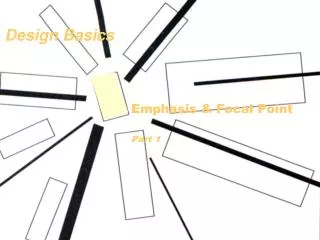
Hierarchy • Headlines get smaller as you move down the page. • Don’t put art between the headline and start of the story.
Text • Avoid columns more than 20 picas wide or less than 10 picas. • Use italics, bold, reverse in small doses. • Type smaller than 8 point is hard to read.
Captions & Jumps • Aim for one caption, one photo. • Don’t jump if you only have a couple inches of type to get on the next page. • Only jump once.
Break the rules • At times, creativity works.