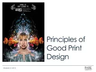
Enhance Your Print Communication: Essential Tips for Effective Newsletters and Bulletins
Discover the best practices for creating impactful printed materials, including newsletters, brochures, and flyers. This guide, led by Linda Rhodes, Conference Director of Communications, emphasizes the importance of clear content, appealing appearance, and effective distribution. Learn to craft a compelling mission statement, identify target audiences, and utilize proper formatting and design principles. Avoid common pitfalls in print communication and ensure your materials are accessible and professional with our expert tips.

Enhance Your Print Communication: Essential Tips for Effective Newsletters and Bulletins
E N D
Presentation Transcript
Looking Good in Print Linda Rhodes Virginia Conference Director of Communications
NewslettersWorship bulletinsBrochuresAdvertisingDirect MailFlyers
Develop Mission Statement Mission Statement Goals and objectives Target audiences
Key elements: Content Appearance Production Distribution
1. Content: a. Hard news
1. Content: a. Hard news b. Features
1. Content: a. Hard news b. Features c. Editorial/Opinions
1. Content: a. Hard news b. Features c. Editorial/Opinions d. Columns
1. Content: a. Hard news b. Features c. Editorial/Opinions d. Columns e. Events/Calendar
1. Content: a. Hard news b. Features c. Editorial/Opinions d. Columns e. Events/Calendar f. Fillers
Writing Style: Conversational
Writing Style: Conversational Simple, direct sentences
Writing Style: Conversational Simple, direct sentences 5 Ws + H
Writing Style: Conversational Simple, direct sentences 5 Ws + H Active voice
Writing Style: Conversational Simple, direct sentences 5 Ws + H Active voice Inverted pyramid
Writing Style: Conversational Simple, direct sentences 5 Ws + H Active voice Inverted pyramid Uniform style
Writing Style: Conversational Simple, direct sentences 5 Ws + H Active voice Inverted pyramid Uniform style Define acronyms
Writing Style: Conversational Simple, direct sentences 5 Ws + H Active voice Inverted pyramid Uniform style Define acronyms Inclusive language
2. Appearance: • a. Page size
2. Appearance: • a. Page size • b. Number of pages
2. Appearance: • a. Page size • b. Number of pages • c. Paper
2. Appearance: • a. Page size • b. Number of pages • c. Paper • d. Name/Flag
2. Appearance: • a. Page size • b. Number of pages • c. Paper • d. Name/Flag • e. Regular items
2. Appearance: • a. Page size • b. Number of pages • c. Paper • d. Name/Flag • e. Regular items • f. Folios
2. Appearance: • a. Page size • b. Number of pages • c. Paper • d. Name/Flag • e. Regular items • f. Folios • g. Table of contents
2. Appearance: • a. Page size • b. Number of pages • c. Paper • d. Name/Flag • e. Regular items • f. Folios • g. Table of contents • h. Typeface
Objective is to make iteasy to read. Help directthe reader
Principles of Layout/Design: Contrast
Principles of Layout/Design: Contrast Repetition
Principles of Layout/Design: Contrast Repetition Alignment
Principles of Layout/Design: Contrast Repetition Alignment Proximity
Layout: Simple, not boring
Layout: Simple, not boring Same thing in same place
Layout: Simple, not boring Same thing in same place Column width
Layout: Simple, not boring Same thing in same place Column width Type faces
Layout: Simple, not boring Same thing in same place Column width Type faces Photos/art
Layout: Simple, not boring Same thing in same place Column width Type faces Photos/art Contrast
Layout: Simple, not boring Same thing in same place Column width Type faces Photos/art Contrast Consistency
Newsletter No-No’s 1.Never underline typeset text
Newsletter No-No’s 2. AVOID ALL CAPITAL BODY TEXT. IT IS VERY DIFFICULT TO READ. EVEN ALL CAP HEADLINES ARE TOUGH.
Newsletter No-No’s 3. Don’t put two spaces after a period.
Newsletter No-No’s Don’t useso many differenttype faces in ONE newsletter that it looks like a cut-and-paste ransom note! Stick to one or two type faces. Get variety with bold, condensed and italic versions of the same type face.
Newsletter No-No’s 5. NEVER print body copy in color. (Limit printing headlines in color.) Better use of color is for rules, bullets, line art, masthead, logo, etc.