Download
1 / 15
150 likes | 279 Vues
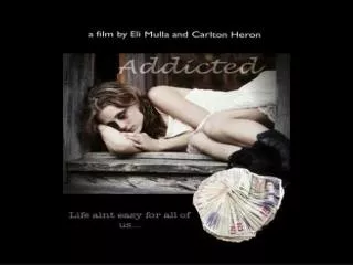
Our new advertising campaign for Toys 'R' Us, "Behind Every Smile", targets parents aged 25-35, evoking nostalgia and emotional connection. The campaign aims to resonate with parents by emphasizing the joy and warmth of childhood, positioning Toys 'R' Us as not just a store, but a creator of unforgettable moments for families. Utilizing PowerPoint for visuals, memorable graphics, and a simple yet effective slogan, we will engage the audience with heartwarming imagery of smiling children, reinforcing that our products are a source of happiness and cherished memories.

E N D
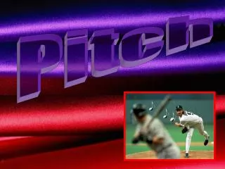
Advertising Pitch Year 8 Assessment Task 5
You are the advertiser. • Convince me, ‘the company’, to choose your new advertising campaign. • Your speech should be 3-5mins. • You must submit palm cards.
What will the theme (unifying element) of your speech be? For example: a) The ‘vision’ of the company? b) The new slogan (or the message behind the slogan).
How will you present the advertising designs? For example: • Powerpoint? • Cardboard posters? • Images?
How will you engage the audience (hook)? For example: • A question • A quote • An anecdote • A factoid
Good Morning President, Vice President and Executives of “Toys R Us”, In the past, your advertising focused only on competitive pricing (or the ‘head’). This new campaign will remind parents about reasons more to do with the ‘heart’. If you choose our campaign ‘Toys R Us’ will be the toy store of choice for parents; not only because of logical reasons (like price) but also because ‘Toys R Us’ creates smiles. The target market for this advertisement are parents from the 25-35 age range. The slogan “Behind every smile” targets this age range using the literary device of a cliché. We have chosen this device because this age group has a strong sense of nostalgia. This phrase is a well-known one, creating nostalgia, whilst not currently being attached to a particular brand. There is also emotive language because it claims that without our products there would be no smiles for their children.
The logo is a familiar logo. We have not changed this, because it fits the audience. The audience is often children as well as parents. The bright colours, fun font and reversed “R” with a star have that great sense of fun. This has always been appealing to children. In addition it fits most of features that make a good logo: 1. Simple – it is just two dimensional and uncomplicated with pictures 2. Memorable – its simplicity and unusual font stay in people’s minds 3. Appropriate - the bright colours, fun font and reversed “R” with a star has that great sense of fun that gives that energy of childhood 4. Versatile – simple two dimensional means it can be printed on t-shirts as easily as billboards
The print advertisement itself has a number of very important features. The salient image is the child and the happy smiling face. It is glowing, brighter and larger than the surrounding background and this is what makes it salient. This is a happy child and has symbolism for parents and also a strong appeal. It has been chosen to tug at the heart strings of parents, their child being the centre of their affection. The background is red which gives a feeling of warmth but also a sense of urgency, which would translate into buying the product. This has been placed at the centre of the page which means the information value is very high for this image. From here the vectors of the advertisement take the eye down to the logo, using the stark white curve of the vest. From here traditional western reading paths lead you left to right across the image to the slogan. The slogan is a lighter colour and smaller to ensure it is the last thing in the person’s mind.
This print advertisement is centered around a strong, simple image of a boy smiling. He is ‘offering’ us the possibility of warm feelings. In addition to this, the colour red emphasizes this feeling of warmth. It is a very tempting invitation that requires only the logo and slogan to orientate the viewer. In conclusion from image to slogan to logo this is an advertisement that will strengthen the “Toys R Us” brand and translate into warm feelings and brand loyalty. “Toys R Us” behind every smile!
Visual Techniques • Label: • Colour • Graphics • Fonts • Size • Shape • Print Ad: • Information value • Vectors • Demand/Offer • Framing • Colour • Depth (foreground/background) • Logo: • Text only • Visual only • Text and Visual • Colours • Symbols • Shapes • Words/letters • Slogan • Font • Colours • Size
Literary Techniques • Label: • Literary/poetic/persuasive techniques • Nutritional information • Contact information • Anecdote • Hook • Print Ad: • Literary/poetic/persuasive techniques • Concise • Memorable • Slogan • Literary techniques • Imagery • Adjectives/descriptive words • Humour • Poetic techniques • Assonance • Alliteration • Rhyme • Persuasive techniques • Emotive words • Hyperbole • Memorable and understandable • Concise (one sentence) • Use of punctuation