Bias in the News
40 likes | 211 Vues
Bias in the News. Kelsey Friberg and John Orlando. Gender Proportions in the News in 2012. Percentage of appearances. Type of News.

Bias in the News
E N D
Presentation Transcript
Bias in the News Kelsey Friberg and John Orlando
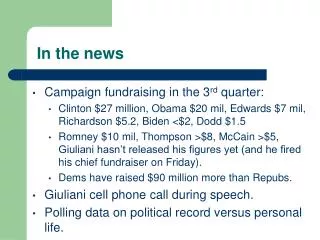
Gender Proportions in the News in 2012 Percentage of appearances Type of News Figure 1. This bar graph displays the proportions of men and women that appeared in the news in 2012. All four of the types of news that are displayed (newspapers, radio, television, and all media), show an overwhelming majority of male appearances. This demonstrates a major flaw in media attention, and the lack of female appearances on our news stations may be a significant contributor to the inattention to the current human trafficking issue. http://www.hyperkinesis.net/wp-content/uploads/2010/10/1-Men-vs-Women-in-the-News.jpg
Tone of Coverage: MSNBC vs. FOX Percentage of Stories Figure 2. The bar graph shows the tone of coverage between Fox News and MSNBC during the McCain and Obama election campaign. The tone is measured in percent of stories provided by each news network. Fox is portrayed as being decently balanced for both candidates, but MSNBC displays liberal bias. "The Color of News." Project for Excellence in Journalism (PEJ). N.p., 29 Oct. 2008. Web. 21 Feb. 2013. <http://www.journalism.org/node/13436>.
Both of these graphs demonstrate the inaccuracies in our news. This first graph, focusing on the inattention of women and overwhelming prevalence of men in the media, elucidates the apparent bias that is found in American news. Going along with this theme of exposing the media’s illiberality, the second graph shows political biases between both parties in two of today’s most popular news networks, displaying that there is favoritism towards one political party over the other. These graphs portray the bias tendencies of our news—tendencies that all viewers should be made cognoscente of and keep in mind while viewing these stations.