Download
1 / 13
130 likes | 340 Vues
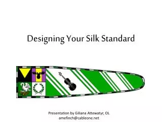
Designing Your Silk Standard. Presentation by Giliana Attewatyr , OL amefinch@cableone.net. A device is very specific. The standard is an interpretation. They do not need to be the same!. The Standard isn’t your Device. Device and Pennant of Karl Braden von Sobernheim.

E N D
Designing Your Silk Standard Presentation by Giliana Attewatyr, OL amefinch@cableone.net
A device is very specific. The standard is an interpretation. They do not need to be the same! The Standard isn’t your Device Device and Pennant of Karl Braden von Sobernheim
Going from device to standard • Take heraldry element(s) and rearrange • Repeat elements • Omit elements • Add elements • Family • Household • Group • Awards • Mottos/text
Adding Borders and Divisions • Adding dividers or borders • Borders can add a finished look or pop to the standard Without border With border
Make elements BIG and simple • Banner is 90” long so there is plenty of room! • Banner is 20' in the air and flapping in the breeze • Think large cartoon-type images; not a lot of small details • Only use small images, like ermine, in a repeating pattern Too detailed Simple outline
Put elements close to the pole • Banner is 20' in the air and flapping in the breeze • As the banner flaps, any images or text at the tips is completely lost.
Put elements close to the pole • Put main identifiers (group, awards) directly against the pole • The equivalent of “What army am I with?” • Put all main charges in first ⅓ to ½ of banner • The rest of the banner would be best to leave with bold colors and/or repeated patterns
Heraldic rules are still a good idea! • The reason for no color on color or metal on metal is to increase visibility from a distance • Banner is 20' in the air and flapping in the breeze • Sometimes different divisions will have color next to color. Try to avoid extremely similar colors: • Blue / Purple / Black • Red / Orange • Yellow / Orange • Green / Blue • Depends somewhat on your selected dyes Hard to see Easily visible
Layout process – Basic Shape • Simple rectangle • Single rounded taper • Single pointed taper • Double rounded taper • Double pointed taper
Layout process – Add a Border • Solid color • Stripes • Complex lines like embattled
Layout process – Optional Badges • Take the first square of the banner (22"x22") and make into an identifier box. • Single element • Multiple elements • Ideas to Choose from: • Kingdom badge • Local group badges • Household badges • Award badges
Layout process – Add Heraldic Charges • Add elements of personal heraldry • Add multiples • Omit charges or divisions • Add other charges or division • Add motto
Additional Information Many resources at the Linkspages at Larsdatter.com http://www.larsdatter.com/banners.htm