AfterImage And Complements
AfterImage And Complements. But First…. For Next Week: we will move on to… Principle 3: Assimilation: The Bezold Effect. A Design in Which the Total Effect of the Perceived Hues are Altered by the Change of ONE Dominant Hue .


AfterImage And Complements
E N D
Presentation Transcript
AfterImageAnd Complements But First…
For Next Week: we will move on to…Principle 3:Assimilation:The Bezold Effect ADesign in Which the Total Effect of the Perceived Hues are Altered by the Change of ONE Dominant Hue. The subordinate hues take on (assimilates) the characteristics of the dominant hue. Named after Wilhem von Bezold, a meterologist who discovered that colors could appear to change based on their relation to a dominant color.
Third Portfolio AssignmentBezold EffectUsing Color-Aid Papers or Photoshop.Let’s do it now! Plan your design Then paste in appropriate colors. The two pattern designs should be equal in all respects, with the exception of the Dominant Hue. Select at least three colors to be used in your pattern, with ONE alternative color for the dominant hue in your second version. Once you are finished look at the two designs and tell me WHAT has changed: saturation, hue or value.Proper labeling:Title: Simultaneous Contrast Principle 3: Assimilation (Bezold Effect). Explanation: In your own words explain the phenomena.
If you finish early… • Another way to describe the differences in color created by overtones is TEMPERATURE. • Oranges, Reds and Yellow provoke a warming sensation, while blues, violets and greens provoke a cooling sensation. • A yellow green is a “hot” green; a blue green is a “cool” green. • Look at your rows of secondary colors and give them ratings on a scale from hot to cool.
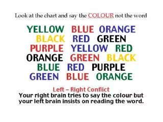
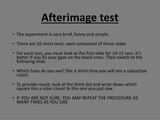
POP QUIZ!!! What is happening in the following slides?
After Image: occurs when eye grows tired of a given hue and spontaneously creates the complementary hue as a result.
The major Complementary Colors include the three Primaries and their Secondaries: (Primary) (Secondary) Red Green Yellow Violet Blue Orange
What are Complementary Colors? Colors which lie directly across from each other on the color wheel. Also called Color Dyads, since they’re in pairs.
What complements are visible in this painting by Hans Hoffman?
BUT…Complementary Colors can also neutralize or cancel each other out. When mixed together, their original INTENSITY is suppressed, leading us to Chromatic Neutral Grays…
First Exercise Try to createanoptical illusion using thecomplementaryeffect. You are making complementary reversal Keep it simple: a bull’s eye, a flag. You may use Color-Aid Paper or the computer. Remember white and black act as reversers.
Andy Warhol commissioned work of Muhammed Ali
Next Exercise • Download a portrait from the web (a celebrity, a gurning participant, your husband or a friend.) • Change the image to black and white and then apply complementary colors in Photoshop using the spray brush OR I can print the black and white and you can paint on the image. • You are making your own Warhol, not as a screen print, but as a computerized or painted rendition.
Cobra Artist: Karl AppelCobra’s was a European avantgarde movement based on spontaneity and experiment, and they drew their inspiration from children’s drawings, art of non-western cultures and the examples of Paul Klee and Joan Miro.,
Third Exercise • Using Photoshop and the brushes (or paint and real brushes) paint a small abstract or semi-abstract composition using a complementary palette. • Use at least two sets of complements. • In the spirit of Cobra, be playful, gestural and bold.