DON’T MAKE ME THINK
600 likes | 941 Vues
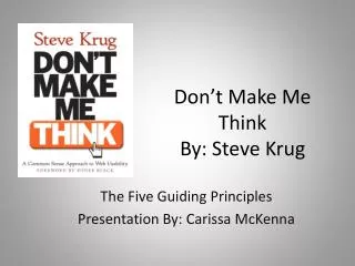
DON’T MAKE ME THINK. Steve Krug. What is the most important thing I should do if I want to make sure my Web site is easy to use?. Nothing important should ever be more than two clicks away. RULE # 1: “Don’t make me think!”. Things that make us think

DON’T MAKE ME THINK
E N D
Presentation Transcript
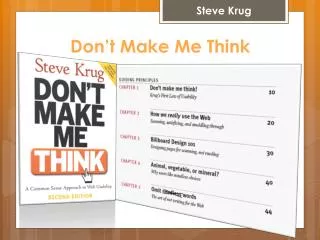
DON’TMAKEMETHINK Steve Krug
What is the most important thing I should do if I want to make sure my Web site is easy to use? Nothing important should ever be more than two clicks away.
RULE # 1: “Don’t make me think!” Things that make us think • All kinds of things on a Web page can make us stop and think unnecessarily.For example: cute or clever names, marketing induced names, company-specific names, and unfamiliar technical names. (like button names as Job! Is obvious than Employment Opportunities)
Visitors shouldn’t spend their time thinking about: • Where am I? • Where should I begin? • Where did they put _________? • What are the most important things on this page? • Why did they call it that ?
So… • Make things Obvious and Easy. • Make pages self- evident or at least self-explanatory (appearance of things, well-chosen names, layout of the page, and the small amounts of carefully crafted text should all work together to create near-instantaneous recognition). • Web pages are going to be effective, they have to work most of your magic at a glance.
EXAMPLE EXAMPLE
RULE # 2: “How we really use the Web” Scanning, satisficing, and muddling through When we’re creating sites, we act as though people are going to pore over each page. What they actually do most of the time (if we’re lucky) is glance at each new page, scan some of the text, and click on the first link that catches their interest or vaguely resembles the thing they’re looking for. There are usually large parts of the page that they don’t even look at.
What we design for… Read Here Read Here Read Here Finally, click on a chosen link.
The Reality… Look around feverishly for anything that Is interesting and is clickable. As soon as you find a halfway-decent Match, click. If it doesn’t pan out, click the back Button and try again.
Fact of life 1 • We don’t read pages. We scan them. If the document is longer than a few paragraphs, we’re likely to print it out because it’s easier and faster to read on paper than on a screen. Why do we scan? • We’re usually in a hurry. • We know we don’t need to read everything • We are good at it (we’ve been scanning news papers, magazines etc all our lives.)
Fact of life 2: We don’t make optimal choices. We satisfice. Most of the time we don’t choose the best option. We choose the first reasonable option.
Fact of life 3: We don’t figure out how things work. We muddle through. Why does this happen? • It’s not important to us • If we find something that works, we stick to it.
RULE # 3: Billboard Design 101 Designing pages for scanning. There are five important things you can do to make sure they see – and understand – as much of your site as possible: Create a clear visual hierarchy on each page The more important something is, the more prominent it is. • For instance more important headings are either larger, bolder, in a distinctive color, set off by more white space, or some combination of the above.
RULE # 3: Billboard Design 101 • Things that are related logically are also related visually. • You can show that things are similar by grouping them together under a heading, displaying them in a similar is usual style, or putting them all in a clearly defined area. • Things are “nested” visually to show what’s part of what.For instance, a section heading (“Computer Books”) would appear above the title of a particular book, visually encompassing the whole content area of the page, because the book is part of the section.
RULE # 3: continued… Take advantage of conventions • Every publishing medium develops conventions and continues to refine them and develop new ones over time. The Web already has a lot of them, mostly derived from newspaper and magazine conventions, and new ones will continue to appear.
RULE # 3: continued… • Dividing the page into clearly defined areas is important because it allows users to decide quickly which areas of the page to focus on and which areas they can safely ignore.
RULE # 3: continued… Make it obvious what’s clickable
RULE # 3: continued… Minimize noise Colors like red and black together Spacing between links
RULE # 4: Animal, vegetable or mineral? Why users like mindless choices? Users don’t mind a lots of clicks as long as each click is painless and they have continued confidence that they’re on the right track. I think the rule of thumb might be something like “ three mindless, unambiguous clicks equal one click that requires thought.”
RULE # 5: Omit needless words The art of not writing for the web. • E. B. White’s seventeenth rule in “The Elements of Style” Omit Needless words. Vigorous writing is concise. A sentence should contain no unnecessary words, a paragraph no unnecessary sentences, for the same reason that a drawing should have no unnecessary lines and a machine no unnecessary parts.
Getting rid of all those words that no one is going to read has several beneficial effects: • It reduces the noise of the page • It makes the useful content more prominent. • It makes the pages shorter, allowing users to see more of each page at a glance without scrolling.
Specially 2 kinds of writing 1. Happy talk and 2. instructions. Happy talk must die. • A lot of Happy talk is the kind of self-congratulatory promotional writing that you find in badly written brochures. Unlike good promotional copy, it conveys no useful information, and if focuses on saying how great we are, as opposed to delineating what makes us great. Instructions must die. • The other source of needless words is instructions. Your objective should always be to eliminate instructions entirely by making everything self-explanatory, or as close to it as possible. When instructions are necessary, cut them back to bare minimum.
RULE # 6: Street signs and Breadcrumbs Designing Navigation It’s a fact: “People won’t use your Web site if they can’t find their way around it.”
Enter Site Feel like browsing Yes Click on a section No Click on a subsection Yes Think you’re in The right section? Look for whatever it is Find It? No Yes Not Yet Thoroughly Frustrated? Leave Happy
Enter Site Feel like browsing No Find a search box Type your query No Credible results? Device a Better query Yes Not Yet Scan results for likely matches Check the out Had Enough? Leave Happy Yes No Find it? Leave Unhappy
Enter Site Feel like browsing Yes No Click on a section Find a search box No Click on a subsection Type your query Yes Think you’re in The right section? No Look for whatever it is Credible results? Device a Better query Yes Find It? No Not Yet Scan results for likely matches Yes Almost Not Yet Check the out Had Enough? Thoroughly Frustrated? Leave Happy Yes No Find it? Leave Unhappy Yes
The unbearable lightness of browsing. • No sense of scale (no, of pages in the site) • Its hard to know whether you’ve seen everything of interest in a site, which means it’s hard to know when to stop looking. This is one reason why it’s useful for links that we’ve already clicked onto display in a different color. It gives us some sense of how much ground we’ve covered. • No sense of direction. • There is no up and down in hierarchy – to a more general or more specific level.
Two of the purposes of navigation are fairly obvious: to help us find whatever it is we’re looking for, and to tell us where we are. • It gives us something to hold on to. • It tells us what’s here. • It tells us how to use the site. • It gives us confidence in the people who build it.
Web navigation conventions Conventions specify the appearance and location of the navigation elements so we know what to look for and where to look when we need them. Putting them in a standard place lets us locate them quickly, with a minimum of effort; standardizing their appearance makes it easy to distinguish them from everything else. Navigation conventions for the web have emerged quickly, mostly adapted from existing print conventions. They will continue to evolve, but for the moment these are the basic element. • Site ID • Sections • Subsection • Utilities • You are here • Page name • Local navigation
Web navigation conventions Don’t look now, but I think it’s following us. Just having the navigation appear in the same place on every page with a consistent look gives you instant confirmation that you’re still in the same site. Navigation should include the five elements you most need to have on hand at all times; • Site ID • A way home • A way search • Utilities • Sections
Web navigation conventions Did I say every page? I lied. There are two exceptions to the "follow me everywhere" rule: • The home page • Forms
Site ID • The Site ID represents the whole site.
The Sections • Primary navigation- are the links to the main sections of the site.
The Utilities • Utilities are the links to important elements of the site that aren't really part of the content hierarchy(like help, sitemap etc).
There is no place like Home • Having a Home button in sight at all times offers reassurance that no matters how lost I may get, I can always start over. Site ID doubles as button that can take you to Home page.
A way to reach (Search Option) • Given the potential power of searching and the number of people who prefer searching to browsing, unless a site is very small and very well organized, every page should have either a search box or a link to search page. • Large percentage of users their first official act when they reach a new site will be to scan the page for search option.
Secondary, tertiary, and ….. XYZ Home Level 1 Product Support Help Level 2 Level 3 Hardware Software Support database Live Support FAQs Contact Info
Page names There are 4 things you need to know about page names: • Every page needs a name • Name needs to be in right place • The name needs to be prominent • Name needs to match what I clicked
You are here • They need to stand out(example highlight sub-section link)
Breadcrumbs • Put them at the top • Use>between levels • Use tiny type • Use the words "you are here" • Boldface the last item. • Don't use them instead of page name
Tabs • They are self evident • They are hard to miss • They are slick • They suggest a physical space
Try the Trunk Test • What site is this? (Site ID) • What page am I on? (Page name) • What are the major sections of the page? (Sections) • What are my options at this level? (Local navigation) • Where am I in the scheme of things? ("you are here" indicators) • How can I search?
RULE # 7: The first step in recovery is admitting that the Home page is beyond your control Think about all the things the Home page has to accommodate: • Site identity and mission. • Site hierarchy • Search • Timely content • Deals • Short-cuts • Registration • Show me what I'm looking for • ...and what I'm not looking for • Show me where to start • Establish credibility and trust
And you have to do it... blindfolded • Everybody wants a piece of it. • Too many cooks • One size fits all
How to get the message across • The Tagline • the welcome blurb • Use as much as space necessary • ...but don't use any more space than necessary • Don't use a mission statement as a welcome blurb • It's one of the most important things to test.
Home page navigation can be unique • Section descriptions. • Different orientation • Everywhere else
The trouble with Pulldowns/Rollovers • You have to seek them out • They are hard to scan
