SlideServe
Menu
Préférences
© SlideServe · v2026

Don ’ t miss the point.

sachi avatar
16 diapositives · 307 Views · Oct 02, 2014

Master the art of PowerPoint presentations with valuable insights from Professor Keri Stephens of the University of Texas. Learn to create impactful designs by selecting appropriate templates, using high-contrast colors, and limiting content to enhance readability. Discover font choices that work, how to effectively utilize bullet points and images, and the importance of testing your presentation on final equipment. Avoid common pitfalls like over-complicated visuals, excessive animations, and poorly chosen clip-art. Elevate your presentation skills with these expert tips! **Relevant
Don ’ t miss the point. - slide 1
01 / 16Don ’ t miss the point.
1 / 17

Télécharger la présentation

Don ’ t miss the point.
Une image / un lien ci-dessous est fourni (tel quel) pour télécharger la présentation

Politique de téléchargement : le contenu du site vous est fourni TEL QUEL pour votre information et votre usage personnel ; il ne peut être vendu, concédé sous licence ni partagé sur d’autres sites sans l’accord de son auteur.Le contenu vous est fourni TEL QUEL, pour votre information et votre usage personnel uniquement. Téléchargez la présentation en cliquant sur ce lien. Lors du téléchargement, si vous ne parvenez pas à télécharger une présentation, l’éditeur a peut-être supprimé le fichier de son serveur.Pendant le téléchargement, si vous ne parvenez pas à obtenir une présentation, le fichier a peut-être été supprimé par l’éditeur.

F I N

Plus de contenu associé

Transcription de la présentation
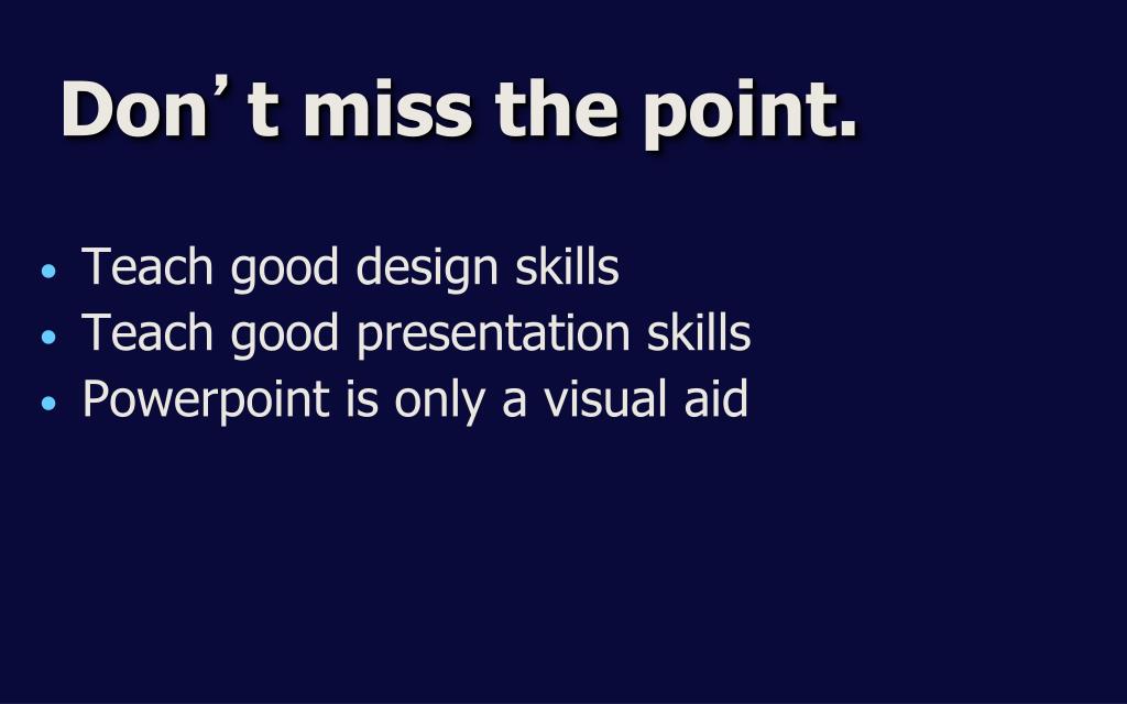
  1. Don’t miss the point. • Teach good design skills • Teach good presentation skills • Powerpoint is only a visual aid

  2. Design Tips for PowerPoint • 1st –– Backgrounds – Templates • Best fonts • Bullets –– 6 is max • Content is king! • Words on a slide –– 25 or less • Images –– key Content and layout provided by Professor Keri Stephens, University of Texas

  3. Pick a good template • Match the mood • Look professional • Don’t get the blues • medium blues • navy blue OK Content and layout provided by Professor Keri Stephens, University of Texas

  4. Bluesy templates – yikes! Azure Bluediagonal Lock & key Soaring Content and layout provided by Professor Keri Stephens, University of Texas

  5. Use high contrast colors GOOD GOOD GOOD Brightondark Darkonbright EVIL EVIL EVIL Content and layout provided by Professor Keri Stephens, University of Texas

  6. Why high-contrast? • Your PC screen is hi-res • everything looks great • don’t trust it! • big displays “wash out” colors • always TEST on final equipment • alter template’s defaults as needed Content and layout provided by Professor Keri Stephens, University of Texas

  7. See for yourself • Which line is easier to read? • Which line is easier to read? Which line is easier to read? Which line is easier to read? Content and layout provided by Professor Keri Stephens, University of Texas

  8. Which is easier to read? Lessvisualcomplexity Strongerlines Once upon a time there lived a yellow bear named Pooh. He had a cat named Tigger and a law degree from Texas Tech. He was allergic to chocolate. Once upon a time there lived a yellow bear named Pooh. He had a cat named Tigger and a law degree from Texas Tech. He was allergic to chocolate. Content and layout provided by Professor Keri Stephens, University of Texas

  9. Be font savvy Sans serifgood • Arial • Arial Black • Futura • Tahoma Serifbad • Times New Roman • New York • Courier Content and layout provided by Professor Keri Stephens, University of Texas

  10. Don’t waste bullets • use • no • more • than • 6 • in a list Content and layout provided by Professor Keri Stephens, University of Texas

  11. Observe the limit 25 More looksbusy words per slidemax Content and layout provided by Professor Keri Stephens, University of Texas

  12. Single phrases Short lists Questions for audience Quotes Photographs Video Words in the PowerPoint are talking points and headings only. Do not read PowerPoint aloud during your demonstration. Content is King! Content and layout provided by Professor Keri Stephens, University of Texas

  13. Weird sound effects Most transitions Flying text Strange animations Bad clip-art Avoid death by cheese… Content and layout provided by Professor Keri Stephens, University of Texas

  14. Clip-art Hall of Shame Content and layout provided by Professor Keri Stephens, University of Texas

  15. PowerPoint rules No more than one graphic image per slide. Make it count! Content and layout provided by Professor Keri Stephens, University of Texas

  16. Graphics • Use quality graphics • MSN Images or Google Images • Remember citations