Effective Data Visualization Methods Comparison
Learn which graphs are best for comparing data sets based on examples including stamp preferences, sunglasses ownership, and weather data. Understand how to choose appropriate visual displays like circle, line, bar, or stem-and-leaf plot.

Effective Data Visualization Methods Comparison
E N D
Presentation Transcript
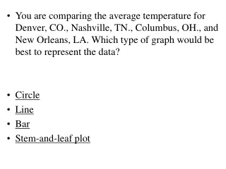
You are comparing the average temperature for Denver, CO., Nashville, TN., Columbus, OH., and New Orleans, LA. Which type of graph would be best to represent the data? • Circle • Line • Bar • Stem-and-leaf plot
Stem Leaf 6 7 8 8 3 6 1 Return
EXAMPLE 1 Choosing an Effective Display Stamps Which graph is more effective in comparing the percent of people who prefer sports stamps to the total number of people?
EXAMPLE 1 Choosing an Effective Display ANSWER The circle graph shows the whole, so it is more effective in showing that 50% of the people chose sports as their favorite stamp subject.
EXAMPLE 2 Making an Appropriate Display Sunglasses You ask 20 people at a beach how many pairs of sunglasses they own. The list below shows their responses. Make a data display that shows the spread of data. 0, 1, 1, 1, 2, 2, 2, 2, 2, 3, 3, 3, 3, 3, 4, 4, 4, 6, 6, 10
EXAMPLE 2 Making an Appropriate Display SOLUTION You can use a box-and-whisker plot to show the spread of data. The box tells you that about half of the people own 2 to 4 pairs of sunglasses.
1 4 5 8 7 9 3 6 6 6 4 3 2 5 3 7 5 0 3 5 EXAMPLE 3 Choosing an Appropriate Display Weather Weather The data displays organize the daily high temperatures during a recent month in Boston, Massachusetts. Which display can you use to find the median high temperature? 6 3 0 9 9 4 3 8 8 5 0 6 2 7 8 4 º 36 F Key:3 6 =
EXAMPLE 3 Choosing an Appropriate Display SOLUTION You can use the stem-and-leaf plot to find the median high temperature, 56ºF, because it displays the data in order. The circle graph does not display the individual temperatures.
for Examples 1, 2, and 3 GUIDED PRACTICE 1. In Example 1 on page 719, suppose you want to compare people preferring art stamps to people preferring animal stamps. Which graph is more effective? Explain. What If?
for Examples 1, 2, and 3 GUIDED PRACTICE 1. In Example 1 on page 719, suppose you want to compare people preferring art stamps to people preferring animal stamps. Which graph is more effective? Explain. What If? ANSWER bar graph; The data is in distinct categories.
for Examples 1, 2, and 3 GUIDED PRACTICE 2. You record the temperature (in degrees Fahrenheit) at noon for seven days in a row. The data are listed below. Which data display would you use to show how the temperature changed during that time? Make the display. 50ºF 42ºF 30ºF 32ºF 45ºF 55ºF 50ºF
for Examples 1, 2, and 3 GUIDED PRACTICE 2. You record the temperature (in degrees Fahrenheit) at noon for seven days in a row. The data are listed below. Which data display would you use to show how the temperature changed during that time? Make the display. 50ºF 42ºF 30ºF 32ºF 45ºF 55ºF 50ºF ANSWER line graph; See margin for art.
Appropriate Data Displays Which graph would be most appropriate to show the method of travel used by most people? Which graph compares the number of people who ride the bus to the entire population? BrainPop: Graphs
Appropriate Data Displays Which graph would be best to show the change in average temperatures?
When would I use… X X x x X x x X x X x a Circle graph a Line graph a Line plot / Frequency table a Bar graph 2 3 4 5
Match the display with it’s purpose • Line graph To compare data in different categories • Circle graph To organize data in numerical order • Bar graph To Show change over time • Stem – and – Leaf To compare parts to a whole • Line Plot To count the number of events