Simple Linear Regression On Excel
This comprehensive guide walks you through the process of conducting a simple linear regression analysis in Excel. You will learn how to create a scatterplot to visually assess the linearity of your data before applying a trendline. Additionally, we'll cover the steps to set up the regression analysis using the Data Analysis Tool, including how to highlight your x and y variable cells, check labels, and interpret critical outputs such as R², adjusted R², p-values, and confidence intervals. Perfect for beginners looking to enhance data analysis skills!

Simple Linear Regression On Excel
E N D
Presentation Transcript
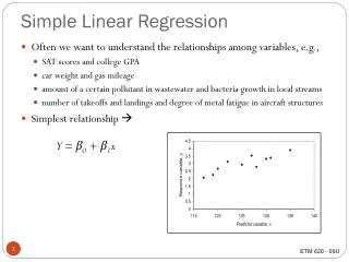
1. Construct Scatterplot to see if data looks linear. Click Chart Wizard.
Select Scatter and this chart sub-type
Highlight only cells that contain the x and y values
Enter a chart title Label x and y axes
Store on a new worksheet Name the worksheet
1. Click on grey background -- Delete 2. Click on any horizontal line -- Delete 3. Click on legend -- Delete
Right mouse click on any data point. Select “Add Trendline”. Select Linear from the trendline options.
Looks linear. Return to Original Worksheet.
Go to Tools Menu Select Data Analysis
1. Highlight cells of y-variable 2. Highlight cells of x-variable 3. Check Labels (if first row has labels) 4. Check Confidence Level -- for other than 95% intervals (and change %) 5. Click New Worksheet Ply and give name
r r2 adj r2 s n SSR SSE SSTOTAL 95% Confidence interval for 1 99% Confidence interval for 1 Low p-value Linear model OK