Download
1 / 43
440 likes | 598 Vues
Learn how to create effective PowerPoint presentations for Computer Science classes. Follow layout, fonts, & color guidelines to enhance your slides and keep your audience engaged.

E N D
Guidelines and Requirements • for • Computer Science Presentations • Students can work together to prepare the presentations • Each student must individually present the topic chosen • For example, teams in Robotics cannot provide a • consolidated table of contents • Your grade will be based on content and observance of • the material presented herein
Contents Items to Include Presentation Guidelines Slides Layout Fonts Caps and italics Templates Colors Graphs and Charts Illustrations Bullets Attention Grabbers Animation Summary
Items to Include • A cover slide with the title, date, and name of the student. • A table of contents. • A body that follows the table of contents. • Pictures, diagrams, and tables when appropriate. • Bullets, not paragraphs. • References in accordance with required format • A summary – at the end - of the main topics covered.
Items to Include: References Each topic must have at least 3 reference Texts: Title, Author(s), Publisher Internet: URL, Title, Author(s) Citations Placed where used in body of text Format: (Reference number x, page x) If Internet reference, instead of page, enter Section Title
PowerPoint Presentation Guidelines • The following slides present guidelines and suggestions for the use of fonts, colors, and graphics when preparing PowerPoint presentations for Computer Science classes. • The media (PPT) is designed to ENHANCE your presentation, not BE the presentation. • Remember, only you can prevent • “Boredom by PowerPoint”
PowerPoint Slide • Highlight key points or reinforce what the facilitator is saying • Should be short and to the point, include only key words and phases for visual reinforcement
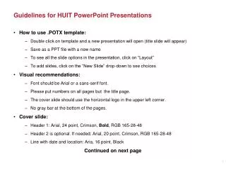
PowerPoint Layout • Layout continuity from frame to frame makes it easier to follow • Headings, subheadings, and logos should show up in the same spot on each frame • Margins, fonts, font size, and colors should be consistent with graphics located in the same general position on each frame • Lines, boxes, borders, and open space also should be consistent throughout
Do ! Fonts • Font Style Should be Readable • Recommended fonts: • Arial • Tahoma Veranda • Standardize the Font Throughout
Font Size • The larger, the better. Remember, your slides must be readable, even at the back of the room. • This is a generally a good title size - Verdana 40 point • A good subtitle or bullet point size Verdana 32 point • Content text should be no smaller thanVerdana 24 point • This font size is not recommended for content. Verdana 12 point.
Don’t ! Font Size • Combining small font sizes with bold or italics is • not recommended: • What does this say? Garamond Font, Italic, Bold 12pt. • This is very difficult to read. Times Font, Bold, 12pt. • This point could be lost. Century Gothic Font, Bold, Italic, 14pt. • No one will be able to read this. Gill Sans Font, Condensed Bold, 12pt • Small fonts are okay for a footer, such as: Evils of Socialism Presentation: 1/1/1986 Margaret Thatcher, Prime Minister
Don’t ! Fonts • Don’t Sacrifice Readability for Style • Don’t Sacrifice Readability for Style • Don’t Sacrifice Readability for Style • Don’t Sacrifice Readability for Style
Caps and Italics • DO NOT USE ALL CAPITAL LETTERS Makes text hard to read Conceals acronyms Denies their use for EMPHASIS • Italics Used for “quotes” Used to highlight thoughts or ideas Used for book, journal, or magazine titles
Use a Template • Use a set font and color scheme. • Differentstylesaredisconcertingto theaudience. • You want the audience to focus on what you present, not the way you present.
Do !! Use the Same Backgroundon Each Slide
Don’t! • Don’t use multiple backgrounds in your presentation • Changing the style is distracting
Colors • Redsandorangesare high-energy but can be difficult to stay focused on. • Greens,blues,andbrownsare mellower, but not as attention grabbing. • Reds and Greens can be difficult to see for those who are color blind.
Don’t ! Avoid These Combinations • Examples: Green on Blue Dark Yellow on Green Purple on Blue Orange on Green Red on Green
Colors • White on dark background should not be used if audience is more than 20 ft away. This set of slides is a good example. You can read the slides up close. • The further away you get, the harder it is to read. • This is a good color combination if viewed on a computer. • A dark background on a computer screen reduces glare.
Don’t Colors • Large Hall Events AvoidWhite Backgrounds • The white screen can be blinding in a dark room • Dark Slides with LightColored Text Work Best
Do ! The Color Wheel • Colors separated by another color are contrasting colors (complementary) • Adjacent colors harmonize with one another (Green and Yellow) • Colors directly opposite one another are said to CLASH • Clashing colors provide readability • OrangeonBlue
BackgroundColors Remember: Readability! Readability! Readability! This is a good mix of colors. Readable! This is a bad mix of colors. Low contrast. Unreadable! This is a good mix of colors. Readable! This is a bad mix of colors. Avoid bright colors on white. Unreadable!
Graphs and Charts Make sure the audience can read them!
Remember As the great communicator would state The objective of communication is to communicate.
Graphics and Charts Don’t ! • Avoid using graphics that are difficult to read. • In this example, the bright colors on a white background and the • small font make the graph hard to read. • It would be very difficult to see, especially in the back of a room. 8
Don’t ! This graph contains too much information in an unreadable format. 10
Do ! Good Graph These are examples of good graphs, with nice line widths and good colors.
Graph Descriptions It is a good idea to provide a brief caption that describes the message you want the audience to get from the graph.
Don’t Charts and Graphs
Do ! Charts and Graphs 80 Mode A 70 60 Mode B 50 40 Mode C 30 20 10 0 North Europe Australia America
Do ! This is a good, readable table. Tables, especially large ones, should be placed on a separate slide. EXCEPT: Columns should be labeled.
Do ! Illustrations • Use only when needed, otherwise they become distracters instead of communicators • They should relate to the message and help make a point • Ask yourself if it makes the message clearer • Simple diagrams are great communicators
Limit Each Slide to One Idea Use Bullet Points to Cover Components of Each Idea
Bullets • Keep each bullet to 1 line, 2 at the most • Limit the number of bullets in a screen to 6, 4 if there is a large title, logo, picture, etc. This is known as “cueing” • You want to “cue” the audience on what you’re going to say Cues are a a brief “preview” They give the audience a “framework” to build upon
Bullets (con.) • If you crowd too much text, the audience won’t read it Too much text looks busy and is hard to read • Why read it, when you’re going to tell them what it says? • Our reading speed does not match our listening speed; hence, they confuse instead of reinforce
Points to Remember Do not do this!Limit Bullet Points To a few words • Limit each slide to 1 idea • Limit each bullet point to only a few words to avoid long sentences that go on and on! • Limit animation – Too much animation can be distracting. Be consistent with animation and have all text and photos appear on the screen the same way each time. There are many animation modes to choose from, but it is best to use just one throughout.
Do ! Points to Remember • Keep bullet points brief • Use the same background for each slide • Use dark slides with light colored text in large hall events
Don’t Avoid the “All Word” Slide Another thing to avoid is the use of a large block paragraph to introduce your information. Attendees do not like to have what is on the screen, read to them verbatim. So, please use short, bulleted statements and avoid typing out your whole presentation on to the slides. Also, it is difficult for some to listen and read a large amount of text at the same time.
Attention Grabber • To make a slide stand out: Change the font or background Or add animation.
! Limit Animation • Use the same animation throughout • Using more than one can be very distracting • The audience will only see the animation • They will not see the message Bam! Don’t
Do ! Limit Animation ! • Use the same animation throughout the entire presentation • Using more than one can be very distracting • The audience will only see the animation and not the message you’re trying to get across
YOU • Practice Know the material • Stand during the presentation • Face the audience, not the slides • Do not use the media to hide you • Do not hide the presentation by standing in front of it • The audience came to SEE you and the presentation
YOU • The media should ENHANCE the presentation, not BE the presentation • If you’re only going to read from the slides, then just send them the slides! • Do not fidget or make distracting motions • Notes are ok 3x5 cards only Only use as a “memory jogger” - do not read or use excessively