Enhancing Horror Through Cinematic Techniques and Intertextuality
In our short horror film, we utilized various camera angles and shots to enhance the narrative and evoke emotions. By implementing close-ups to capture characters' fear and wide shots to set the eerie atmosphere, we aimed to engage the audience deeply. Sound design played a crucial role, incorporating thematic horror tunes, while editing techniques added suspense. Inspired by films like "One Missed Call" and "The Roommate," we explored themes of revenge and psychological tension. Our ancillary texts, including an article and poster, aimed to convey the chilling essence of our project.

Enhancing Horror Through Cinematic Techniques and Intertextuality
E N D
Presentation Transcript
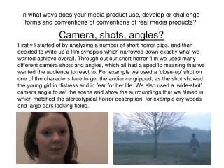
In what ways does your media product use, develop or challenge forms and conventions of conventions of real media products? Camera, shots, angles? Firstly I started of by analysing a number of short horror clips, and then decided to write up a film synopsis which narrowed down exactly what we wanted achieve overall. Through out our short horror film we used many different camera shots and angles, which all had a specific meaning that we wanted the audience to react to. For example we used a ‘close-up’ shot on one of the characters face to get the audience gripped, as the shot showed the young girl in distress and in fear for her life. We also used a ‘wide-shot’ camera angle to set the scene and show the surroundings that we filmed in which matched the stereotypical horror description, for example ery woods and large dark looking fields.
Different shots • Long shots • Extreme close-ups • Close-up side shots • Looking through shot • Mid Close-up
Sound, Music and Editing • I then started to carry out research on horror theme tunes which related to the genre we decide to feature as our own film. When we all came to a decision on what type of music/sounds we wanted to use, we chose a famous theme tune which is used in One Missed Call. We edited this into our film at the start of the clip and used it at the end as well. Also we recorded one of our voices explaining the events that have gone on in the past, which was played over the entering theme tune at the start of the clip. We used a number of cuts and effects to join it all together, which then made it into a short film. For example we used effects like dissolves, black-out and ‘sharp/fast’ cuts.
Intertextuality: One Missed Call • This is the trailer from the horror film ‘One Missed Call’. This film has given my group and I ideas for our own psychological thriller film that we are yet to design. We have decided to have one suspicious phone call that leads to the main events in the film, taken by a prank from a group of teenage girls. In this remake of the Japanese horror film “Chakushin Ari” (2003), several people start receiving voice-mails from their future selves. These are messages which include the date, time, and some of the details of their deaths.
Mise-en-scene and Lighting • In the film we used many props such as pillows, popcorn, sweets, phones, make-up, blood, music quietly playing and a bloody knife. Each one of these props would have had a specific meaning, for example a bloody knife indicates a murder. Our main concern in this short film was the lighting because every time we came to film outside the weather was always different, but in one section of the film we managed to film when it was a dark, rainy gloomy day which matched with our description of ‘horror’. When we were filming inside we used all artificial lighting to show that we were filming in the evening, and we still wanted to show that dark lighting effect towards the audience.
Intertextuality: The Roomate • This Trailer clip is on the same sort of story lines which I and my group are hoping to achieve, through out filming our short film. The story line is extremely over the top in this film but it’s still based on starting off with a bunch of girls, which follows onto turning into a complete disaster. This film is mostly based on a prank that went wrong, the meaning behind this was that the girlfriend (Megan) found out her boyfriend (Garret) was cheating on her so she and her friends wanted to get revenge. So Megan the girlfriend soon to be his ex decided to fake her own death, whilst they were making out. Garrett brings Megan to a steel mill, intent on dumping her body in the lake because he thinks she is dead. Hw then stabs her through the chest with a tire iron, killing her for real this time. Panicking, the group decides to dump Megan’s body in the mine, along with the tire iron. Eight months later, the girls have grown apart and put the incident behind them. During the party held after graduation, the girls all receive a picture sent to their phones of a robed arm holding the bloody lug wrench Garrett used to kill Megan, the suspicion falls on Garrett (the boyfriend). They all started to get murdered by the mysterious killer. At the end Garret was the mysterious killer through out the film, he wanted to get revenge back with all of the friends that were involved with the previous prank which was on him cheating on Megan.
Poster and Article 2. How effective is the combination of your main product and ancillary texts? When I was designing my article I wanted to get across the same feeling that most people get when they think of horror. The text includes an interview which involves all 4 characters. I also included an image of the 4 of us before the big disaster, to show image contrast between the poster and article. Sorority Row’ – This is a movie poster to a film similar to the one we are creating, as it is about teenage girls struggling with murder and gore. We want a photograph with all four of us with our backs to each other, with knifes behind our backs and blood.
Colour and Genre? • I decided to use dark daunting colours for my article to represent my genre, which was horror. For example I used red to represent ‘blood’ with contrast font colours which were black and white. The same goes for my poster I used a dark (dark clothing) photograph of all 4 main characters, with a white/grey background and a bold title (red).
Locations: • Jade’s House- bedroom, kitchen, toilet (maybe), hall way, stair case and landing. Indoors. • Garden/Feilds (Cathy’s Garden)- Front and back garden, ailey way/side streets (maybe) and feilds surrounding. Outdoors.
What have you learned from your audience feedback? • I asked a number of questions to see if my ancillary text and short film were a success and if they both linked together well. My film poster was suitable for my film as they knife worked especially well as a semiotic object, as it connoted violence. My article also gives out relevant information as it has affective the lives of the cast. The A2 film has a clear build up of tension through out, it also has a excellent use of disequilibrium. My audience feedback also told me that the hand-held camerawork worked really well and matched the genre perfectly (horror).
4. How did you use media technologies in the construction and research, planning and evaluation stages? What I used in A2: • Wordpress.com – Blog • Photoshop – Poster • Indesign – Article • IMovie – A2 Production film • You Tube – Research horror films
Wordpress.com Blog • I created my Blog to upload all my work and to receive audience feedback and teacher feedback. I also used the page to upload all draft work and sketches that i scanned. This was web has been really helpful through both AS and A2 as I have been able to show all research and planning work.
Photoshop-Poster • I used photoshop to create my poster as i got to edit it the way I wanted, and to portray the genre through the image we decided on. For example one of the young teenagers is holding a large knife, which we used a specific tool for to create the blood dripping from it.
IMovie We created our A2 horror film by using IMovie. This provided us with a range of tools in which we could use to create specific ideas and feelings. For example in one of the scenes outside where one character is getting chased, we specifically edited the lighting to make the sky and surrounding area of the fields and lane darker; this created more tension and edgy feelings for the audience as you could tell she was running towards something dangerous and forbidden. 14
InDesign When creating my double page spread article I used InDesign. With this programme I was able to get the specific layout that is used in magazines for article as I wanted to go for an interview with the characters of the film. By using the tools on here I decided to have three columns, as when I carried out my research on magazine articles they are always in separate columns, this is easier for the audience to read.
YouTube • We used Youtube to research trailers of films with similar story lines; ones where we took specific ideas from each; for example, the symbolic knife covered in blood was taken from Scream. Also the One Missed Call music that we used for the opening and ending credits was taken off Youtube. Also our finished film has been uploaded to Youtube, so therefore it is available to everyone in the world which gives us continuous audience feedback for if we were to create a film again. • http://www.youtube.com/

