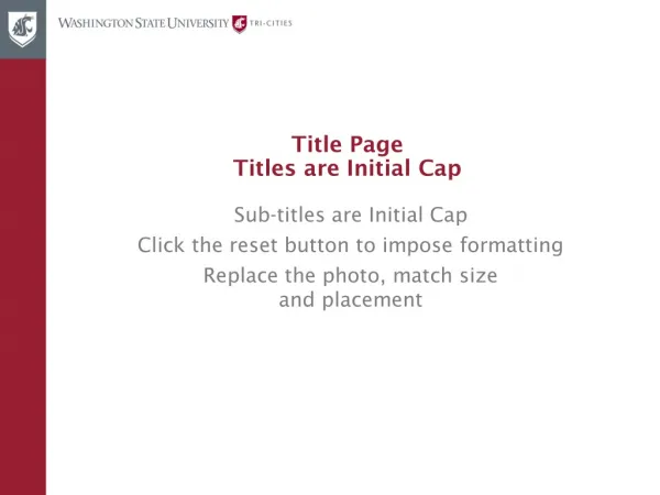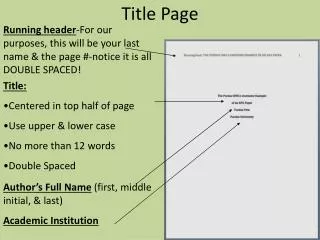
Initial title page
This guide will explore best practices for designing visual content that enhances communication on digital platforms. It covers typography choices, color schemes, and layout structures that maximize readability and engagement. Key considerations include using appropriate font sizes, ensuring a clean white background for clarity, and the effective integration of images. By adhering to these design principles, you can significantly improve user experience and increase the impact of your digital messages.


Initial title page
E N D
Presentation Transcript
Initial title page For the main heading (above), please use Verdana Bold (approx size 60pt + or – 10pt) in black. Secondary headings – use Verdana Bold (approx size 36), in black or red. Body copy – use smaller font size (approx size 18 depending on the amount of text) Verdana Regular in black. The white background works better with charts and images and makes reading easier. Please do not run copy or images below the horizontal line below.
Secondary heading Use white background. Secondary heading – use Verdana Bold (approx size 36) in black or red. Body copy – use smaller font size (approx size 18 depending on the amount of text) Verdana Regular in black. Please do not run copy or images below the horizontal line below.
Secondary heading Use white background. Secondary heading – use Verdana Bold (approx size 36) in black or red. Body copy – use smaller font size (approx size 18 depending on the amount of text) Verdana Regular in black. Use of pictures - please ensure that any images you wish to include are not squashed or distorted to fit or fill a space. Please do not run copy or images below the horizontal line below.