CRAP
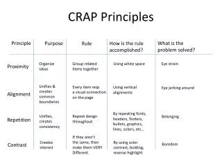
CRAP. contrast, repetition, alignment, proximity. The Four Basic Principles of Design. The following is a brief overview of the principles of design. Although they are discussed separately, they are really interconnected. Rarely will you use only one principle at a time. Contrast

CRAP
E N D
Presentation Transcript
CRAP contrast, repetition, alignment, proximity
The Four Basic Principles of Design The following is a brief overview of the principles of design. Although they are discussed separately, they are really interconnected. Rarely will you use only one principle at a time. Contrast Repetition Alignment Proximity
Design Considers These Elements • letter case • highlighting • color • graphics, images, icons, symbols • tables, charts, diagrams • columns • headings • headers and footers • page numbers • margins • blank space • paragraph spacing • paragraph length • line spacing • line length • justification • type size and typefaces (fonts) • type features (bold, italics, etc.)
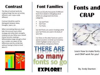
Contrast The idea behind contrast is to avoid elements that are merely similar. If the elements (type, color, size, line thickness, space, shape) are not the same, then make them very different. Contrast is often the most important visual attraction on the page.
Contrast • makes different things different • brings out dominant elements & mutes lesser elements • creates dynamism • aids in the organization of information and creates organizational hierarchy • can add clarity • if two items are different, make them really different; avoid doing wimpy contrast
Contrast Summary Contrast on a page draws our eyes to it; our eyes likecontrast. How to get it: Add contrast through your typeface choices, line thicknesses, colors, shapes, sizes, space, etc. It is easy to find ways to add contrast, and it's probably the most fun and satisfying way to add visual interest. The important thing is to be strong.
Contrast Summary What to avoid: Don't be a wimp. If you're going to contrast, do it with strength. Avoid contrasting a sort-of-heavy line with a sort-of-heavier line. Avoid contrasting brown text with black headlines. Avoid using two or more typefaces that are similar. If the items are not exactly the same, make them different!
ContrastAssignment • Contrast Poster • Using art supplies, make a poster that illustrates contrast. • Guidelines: • 1.) Use white 11" x 17" paper for your design. • 2.) Design it in landscape format: • with the 17" edge going left-to-right and the 11" edge going • top-to-bottom with a 1" border on all sides • 3.) You can use any of the available materials to complete your ad: markers, colored pencils, crayons, rulers, compasses, and stencils. Do not cut pictures from magazines. • 4.) Start your design in pencil so you can make adjustments before you finalize your design.
ContrastAssignment • 5.) Design your poster with the following elements: • a.) The word "contrast" should appear three times in three very different styles of lettering. • b.) Each time, the letters in the word "contrast" should be at least two inches high. • c.)Restrict your color selection to three very different (contrasting) colors plus the white of the paper. Using only three colors will unify your poster. • d.) Put a contrasting background rectangle behind the word "contrast" at least once. • e.) Thick "bubble" letterforms will work best for this. Do your best to create outlines for the letters and fill them in, rather than writing the word "contrast" with simple handwriting.
ContrastAssignment Example of Contrast Poster
Repetition Repeat visual elements of the design throughout the piece. You can repeat color, shape, texture, spatial relationships, line thickness, size, and type. This helps develop the organization and strengthens unity visually.
Repetition • repeat design throughout the piece of work • consistency • creates unity • adds visual interest • develops organization and creates consistency • repeat some aspect of a design (horizontal rule, a certain type of bullet, a type of font) throughout an piece of work • avoid repeating an element so much that it becomes annoying or overwhelming
Repetition Summary A repetition of visual elements throughout the design unifies and strengthens a piece by tying together otherwise separate parts.
Repetition Summary How to get it: Think of repetition as being consistent. Then push the existing consistencies a little further - can you turn some of those consistent elements into part of the conscious graphic design, as with the headline? Do you use a I-point rule at the bottom of each page or under each heading? How about using a 4-point rule instead to make the repetitive element stronger and more dramatic?
Repetition Summary What to avoid: Avoid repeating the element so much that it becomes annoying or overwhelming. Be conscious of the value of contrast.
Repetition Assignment • Repetition Poster • Using art supplies, make a poster that illustrates repetition. • Guidelines: • 1.) Use white 11" x 17" paper for your design. • 2.) Design it in landscape format: • with the 17" edge going left-to-right and the 11" edge going • top-to-bottom with a 1" border on all sides • 3.) You can use any of the available materials to complete your ad: markers, colored pencils, crayons, rulers, compasses, and stencils. Do not cut pictures from magazines.
Repetition Assignment • 4.) Start your design in pencil so you can make adjustments before you finalize your design. • 5.) Write the word REPETITION in letters at least two inches high somewhere on your poster, so they can be read across the room. Check your spelling! • 6.) The rest of your poster must be arranged like this: • a.) At least four identical items or shapes repeating in an orderly fashion; this is consistency. • b.)An additional item that is nearly identical but different in a distinctive way; this is unity with variety.
Repetition Assignment • 7.) Here are some ways to make this single item distinct: • a.) Make it significantly bigger or smaller, or • b.) Make it a very different color, or • c.) Put the item on its own, away from the other, orderly items. • 8.) Make it colorful. • 9.) Make it neat. Take your time.
Repetition Assignment Example of Repetition Poster
Alignment Nothing should be placed on the page arbitrarily. Every element should have some consciously designed visual connection with another element on the page. This creates a clean, fresh, and intentional look.
Alignment • creates a visual flow • visually connects elements • unifies and organizes the page • nothing should be placed on a page arbitrarily • avoid using more than two text alignments on a page • center alignment and full alignment are more difficult to read than right
Alignment The web site’s page is arranged along a curved alignment.
Alignment The main pages of the Art Institute’s site are contained in frames with a centered alignment.
Alignment Summary Nothing should be placed on the page arbitrarily. Every element should have some visual connection with another element on the page. Unityis an important concept in design. To make all the elements on the page appear to be unified and connected their needs to be some visual tie between the separate elements. Take a look at designs you like. No matter how wild and chaotic a well-designed piece may initially appear, you can always find the alignments within.
Alignment Summary How to get it: Be conscious of where you place elements. Always find something else on the page to align with, even if the two objects are physically far away from each other.
Alignment Summary What to avoid: Avoid using more than one text alignment on the page (that is, don't center some text and right-align other text). And please try very hard to break away from a centered alignment unless you are consciously trying to create a more formal, sedate presentation. Choose a centered alignment consciously, not by default.
Alignment Assignment • Alignment Poster • Using our art supplies, make a poster that illustrates alignment. Guidelines: • 1.) Use white 11" x 17" paper for your design. • 2.) Design it in landscape format: with the 17" edge going left-to-right and the 11" edge going top-to-bottom with a 1" border on all sides • 3. You can use any of the available materials to complete your ad: markers, colored pencils, crayons, rulers, compasses, and stencils. Do not cut pictures from magazines.
Alignment Assignment • 4. Start your design in pencil so you can make adjustments before you finalize your design. • 5. Write the word ALIGNMENT in letters at least two inches high somewhere on your poster, so they can be read across the room. Check your spelling!
Alignment Assignment • 6. The rest of your poster must be arranged like this: • a.)THREE identical shapes/images, which are close to each other and aligned along an imaginary vertical line. b.)THREE identical shapes/images, which are different from the first three, and are close to each other and aligned along an imaginary vertical line. • c.)The top shape/image in each group should be aligned along an imaginary horizontal line.hichis at least ½ inch from the top edge. • d.) If you can make your items align with the word "alignment" in some way, that's even better. • 7. Make it colorful. • 8. Make it neatly. Take your time.
Alignment Assignment Example of Repetition Poster
Proximity Items relating to each other should be grouped close together. When several items are in close proximity to each other, they become one visual unit, rather than several separate units. This helps organize the information and reduces visual clutter.
Proximity • groups related elements • separates unrelated ones • helps to organize elements, imply relationships • helps with use of blank space • reduces clutter-creates visual relationships with elements that belong together • don’t stick things in the corners and in the middle of the page
Proximity Summary When several items are in close proximity to each other, they become one visual unit rather than several separate units. Items relating to each other should be grouped together. The basic purpose of proximity is to organize.
Proximity Summary • How to get it: • Squint your eyes slightly and count the number of visual elements on the page by counting the number of times your eye stops. • If there are more than three to five items on the page (of course it depends on the piece), see which of the separate elements can be grouped together into closer proximity to become one visual unit.
Proximity Summary • What to avoid: • Don't stick things in the corners or in the middle just because the space is empty. • Avoid too many separate elements on a page. • Don't create relationships with elements that don't belong together! If they are not related, move them apart from each other.
Proximity Assignment • Proximity Poster • Using our art supplies, make a poster that illustrates proximity.. Guidelines: • 1.) Use white 11" x 17" paper for your design. • 2.) Design it in landscape format: with the 17" edge going left-to-right and the 11" edge going top-to-bottom with a 1" border on all sides • 3. You can use any of the available materials to complete your ad: markers, colored pencils, crayons, rulers, compasses, and stencils. Do not cut pictures from magazines. • 4. Start your design in pencil so you can make adjustments before you finalize your design.
Proximity Assignment • 5. Write the word PROXIMITY in letters at least two inches high somewhere on your poster, so they can be read across the room. • 6. The rest of your poster must be arranged like this: • a.)FIVE identical shapes/images, which are close to each other. • b.)THREE identical shapes/images, which are close to each other and different from the five, mentioned above. • 7. Make it colorful. • 8. Make it neat. Take your time.
Proximity Assignment Example of Repetition Poster