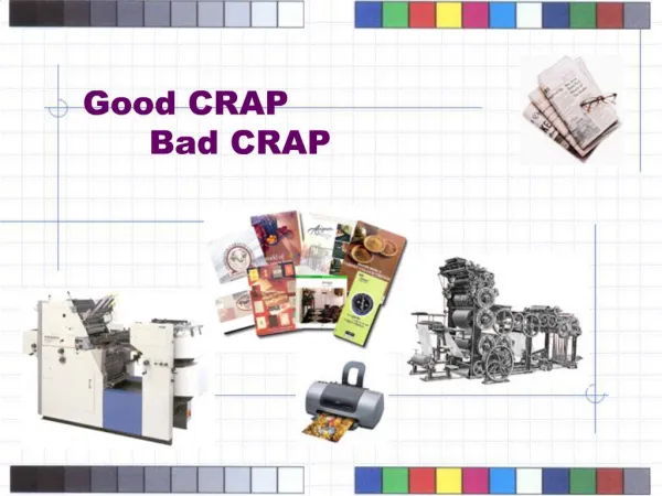
Mastering Contrast, Fonts, and CRAP in Design
Understanding the principles of contrast, typography, and design fundamentals like Repetition, Alignment, and Proximity (CRAP) is crucial for any effective communication. Contrast distinguishes ideas, making differences clear without confusing the reader. Fonts are categorized into Sans Serif, Serif, and Fun Fonts, each serving distinct purposes in design. Using repetition maintains visual consistency, while alignment ensures a logical flow of information. Proximity emphasizes relationships between elements, enhancing readability. Learn to leverage these concepts for compelling and clear designs that engage your audience.

Mastering Contrast, Fonts, and CRAP in Design
E N D
Presentation Transcript
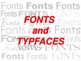
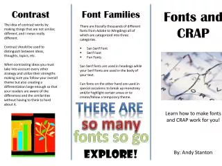
Contrast Font Families Fonts and CRAP The idea of contrast works by making things that are not similar, different, and I mean really different. Contrast should be used to distinguish between ideas, thoughts, topics, etc. When contrasting ideas you must take into account every other strategy and utilize their strengths making sure you follow your overall theme but also creating a differentiation large enough so that your readers are aware of the differences and the similarities without having to think to hard about it. • There are literally thousands of different fonts from Adobe to Wingdings all of which are categorized into three categories. • San Serif Font • Serif Font • Fun Fonts • San Serif fonts are used in headings while your Serif fonts are used in the body of your text. • Fun fonts on the other hand are used in special occasions to break up monotony and/or highlight certain areas or to create/follow a temporary theme. There are Learn how to make fonts and CRAP work for you! so many fonts so go EXPLORE! By: Andy Stanton
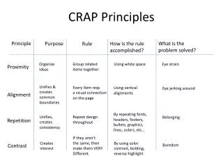
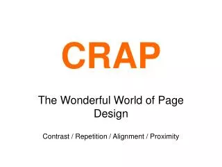
Repetition Alignment Proximity • Reputation is the act of regenerating design throughout your work. This allows readers to easily follow and understand what they are reading. • Ideas for repetition include: • Font • Bold, underline, italics • Color • Format • Bullets • There is such thing as “over repetition,” which is when a format or information is so overused the reader become distracted or uninterested by it. • Alignment is the principle that states information should create a visual connection with the reader of your page. • Alignment has a strong connection with proximity and should be treated as such. • When aligning text, you should check the following things: • Spacing • Margins • Layout • Proximity • Text Alignment • Make sure that your alignments are unified throughout your entire work in order for readers to easily read and maneuver through your provided information. • Proximity is the relationship or nearness in space, time, and/or relationship. • Physical closeness implies a relationship between the information. • Things to do: • Create an order • Organize • Use fonts correctly • Spacing • Things to NOT do: • Overfill Space • Confuse your reader • Add “too much” information