Mastering Design Principles: The CRAP Method for Effective Visual Interfaces
Discover the essential design principles using the CRAP method: Contrast, Repetition, Alignment, and Proximity. Based on insights from Robin Williams' "Non-Designers Design Book," this guide highlights how to create compelling and cohesive visual interfaces. Learn how to effectively differentiate elements, maintain consistency, establish visual flow, and group related components for better communication. With proper application of CRAP, you can enhance user experience and readability, ensuring your designs are both aesthetically pleasing and accessible.

Mastering Design Principles: The CRAP Method for Effective Visual Interfaces
E N D
Presentation Transcript
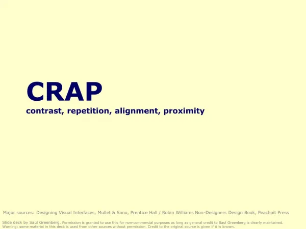
CRAPcontrast, repetition, alignment, proximity Major sources: Designing Visual Interfaces, Mullet & Sano, Prentice Hall / Robin Williams Non-Designers Design Book, Peachpit Press Slide deck by Saul Greenberg. Permission is granted to use this for non-commercial purposes as long as general credit to Saul Greenberg is clearly maintained. Warning: some material in this deck is used from other sources without permission. Credit to the original source is given if it is known.
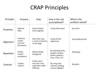
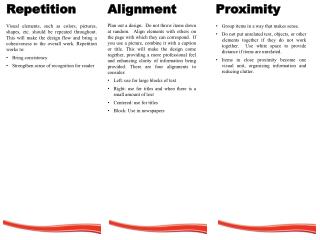
CRAP • Contrast • Repetition • Alignment • Proximity Robin Williams Non-Designers Design Book, Peachpit Press
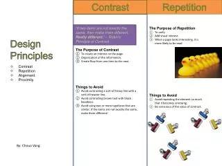
CRAP • Contrast • make different things different • brings out dominant elements • mutes lesser elements • creates dynamism • Repetition • Alignment • Proximity 1 2 3 4 5 Robin Williams Non-Designers Design Book, Peachpit Press
CRAP • Contrast • Repetition • repeat design throughout the interface • consistency • creates unity • Alignment • Proximity 1 3 2 4 Robin Williams Non-Designers Design Book, Peachpit Press
CRAP • Contrast • Repetition • Alignment • creates a visual flow • visually connects elements • Proximity 1 3 2 4 Robin Williams Non-Designers Design Book, Peachpit Press
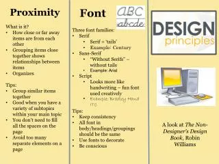
CRAP • Contrast • Repetition • Alignment • Proximity • groups related elements • separates unrelated ones 1 2 3 Robin Williams Non-Designers Design Book, Peachpit Press
Where does your eye go? • CRAP combines to give you cues of how to read the graphic title subtext three points main point sub point Robin Williams Non-Designers Design Book, Peachpit Press
Where does your eye go? • Boxes do not create a strong structure • CRAP fixes it Robin Williams Non-Designers Design Book, Peachpit Press
Where does your eye go? • Some contrast and weak proximity • ambiguous structure • interleaved items Robin Williams Non-Designers Design Book, Peachpit Press
Where does your eye go? • Strong proximity (left/right split) • unambiguous Robin Williams Non-Designers Design Book, Peachpit Press
Mmmm: Mmmm: Mmmm: Mmmm: Mmmm: Mmmm: Mmmm: Mmmm: Mmmm: Mmmm: Mmmm: Mmmm: Mmmm: Mmmm: Mmmm: Where does your eye go? • the strength of proximity • alignment • white (negative) space • explicit structure a poor replacement
Terrible alignment • no flow • Poor contrast • cannot distinguish colored labels from editable fields • Poor repetition • buttons do not look like buttons • Poor explicit structure replaces proximity • blocks compete with alignment Webforms
No regard for order andorganization IBM's Aptiva Communication Center
Haphazard layout Mullet & Sano
Repairing the layout Mullet & Sano
Spatial Tension Mullet & Sano
Using explicit structure as a crutch Mullet & Sano
Redesigning a layout using alignment and factoring Mullet & Sano