Download
1 / 2
20 likes | 254 Vues
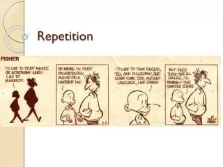
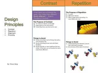
Contrast. Repetition. Design Principles. “If two items are not exactly the same, then make them different. Really different. ” – Robin’s Principle of Contrast. The Purpose of Repetition To unify. Add visual interest. When a page looks interesting, it is more likely to be read

E N D
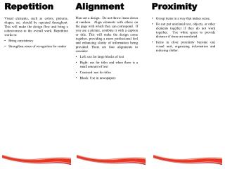
Contrast Repetition Design Principles “If two items are not exactly the same, then make them different. Really different.” – Robin’s Principle of Contrast The Purpose of Repetition To unify. Add visual interest. When a page looks interesting, it is more likely to be read Things to Avoid Avoid repeating the element so much that it becomes annoying. Be conscious of the value of contrast. The Purpose of Contrast To create an interest on the page. Organization of the information. Create flow from one item to the next. Things to Avoid Avoid contrasting a sort-of-heavy line with a sort-of-heavier line. Avoid contrasting brown text with black headlines. Avoid using two or more typefaces that are similar. If the items are not exactly the same, make them different! • Contrast • Repetition • Alignment • Proximity By: ChouaVang
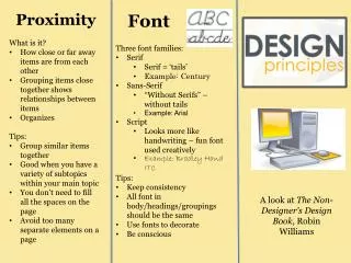
Alignment Proximity Font Families Three Font Families Serif: Font with tails or “feet”. Example: Times. If you look closely, you can see that there are “feet” to the letters and “tails” to the letter ‘t’. Sans Serif: Font without tails. Example: Arial. If you look closely, there are no “feet” to the letters like in Times and no “tails” to the letters like letter “t”. Fun: Any fun fonts The Purpose of Proximity To organize by grouping related elements together. Create a relationship among elements with close proximity. The Purpose of Alignment To unify. Create organization to the page. “Nothing should be placed on the page arbitrarily. Every item should have a visual connection with something else on the page.” – Robin’s Principle of Alignment “Physical closeness implies a relationship.” – Robin’s Principle of Proximity Things to Avoid Don’t stick things in the corners or middle just because there’s empty space. Avoid too many separate elements on a page. Avoid leaving equal amounts of white space between elements unless each group is part of a subset. Avoid creating a confusion over whether a headline, subhead, caption, graphic,etc., belongs with its related material. Don’t create relationships with elements that don’t belong together. If they are not related, move them apart! Things to Avoid Avoid using more than one text alignment on the page. Choose a centered alignment consciously. Try to stay away from a centered alignment unless you are trying to create a formal, sedate presentation. You can only use two fonts in a document. Use one for your titles and the other for your text. “Even if the separated elements are not physically close on the page, they can appearconnected, related, unified with the other information simply by their placement.” – Robin’s Principle of Alignment