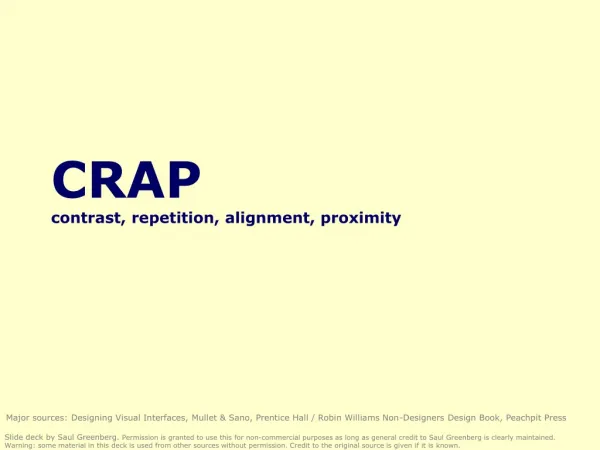
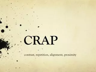
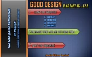
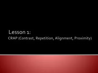
CRAP (Contrast, Repetition, Alignment, Proximity)
190 likes | 488 Vues
Lesson 1:. CRAP (Contrast, Repetition, Alignment, Proximity) . Introduction. This lesson will cover the four primary principles of design: C ontrast R epetition A lignment P roximity. Contrast Defined. Contrast is the design principle in which

CRAP (Contrast, Repetition, Alignment, Proximity)
E N D
Presentation Transcript
Lesson 1: CRAP (Contrast, Repetition, Alignment, Proximity)
Introduction • This lesson will cover the four primary principles of design: • Contrast • Repetition • Alignment • Proximity
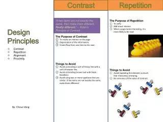
Contrast Defined • Contrast is the design principle in which similar design items are distinctly different. • Contrast gets the attention of your reader. • Contrast is a visually important aspect of design. • Contrast must be strong. • Contrast can be “striking,” drawing the attention of the viewer to your page.
Ways to Create Contrast • Type (text): Large text with small text, bold text with regular text, sans serif headline with serif body copy • Examples: • Horizontal rule/vertical rule: thin horizontal rule with a thick vertical rule • Graphics: Small graphic with a large graphic Sans Serif Headline Serif Body Copy
Ways to Create Contrast Cont. • Color: a bold color with a soft color • Example: • Shade colored boxes no greater than 70% opacity when using black text • Shade colored boxes no less than 30% opacity when using reverse text (white text)
Contrast: What to Avoid • Contrasting a sort-of-heavy line with a sort-of-heavier line. • Contrasting brown text with black headlines. • Using two or more typefaces that are similar.
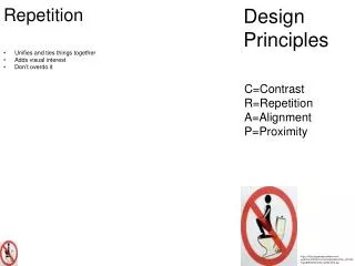
Repetition Defined • Repetition is the design principle in which visual elements are repeated throughout the page(s) of a publication. • Incorporating repetition into a publication will “strengthen the unity” of the design.
Ways to Create Repetition • Type (text): Use the same font style and size for body copy, subheads, pull quotes and headlines throughout your publication. • Color: Use the same color scheme and color intensity (shading). • Indentation: Lay out and indent articles consistently using either a line of space or a 3em space. • Framing: Keyline/Frame photographs consistently.
Ways to Create Repetition Cont. • Make pull quote design, font style and size consistent. • Use the same rule or combination of rules. • Place page numbers and running heads in the same location on each page.
Repetition: What to Avoid • Avoid repeating an element so much that it becomes annoying or overwhelming. Example: If you were to add a read hat, red belt, read necklace to this ensemble, the repetition would be overdone.
Alignment Defined • Alignment is the design principle in which every design element has a visual connection with something else on the page. • Nothing is placed on a page arbitrarily. The aim is to create a “clean and sophisticated look.” “Lack of alignment is probably the biggest cause of unpleasant- looking documents. Our eyes like to see order; it creates a calm, secure feeling”
Ways to Create Alignment • Align captions with photographs. • Example: • Align headlines with articles. • Align headlines left with left aligned, ragged right text. (optional: Align headlines center with justifies text)
Ways to Create Alignment Cont. • Make an impact with alignment. • Example: • The information on this card is right aligned (flush right). It has a strong invisible vertical line that has more of an impact than simply aligning all elements down the center.
Alignment: What to Avoid • Avoid using more than one text alignment on the page (that is, don't center some text and right-align other text). • Stay away from centered alignment unless you are consciously trying to create a more formal, sedate (often dull!) presentation. Choose a centered alignment consciously, not by default.
Proximity Defined • Proximity is the design principle in which related items are grouped together. • Elements that have a relationship should be grouped together, giving your publication a cohesive appearance.
Ways to Create Proximity • Group each photograph, chart, illustration with its respective caption. • Group headlines with respective article. • Example: • In this example, your eye knows exactly where to begin reading. Related information is grouped together, and it makes sense.
Proximity: What to Avoid • Avoid too many separate elements on a page. • Don't stick things in the corners and in the middle. • Don’t Do This: Do This: • In this example, the eye stops 5 times. It is difficult to know where to begin reading. Visually, it is confusing to look at. Thus, it will be overlooked. (817)555-1212 Connor Blake Used Cars 6195 Del Lane Mansfield, Texas (817) 555-1212 Used Cars Connor Blake 6195 Del Ln. Mansfield, Tx.
Design Principles Summary • In this lesson, we discussed the four primary design principles: • Contrast • Repetition • Alignment • Proximity
Final Note • CRAP is an acronym to remember the four basic design principles. • Consequently, when a designer does not incorporate contrast, repetition, alignment, and proximity into the design, the publication will look like crap. Even a beginning designer can produce publications that are professional, organized, unified, and interesting by incorporating the four basic design principles: contrast, repetition, alignment, and proximity.