Lesson 4: Design Principles
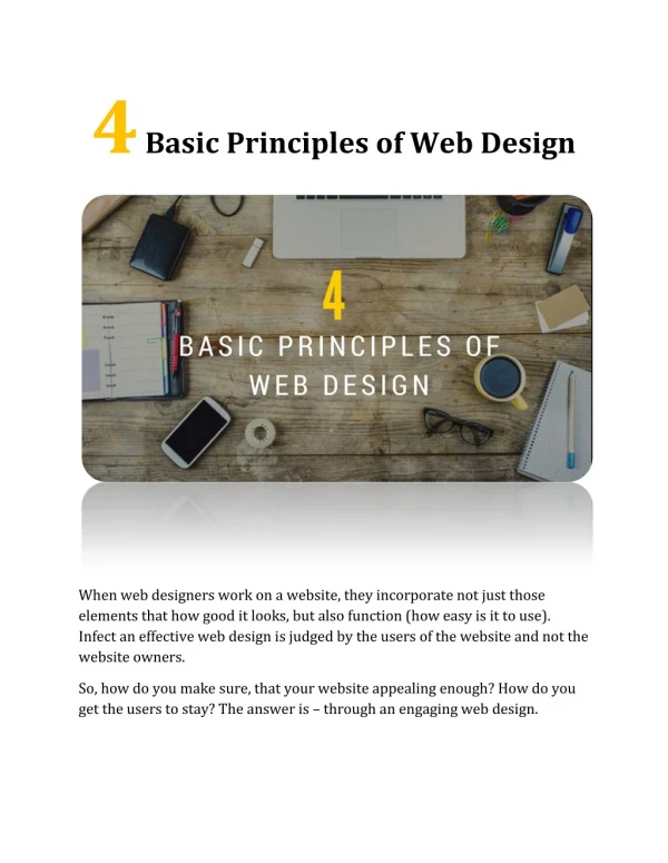
This lesson delves into the four fundamental principles of design: Contrast, Repetition, Alignment, and Proximity (CRAP). Learn how to effectively use contrast to capture attention, repetition to ensure unity throughout your design, alignment to create a clean and professional layout, and proximity to group related items for clarity. Each principle includes practical tips and examples, making it easier for you to implement these concepts into your web designs or publications for impactful communication.

Lesson 4: Design Principles
E N D
Presentation Transcript
Lesson 4: Design Principles • This lesson will cover the four primary principles of design: • Contrast • Repetition • Alignment • Proximity
Design Principles: Contrast Contrast is a visually important aspect of design. Contrast can be “striking,” drawing the attention of the viewer to your page. Contrast must be strong. However, contrast and conflict are very different.
Design Principles: Contrast Ways of creating contrast: Type (text): Large text with small text Color: a bold color with a soft color Horizontal rule/vertical rule: thin horizontal rule with a thick vertical rule Graphics: Small graphic with a large graphic
Design Principles: Contrast Contrast is “critical” to organizing the information on your publication. Contrast makes the “purpose and organization of the document” clear to the audience. For examples of contrast, refer to your course book The Non-Design Design Book on pages 53-62.
Design Principles: Repetition Repetition is the design principle in which visual elements are repeated throughout the page(s) of your publication.
Design Principles: Repetition Incorporating repetition into your web page (publication) will “strengthen the unity” of your design and page.
Design Principles: Repetition Ways to incorporate Repetition: Type (text): Use same font throughout your document, bolding particular words consistently Color: Use the same color, colors, or color patterns throughout the document Bullets: make them the same throughout the document
Design Principles: Repetition Ways to incorporate Repetition continued: Design elements: horizontal rules, graphics Headlines/Subtitles: should be consistent throughout your web page (publication).
Design Principles: RepetitionExercise 4.1 I have created a web page for Angelo State University’s CDJ Department. View the URL below AND the link within it entitled: “View Advertising Course Descriptions” http://webclass.angelo.edu/comm6301/stanley/lessonexercises/coursedescrip.htm (Name at least four elements of Repetition within these two web pages.)
Design Principles: Alignment “Lack of alignment is probably the biggest cause of unpleasant-looking documents. Our eyes like to see order; it creates a calm, secure feeling” (p. 35).
Design Principles: Alignment 1. The principle of Alignment states that “nothing should be placed on a page arbitrarily.”
Design Principles: Alignment 2. A visual connection between the elements on the page is critical to creating a “clean and sophisticated look.”
Design Principles: Alignment 3. There must be a “reason” and purpose for the placement of all design elements.
Design Principles: Alignment Here is an example of my business card. The elements on the card look as though they were placed at random and have no connection to one another.
Design Principles: Alignment The information on this business card has been aligned centered. It looks all right, but I want something that has more of an impact.
Design Principles: Alignment The information on this card is right aligned (flush right). It has a strong invisible vertical line that has more of an impact than the other two cards. (Another example: Center Alley p. 40)
Design Principles: Alignment Newsletter Tip: 1. Do not center headlines over body copy that is left aligned (flush left) or indented.
Design Principles: Alignment Turn to page 38 in your Non-Design Design Book, and see if you can find all of the items that are not aligned correctly. Example: Ladle Rat Rotten Hut
Design Principles: Alignment It tends to be the bad examples that pop out at us. Why? Probably because when the alignment is right (correct), it's invisible.
Design Principles: Proximity Finally, let’s review the design principle of Proximity. Proximity means that related items are grouped together.
Design Principles: Proximity When elements that have a relation are grouped together, your page will have a cohesive appearance. Let’s look at the business cards once again:
Design Principles: Proximity In this example, the eye stops 5 times. It is difficult to know where to begin reading. Visually, it is confusing to look at. Thus, it will be overlooked.
Design Principles: Proximity In this example, your eye knows exactly where to begin reading. Related information is grouped together, and it makes sense.
Design Principles In this lesson, we have discussed the four primary design principles: Contrast Repetition Alignment Proximity
Design Principles You may have noticed before now that CRAP is an acronym to remember these design principles. Consequently, if you do not incorporate contrast, repetition (consistency), alignment, and proximity into your web page designs, your pages will look like crap.
Design Principles Go to Blackboard Course Documents Save Design Style Sheet Begin working on your design style sheet.