Design Harmony: Proximity, Fonts, and Alignment Tips
Learn how to achieve visual harmony in your design with principles like proximity, font families, and alignment. Discover techniques for creating contrast, repetition, and alignment for a polished look.


Design Harmony: Proximity, Fonts, and Alignment Tips
E N D
Presentation Transcript
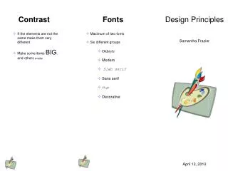
Proximity • Keep items that are related with each other together. Keep others far, far away. • Do NOT leave a blank line between a story’s title and the story…they are related. Keep them together! • Use white space to provide distance between unrelated items. • Font Families • There are 3 major font families • Serif- font with a foot. Example: Times New Roman • San serif- font without a foot. Example: Arial • Fun- all other fonts. Example: Giddyup Std. Design Principles KacieEllenbecker April 16, 2013
Contrast • Visual attraction on the page. • Keep elements the same or very different. • Make darks, dark and light items, light. • Place dark text on a light background and light text on a dark background. • Makebig items, big andsmall ones small. • Repetition • Aim for consistency • Repetition will strengthen the reader’s sense of recognition. • Repeat elements throughout your document. • Repeat fonts, font sizes, colors, and graphics. • Alignment • There are 4 alignments: • Left- Use for large blocks of text that need to be read. This is a traditional style • Right-Use for titles and small amounts of texts. This is funky. • Central- use for titles. This is formal. • Block- Use in newspapers.