
Design Principles
Explore the art of design contrast using fonts and principles like repetition, alignment, and proximity to create visual interest and harmony. Learn how to make elements stand out by making them different yet connected. Discover the impact of using different font styles within six groups - oldstyle, modern, slab serif, sans serif, script, and decorative. Dive into the world of design principles to enhance your projects with balance and cohesion.

Design Principles
E N D
Presentation Transcript
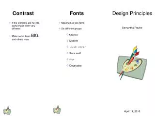
Contrast Fonts Design Principles • If the elements are not the same make them very different • Make some items BIG, and others smaller • Maximum of two fonts • Six different groups • Oldstyle • Modern • Slab serif • Sans serif • Script • Decorative Samantha Frazier April 13, 2010
Repetition Alignment Proximity • Repeat visual elements throughout the piece • Note how the artist pallet repeats on each page • Font, colors, textures, sizes • Nothing should be placed arbitrarily • Every element should have connection with another • Objects can be aligned: • Left • Right • Center • Items related together should be close together • Creates visual units • Beagle • Boxer • Dalmatian • Labrador • Rottweiler • Daisy • Rose • Lily


