Design Principles
“The point of design is to encourage and facilitate communication between the viewer and the media being viewed. Effective design initiates this connection by attracting and holding the attention of the viewer through aesthetically satisfying and conceptually intriguing content.”


Design Principles
E N D
Presentation Transcript
“The point of design is to encourage and facilitate communication between the viewer and the media being viewed. Effective design initiates this connection by attracting and holding the attention of the viewer through aesthetically satisfying and conceptually intriguing content.” ~Jim Krause, author Design Basics Index Design Principles
Design Principles • Definition: guidelines for the arrangement of elements within a production • In the field of graphic, web, and multimedia design, there is little to no consensus on an exact list of principles. The six principles selected for this unit encompass most of the concepts currently being discussed.
Basic Design Principles • Focal Point • Balance • Visual Flow • Repetition • Contrast • Alignment
Focal Point • Definition: the visually dominant elements in a presentation; the center of interest • Other terms: geometric center; optical center
Geometric vs. Optical • Geometric Center—the exact center of the page • Optical Center—the area slightly above and to the right of geometric center; the area that naturally draws the eye to the page; this is the technique used most frequently by designers
Hot Air Balloon Rides Call 555-8765
Balance • Definition: creating equal visual weight to a page design • Symmetrical or asymmetrical http://www.artsconnected.org/TOOLKIT/explore.cfm
Symmetrical Balance • Definition: the weight of a composition is evenly distributed around a central vertical or horizontal axis; visual elements are mirrored from side to side or from top to bottom • Symmetrical balance generally lends itself to more formal, orderly layouts
Symmetrical Balance Radial Symmetry Horizontal Symmetry Approximate Horizontal Symmetry
Asymmetrical Balance • Definition: the weight of objects is not identical, but appear to have the same visual weight. Often there is one dominant form that is offset by many smaller forms. • Can provide a sense of visual tension; also known as informal balance http://www.digital-web.com/articles/principles_of_design/
Rule of Thirds • Definition: visually dividing a frame into thirds, either horizontally or vertically • Points of interest should occur at 1/3 or 2/3 • The theory is that if you place points of interest in the intersections or along the lines, your photo/page becomes more balanced and will enable a viewer of the image to interact with it more naturally. http://digital-photography-school.com/blog/rule-of-thirds/
Visual Flow • Definition: the visual path created by the arrangement of elements • Visual flow carries the viewer's eye through the project • Z-Pattern—the visual path that draws the eye from top left to top right down to bottom left and then to bottom right. http://webdesign.about.com/od/webdesignbasics/ss/flow-in-design.htm
Repetition • Definition: the use of the same visual effect a number of times in the same project. • The consistent repetition of graphic elements works to create visual unity Tyndale Forestry
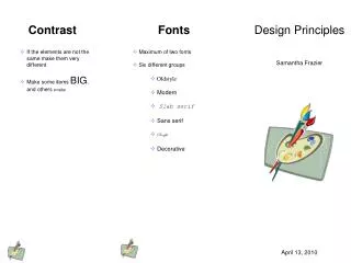
Contrast • Contrast occurs when two elements are different. The greater the difference the greater the contrast. Make sure the differences are obvious. • Common methods of creating contrast are by using differences in size, value, color, texture, shapes and type. • Contrast adds interest to the page/frame and provides a means of emphasizing what is important or directing the viewer’s eye. http://desktoppub.about.com/od/contrast/ss/contrast.htm
For Sale Office 2003 Textbooks Tel: 555 555 5555
Alignment • Alignment: The visual connection among words, shapes, graphics, images and lines on a page/screen when their edges or axes line up (align) with each other. • Text and other objects may be aligned with relation to each other or the page itself. • The proper use of alignment improves the organization and professional appearance of a page • Good alignment is invisible!
Alignment There are several different types of alignment: Visual Grid Breaking • Center • Edge • Left • Right • Justified
Center Alignment • Center alignment may be horizontally or vertically aligned, or both. • Elements may be centered on the page, within sections of the page, and centered with other elements on the page.
Edge Alignment • Edge alignment lines up text or objects along their top, bottom, left, or right edges. • Left-aligned text (with ragged right edges) is one of the most familiar alignments. • Right alignment generally works best for small bits of text, such as posters, some ads, and small documents like a business card • Justified alignment lines up text on both the left and right edges
Visual Alignment • Visual alignment: alignment is not precise, but appears aligned to the human eye • This type of alignment can fix problems that might occur when the shapes of letters and graphics do not automatically “fit” each other. desktoppub.about.com/od/alignment/ss/alignment_6.htm
Grid Alignment • Grid alignment: using guidelines and grids to precisely place elements on the page • Use grids to provide page-to-page consistency, unify and align page elements, and provide design continuity across related documents. desktoppub.about.com/od/alignment/ss/alignment_5.htm
Breaking Alignment • Breaking alignment: intentionally mis-aligning text or an object to create tension or draw attention to a specific element on the page. Desktoppub.about.com
Creating Unity • Unity is the relationship among the elements of a visual that helps all the parts function together • When unity has been achieved: • The individual elements within a composition are not competing for attention. • The key theme will be communicated more clearly. • The design will evoke a sense of completeness and organization.----in other words, everything “fits”
Creating Unity • Some suggestions for creating unity: • Try repeating colors, shapes, values, textures, or lines to create a visual relationship between the elements. Repetition creates a sense of consistency and completeness. Consistency: maintaining the same layout and style throughout the publication, i.e. fonts, colors, spacing, graphic elements, etc. • Arrange shapes so that the line or edge of one shape leads into another. • Group related items together so that the items are seen as one group rather than unrelated elements (proximity).
Design Principles • The principles of design govern how well we communicate the desired message. • By using these guidelines effectively—focal point, balance, visual flow, repetition, contrast, alignment—you can insure the success of your project! http://karlcleveland.com/151/DesignLecture.htm