SlideServe
Menu
Préférences
© SlideServe · v2026

Design Principles - Font Families, Alignment, Contrast, Repetition

dinesh avatar
2 diapositives · 140 Views · Jul 23, 2014

Learn about the 3 major font families, different alignments, creating visual contrast, and the importance of repetition in design principles. Explore ways to use white space effectively and keep related items together for a cohesive layout.
Design Principles - Font Families, Alignment, Contrast, Repetition - slide 1
01 / 2Design Principles - Font Families, Alignment, Contrast, Repetition
1 / 17

Télécharger la présentation

Design Principles - Font Families, Alignment, Contrast, Repetition
Une image / un lien ci-dessous est fourni (tel quel) pour télécharger la présentation

Politique de téléchargement : le contenu du site vous est fourni TEL QUEL pour votre information et votre usage personnel ; il ne peut être vendu, concédé sous licence ni partagé sur d’autres sites sans l’accord de son auteur.Le contenu vous est fourni TEL QUEL, pour votre information et votre usage personnel uniquement. Téléchargez la présentation en cliquant sur ce lien. Lors du téléchargement, si vous ne parvenez pas à télécharger une présentation, l’éditeur a peut-être supprimé le fichier de son serveur.Pendant le téléchargement, si vous ne parvenez pas à obtenir une présentation, le fichier a peut-être été supprimé par l’éditeur.

F I N

Plus de contenu associé

Transcription de la présentation
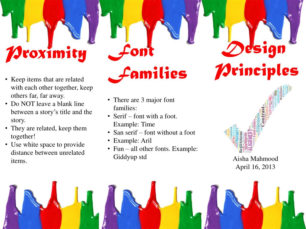
  1. Design Principles • Font Families • There are 3 major font families: • Serif – font with a foot. Example: Time • San serif – font without a foot • Example: Aril • Fun – all other fonts. Example: Giddyupstd • Proximity • Keep items that are related with each other together, keep others far, far away. • Do NOT leave a blank line between a story’s title and the story. • They are related, keep them together! • Use white space to provide distance between unrelated items. Aisha Mahmood April 16, 2013

  2. Alignment • There are 4 alignments: • Left – Use for large blocks of text that need to be read. This is a traditional style. • Right – Use for tittles and small amounts of text. This funky. • Centered – Use for titles is formal. • Block – use in newspapers. • Contrast • Visual attraction on the page. • Keep elements the same or very different. • Make darks dark and light items light. • Place dark text on a light background and light text on a dark background. • Make big items bigandsmall ones small. • Repetitions • Aim for consistency. • Repetition will strengthen the reader’s sense of recognition. • Repeat elements throughout your document.