Download
1 / 14
140 likes | 266 Vues
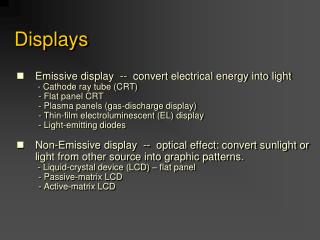
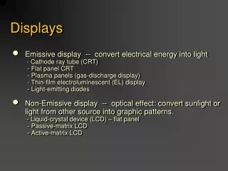
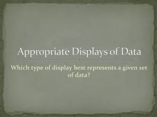
Understanding how to effectively display data is crucial for clear communication. Different types of displays, such as bar graphs, line graphs, and histograms, serve unique purposes based on the nature of the data you're working with. A bar graph is ideal for comparing quantities across categories, a line graph effectively shows trends over time, while a histogram is perfect for representing frequency distributions. This guide will help you choose the most appropriate display type for your data, ensuring accurate and impactful presentations.

E N D
Appropriate Displays of Data Which type of display best represents a given set of data?
Data Collection • Determine a type of data you could collect for creating a … • Bar Graph • Line Graph • Histogram