CCT384 – Universal Design and Access
CCT384 – Universal Design and Access. UD Principle: Perceptible Information. Week 4. Use of Different Modes (Pictorial, Sound etc). Use of Different Modes (Pictorial, Sound etc). Use of Different Modes (Pictorial, Sound etc). Maximize Legibility of Information.

CCT384 – Universal Design and Access
E N D
Presentation Transcript
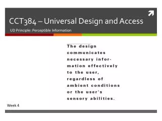
CCT384 – Universal Design and Access UD Principle: Perceptible Information Week 4
Principles of Universal Design Perceptible Information • The design communicates necessary information effectively to the user, regardless of ambient conditions or the user's sensory abilities. • Related to Norman’s Principles of “Visibility and Feedback” and “Constraints”. • Ex. Customizable display fonts and colours. • Benefits people with low vision or colour blindness as well as people who are pre-occupied by another task.
Usability Principles • Visibility • Feedback • Constraints • Mapping • Affordance
Visibility Principle • For more detailed descriptions read Don Norman’s “The Design of Everyday Things” • • Visibility • – Make core user functions clearly apparent • •(e.g., toolbars vs. Menus) • – Hide secondary user functions • – Visible properties guide users as to what todonext • – Structure enhances visibility
Visibility • • This is a control panel for an elevator. • • How does it work? • • Push a button for the floor you want? • • Nothing happens. Push any other button? Still nothing. What do you need to do? • It is not visible as to what to do! From: www.baddesigns.com
Visibility …you need to insert your room card in the slot by the buttons to get the elevator to work! How would you make this action more visible? • make the card reader more obvious • provide an auditory message, that says what to do (which language?) • provide a big label next to the card reader that flashes when someone enters •make relevant parts visible • make what has to be done obvious
What do I do if I am wearing black? • Invisible automaticcontrols can make it more difficult to use
Visibility • Know state of device and actions available • Natural design • No explanations needed • What can I do with this technology? • What is it doing?
Visibility • Poor visibility: • Boeing 757 Flight Management System did not show names of beacons when selecting where to navigate • Good visibility: • Google search page makes it clear where you can enter search text
Class discussion • What other examples of poor or good visibility can you think of?
Case Study 1: Multimedia CD-Rom • The Digital Field Trip is a popular series for teaching topics in high school biology. • The accessibility improvements were performed as part of a pre-planned upgrade. • Students with visual and other disabilities were included in the user testing. • We used active accessibility.
Case Study 1: Multimedia CD-RomOriginal point-and-click interface Large buttons (Principle 7: Appropriate Size) Relatively simple layout (Principle 3: Simple/Intuitive) Image-rich content “Back” Function (Principle 5: Error Tolerant) Most controls mouse-driven Text in images
Case Study 1: Multimedia CD-RomKeyboard navigation Focus indicator (Principle 4: Perceptible) Voice output of navigation information (Principle 4: Perceptible) TAB key navigation (Principle 1: Equitable Use) (Principle 6: Low Physical Effort) Mouse-only use still available (Principle 2: Flexible Use)
Case Study 1: Multimedia CD-RomPanoramic field trip viewer Keyboard control and descriptions of viewer(Principle 1: Equitable Use) (Principle 4: Perceptible) (Principle 6: Low Physical Effort) Text-to-speech of content (Principle 2: Flexible Use) (Principle 4: Perceptible)
Case Study 1: Multimedia CD-RomAudio descriptions of images Descriptions of images (Principle 4: Perceptible) Keyboard operable controls (Principle 1: Equitable Use) (Principle 6: Low Physical Effort)
Case Study 1: Multimedia CD-RomOther interactive exercises Keyboard operable (Principle 1: Equitable Use) (Principle 6: Low Physical Effort) Keyboard shortcut not listed
Case Study 1: Multimedia CD-RomVideo Descriptions added to narration (Principle 4: Perceptible) Captions (Principle 4: Perceptible)
Case Study 2: Web-Based App • The project was to develop an accessible Web-Base chat application. • The result was A-Chat. • We recruited user testers who are blind, have low vision, or who have mobility impairments. • We used passive accessibility.
Case Study 2: Web-Based AppMain Window Enables keyboard navigation (Principle 1: Equitable Use) (Principle 6: Low Physical Effort) Simple Layout (Principle 3: Simple/Intuitive) Screen Reader-Friendly Text and Controls (Principle 4: Perceptible) Same product used by everyone. (Principle 1: Equitable Use) Undo for most functions(not “Message Send”) (Principle 5: Error Tolerant)
Case Study 2: Web-Based AppPreferences I Preferences (Principle 2: Flexible Use) Screen refresh options (Principle 2: Flexible Use) Help for AT users (Principle 2: Flexible Use) New message chime (Principle 4: Perceptible)
Case Study 2: Web-Based AppPreferences II Order of message can be “old to new” or “new to old” (Principle 2: Flexible use) “New messages only” function (Principle 3: Simple/Intuitive)
Case Study 2: Web-Based AppPreferences III Display preferences (Principle 4: Perceptible) (Principle 7: Appropriate Size) Navigation Aids (Principle 1: Equitable Use) (Principle 2: Flexible Use) (Principle 3: Simple/Intuitive)
Case Study 2: Web-Based AppOther interactive exercises High contrast colour schemes (Principle 4: Perceptible)
Activity Applying Universal Design – from learning to practice
Activity • Do this on your own groups • Go find two examples of problems in the GUIs of software apps or the UI of a interactive device (not Web pages) • Problem must illustrate a violation of the perceptible information principle • Describe the problems in these terms • “Post” on the wikipage before end of class
Group Exercise The following is the user interface for an application. It allows a customer of an insurance agency to submit a claim form for damage to their automobile The customer can fill out the textboxes then click on the image of the automobile to enter a description of the damage. For example, if the door is dented, the customer can click on the door. A dialog box will appear that allows the user to enter a description of damage to the door. When the user is done the dialog box is closed. The user can click on the door again to view or edit what was previously entered. Critique this interface in terms of the fundamental design principles discussed in class, and suggest an alternate interface.
References • The Principles of Universal Design‚ Version 2.0 (1997) by North Carolina State University (as cited in Preiser & Ostroff ‚ 2001) • Center for Universal Design (US) Home of the Principles of Universal Design, Exemplars of Universal Design, universal design history, the Design File, Center for Universal Design Newsline, publications, and more. http://www.design.ncsu.edu/ • CAST (US) Home of Bobby, the web accessibility analysis tool, Universal Design in Learning and the National Center On Accessing the General Curriculum, and eProducts. http://www.cast.org • DO-IT: Disabilities, Opportunities, Internetworking, and Technology,http://www.washington.edu/doit/ • Adaptive Environments Center (US) Home of the South Boston Waterfront Project, Designing for the 21st Century Conference, Access to Public Schools, New England ADA Technical Assistance Center, universal design education and consulting, Access to Design Professions, publications and more. http://www.adaptenv.org • Accessible Electronic & Information Technology: Legal Obligations of Higher Education and Section 508, Cynthia D. Waddell, J.D., 1999, http://athenpro.org/node/54
Next class • Next class: Universal Design Principle: Cognitively Sound • Readings: • Erlandson, Chapter8

