Download
1 / 8
80 likes | 234 Vues
Figures Chapter 6 Drought Early Warning. Figure 6.1. Mean sea surface temperatures and surface winds. Arrows denote the main Pacific trade winds. The purple ellipses mark areas with strong temperature gradients. These gradients help drive the mean winds. .

E N D
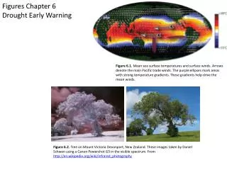
Figures Chapter 6Drought Early Warning Figure 6.1. Mean sea surface temperatures and surface winds. Arrows denote the main Pacific trade winds. The purple ellipses mark areas with strong temperature gradients. These gradients help drive the mean winds. Figure 6.2. Tree on Mount Victoria Devonport, New Zealand. These images taken by Daniel Schwen using a Canon Powershot G3 in the visible spectrum. From http://en.wikipedia.org/wiki/Infrared_photography
Figure 6.1. Mean sea surface temperatures and surface winds. Arrows denote the main Pacific trade winds. The purple ellipses mark areas with strong temperature gradients. These gradients help drive the mean winds. Figure 6.2. Tree on Mount Victoria Devonport, New Zealand. These images taken by Daniel Schwen using a Canon Powershot G3 in the visible spectrum. From http://en.wikipedia.org/wiki/Infrared_photography
Figure 6.3 Regression estimates of El Niño impacts on sea surface temperatures and near-surface winds (top), and Global Precipitation Climatology Project (GPCP) precipitation (bottom). The maps show the change in austral summer (January-February-March) conditions associated with a one standard deviation change in El Niño conditions. The precipitation map is based on standardized precipitation index (SPI) values. So a -0.5 value indicates a half standard deviation reduction in rainfall.
Figure 6.4. My friends and original Climate Hazards Groupies : Alkhalil, Gideon, Tamuka, Joel, Greg and Diego. Figure 6.5. Time series of rainfall for Ethiopia. An update version of our results from Verdin et al., 2005.
Figure 6.6. Ethiopia elevation and watersheds. Figure 6.7. Ethiopia livelihoods and population density.
Figure 6.8.Schematic showing FEWS NET upscaling/downscaling approach to climate trend analysis. Shading on the left panel shows regression coefficients between main growing season rainfall and Indian Ocean rainfall (based on Fig. 7 from Funk and Brown, 2009). Red (blue) denotes a negative (positive) relationship. The right panel represents enhanced convection/rainfall/diabatic forcing over the Indian Ocean and Western Pacific. Figure 6.9. a) time series of PC1 (black) and mean March-June annual global temperature anomalies (red). Lower2 panels: Correlation maps for March-June climate variables and the PC 1 time series from a. Climate variables are b) mean zonal wind profile between 20°S and 20°N and c) mean vertical velocity profile between 20°S and 20°N.
Figure 6.11. Maps show a comparison of precipitation anomalies during (a) old La Niña years and (b) new La Niña years. In a and b, each of the three maps were calculated using a different precipitation dataset. Top map: NCEP/NCAR, Bottom-left map: GPCC, Bottom-right map: Climate Hazard Group rainfall estimates. Figure 6.10. a) Map of the percent of the variance in sea surface temperatures related to ENSO and the Pacific Decadal Oscillation. As suggested by Figure 6.2, ENSO variations primarily influence the Eastern Pacific. B) Map of the percent of the variance in sea surface temperatures explained by a time series of global mean temperatures (e.g. the time series shown in Figure 6.8.a). Graphics credit: Professor Joel Michaelsen. Figure 6.12. Top - the impacts of drought on Somali livestock – source FEWS NET. Bottom – time series of estimated excess deaths due to the 2010/2011 Somali drought.
Figure 6.13. Time series of observed March-May Southern Ethiopian rainfall (black), rainfall predicted based on a reformulated coupled climate model (red), and rainfall estimated based on observed March-May sea surface temperatures (green). Figure 6.12. Panel a shows the 1993-2012 cross-validated correlations between Southern Ethiopian March-May rainfall and observed March-May sea surface temperatures. Panel b shows the correlation with predicted March-May rainfall fields, based on climate conditions in February.