Color
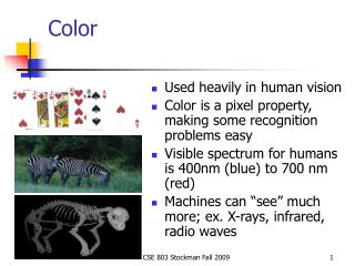
Color. More & more internet surfers use high quality monitors As a result, color & graphics are becoming increasingly important to Web page design Color use can be a highly subjective. Electromagnetic Spectrum. Monitors. A pixel color is a combination of red, blue, and green

Color
E N D
Presentation Transcript
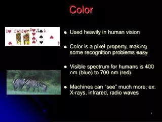
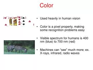
Color • More & more internet surfers use high quality monitors • As a result, color & graphics are becoming increasingly important to Web page design • Color use can be a highly subjective
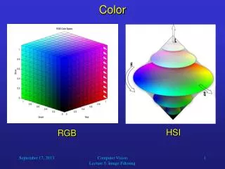
Monitors • A pixel color is a combination of red, blue, and green • RGB values typically 0 – 255, which means 2553 possible colors • 16,777,216
Color Harmony • Implies a color scene is neither boring nor chaotic • people respond well to the harmonious use of color • creates an inner sense of order & visual balance • Techniques for color harmony: • don’t use too many colors (overwhelming) • Use no more than 4 or 5 colors • don’t use too few (boring) • use proper color contrast • Be conservative in your use of color • Design for monochrome first
Contrast & the Color Wheel • For good contrast: • select colors on opposite sides of the color wheel • color complement • Other contrasts: • by saturation • cool-warm contrast
Color Selection • Use bright colors to emphasize or draw attention • Use contrasting colors to emphasize separation • opposite on color wheel • different saturation • Use similar colors to convey similarity • themes for a site • near each other on color wheel • Warm colors indicate that action is necessary and force attention • Red, orange, yellow • Cool colors to provide status and sometimes background • Green, blue, violet, purple • Pastels for background colors • Be consistent with other color meanings • Yellow – caution • Red – stop • Green - OK
Refocus Issues • Too many colors in a page require refocusing of the eye, resulting in fatigue • Proper choice of colors enhance readability, poor choices result in fatigue • Pure or saturated colors require more refocusing than unsaturated colors • Older surfers have decreased sensitivity to blue • A clear image requires differences in brightness between adjacent objects
Web Page Color Implications • If different parts of the screen are attended to separately, color the parts differently • If screen searching is performed to locate information, color code these items for contrast • If a sequence of information is ordered, color code the sequence • ROYGBIV • If information on a screen is crowded, use color to provide visual groupings
Text • Text in color is not as visible as in B/W • Text in color is not as visible as in B/W • Maintain legibility of color text by increasing the font size or make bold Note this font is not bold Note this font is bold
Color Aesthetics • Terms, color themes and relationships, type, layout • Please remember that you are hearing a talk on color aesthetics from an engineer. Aestheticsa guiding principle in matters of artistic beauty and taste; artistic sensibility
Spectrum & Hue • SPECTRUM: All the possible colors in a color space • HUE: specific location on color wheel or in color spectrum
Value • VALUE: describes how light or dark something is. The following example shows a red hue at varying values
Saturation SATURATION: defines the intensity of a color. Muted refers to colors with little saturation.
Contrast CONTRAST: separation between values. Text color must contrast with background to be readable.
Tint & Tone • TINT: process of adding WHITE to a color • TONE: process of adding BLACK to a color
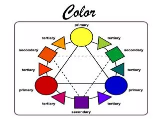
Color Wheels • Color wheels show how colors are related – imagine a circular rainbow spectrum Secondary Tertiary Primary
Color Relationships • Harmonious relationshipsshow a pattern on the color wheel
Analogous • 3-5 colors next to each other on color wheel
Complementary colors • opposites on the color wheel
Monochromatic • Single hue with different values of that hue • Examples: http://www.sweetaspirations.com/ http://www.mike-cookson.pwp.blueyonder.co.uk
Applying Color • Saturation and value are as important as hue – need contrast! • Try designing in gray first.
Useful Links • http://webdesign.about.com/cs/color/a/aacolorharmony.htm • http://www.poynter.org/special/colorproject/colorproject/color.html • http://www.colorcombo.com/
Color Summary • Strive for high contrast (readability) • Effective color schemes are simple and harmonious • Use different colors or values for important information to attract attention • Begin a file (bookmarks?) of designs you like
Typography • Text is created in a graphics application (Fireworks, Photoshop, etc.) OR within HTML • HTML text can be searched, selected, and copied (but less control over font and color) • Text within graphics allows you full control (font face, spacing, effects, layering, etc.) but cannot be searched or selected
Typography Terms • Serif (has stroke on edges, default) vs sans serif (easier to read on screen) • Monospace – same width for each letter (courier) • Leading – space between lines (can be adjusted in graphics app or via CSS using letter-spacing property) • Spacing – space between letters or words (adjust with KERNING or TRACKING in graphics app or via CSS using letter-spacing property)
Typography Terms • Drop Caps – can be set in HTML or CSS • Small caps – can be set in CSS • Body Text – main block of text in a document (should be HTML text) • Headline text –use H1-H6 HTML tags and change look with CSS • Baseline shift – move character up or down • Anti-aliasing – edges of text are blurred to get rid of JAGGIES
Resources • http://counterspace.motivo.com/ • http://www.rsub.com/typographic/ • http://www.myfonts.com/
HTML text • You can specify font face & size in HTML or CSS, but the end user must have the font installed to view it • See font list on page 32 • You can specify a LIST of fonts – Dreamweaver automates this • Use HTML for body text
Pictures of text • Created in graphics application • Saved as gif, jpg, or swf file • Can’t be searched or copied, so use for titles & buttons
Legibility & Readability • sans-serif is easiest to read – Verdana is a good choice • For serif, use Georgia • High contrast • Avoid noisy backgrounds • Small text should not be anti-aliased • Use simple, sans-serif font for buttons • CAPS ok for titles & headers, but not for body
Tips • Specify size in CSS (pixel based so won’t look different on Mac) • Choose a FEW FONTS for your site • Large text looks better anti-aliased • Break up body text with paragraphs, headings, etc. Make it EASY TO SKIM • People print pages, so make sure it works (print version? PDF?)
Flash • Vector graphics, so scales nicely and creates small file • Full control over font & graphics • Supports audio and video • Requires plug-in • Less searchable • Can’t link to particular page
Layout • Rectangles are not particularly pleasing. • Unfortunately HTML was initially designed with rectangles in mind as a layout.
Rectangle • HTML is rectangle-oriented (images, frames, tables, browser window) • TIPS • Round edges • use graphics & backgrounds to break lines • Empty space is good • Vary sizes and weights • Use irregular shapes (title rectangles?)
More tips • Grids help with alignment • Use tables to limit line width • WHITE SPACE!!!! • Remember the fold – important info on top, assume 800 x 600 resolution • Limit animation
What is Browser-Safe Color? • Different systems and browsers support color differently. • Some users have 8-bit video (old, hand-held devices) • If user’s system doesn’t have your color, it could SHIFT or DITHER • Netscape & IE share 216 color palette • Linkhttp://www.lynda.com/hex.html
Hexidecimal codes • RGB values are converted to 6-digit codes: • 0 0 00 • 51 33 • 102 66 • 153 99 • 204 CC • 255 FF
Examples • Code: R G B • White FF FF FF • Pale Yellow: FF FF CC • Blue: 00 00 CC
When to Use Browser-Safe Palette • Not necessary any more unless designing for hand-held devices (but nice to know) • For solid areas of color in line art and hybrid images – otherwise, dithering may occur • Hexidecimal colors (text, background in body tag, link, visited link, etc.) – otherwise, color shifting may occur
Swatches • Fireworks default color palette is browser safe • “Websnap Adaptive” option shifts solid color areas to web-safe colors
JPEG • Not browser-safe, so don’t use JPG format if the image includes large areas of solid color (will show blotchy artifacts and file size may be larger than GIF)