ANGEL: A Dark Twist on Innocence | Draft Poster Layouts
Explore the evolution of film poster designs inspired by 'GRACE,' 'The Ring Two,' and 'Insidious' in these draft layouts by Kiera Garrison. Each draft aims to capture the eerie and unsettling essence of the main character, showcasing a juxtaposition of innocence and darkness. The tagline and imagery hint at a deeper narrative where appearances can deceive. Witness the transformation of a young girl named Angel into something far from heavenly in this chilling film trailer teaser.

ANGEL: A Dark Twist on Innocence | Draft Poster Layouts
E N D
Presentation Transcript
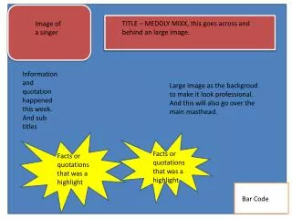
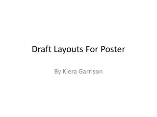
Draft Layouts For Poster By Kiera Garrison
Draft #1 • This is the basic layout that I created by being inspired by the poster ‘GRACE’. Here I have created my own tagline in which I think is very relevant to the genre of my film trailer. The meaning of this is that our main character of a young girl is going to be in a white dress in which she would look like she is innocent but in fact that is the complete opposite. The film title ‘ANGEL’, I think is a good name as it is actually the girls name but it also has a totally different meaning as when you think of an angel you think of goodness and purity but this isn't the case in this film trailer.
Draft #2 • Here I have kept that same basic outline as the previous draft as I feel that the more simple it is the better. The photo I used here is off the film poster ‘The Ring Two’. I wanted to see what this looked like as I think that the way they show this young character is very interesting. From having a basic outline, it makes the image look more eerie because there is nothing in it’s way so it looks like it is the most dominant thing on the page.
Draft #3 • I have still kept with the original layout of film poster, I don’t think it will change drastically through the rest of my draft to get to my final one. I have took this image off the ‘Insidious’ poster because I think that the emotion that the boy is giving off is very daunting and it is what I want my character to be showing. I also think that the way the house is in the background is also effective because as a viewer we would wonder what significance it has to the film. The boy also looks bigger than the house which I think looks very creepy as normally a house would look much more powerful that a young boy so it could suggest that this boy has a very strong impact on the house as a whole which is something that I may want to show in my poster.