Download
1 / 10
100 likes | 236 Vues
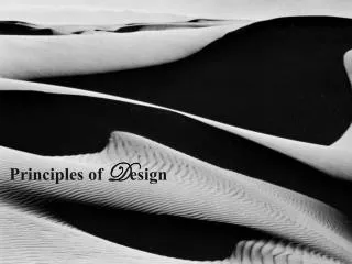
Principles of D esign. Symmetrical . The Reason why this shows symmetry is because the flower looks like it could be split in half. It looks like if you where to be able to cut it and fold it then both side would be extremely identical. . Gradation.

E N D
Symmetrical The Reason why this shows symmetry is because the flower looks like it could be split in half. It looks like if you where to be able to cut it and fold it then both side would be extremely identical.
Gradation The reason why this is gradation is because the picture looks like it starts out really dark at the top right of the picture. Then slowly it looks like the darkness starts to fade until it gets really dark in the center. Then it looks like at the bottom it starts to get dark again. Gradation is basically when it changes from dark to light.
Contrast In this picture there is contrast in the way that the light shines beside the sharpener. On the top and the bottom you can see that the red is really dark. Then like in the center the light makes the red look lighter.
Emphasis In this picture I am putting emphasis on the trash on the street. This means that the main focus of this picture is what I am centering on. In this picture I decided to focus on the trash to show what we have to live with every day. This put emphasis on the problems of our community.
Harmony This picture shows harmony because it has a peaceful side to it. The branches of the trees make it look like something magical and harmonious. The way that the leaves seem to swaying in the wind looks peaceful and calm. That is why it is harmoneous.
Pattern In this picture the plants seem to have a pattern to it. The pattern seems to start at the center. Then all of the leaves of this plant stick out of the plant from the center.
Rhythm I put this picture in rhythm because the bottle of water reminded me of when people put water on glass and then it makes music notes. That is why I put this picture in the rhythm section.
Movement In this picture you can see movement because my friend has a ball in his finger. The picture doesn’t show it completely but he is spinning the ball on his finger that is why the finger stayed on his finger. This is movement because the ball is moving on his finger.
Space This is space because the table has a lot of space in it. There are not a lot of things on this picture. There is only open space.