Graphic Design : T he Fun Part
300 likes | 677 Vues
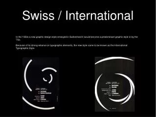
Graphic Design : T he Fun Part. Hierarchy: Organize Your Information. a hierarchy is a “ visual path ” establishes the relative importance and sequence of information use various font sizes , colours and weights for contrast similar “chunks” of information together

Graphic Design : T he Fun Part
E N D
Presentation Transcript
Hierarchy: Organize Your Information • a hierarchy is a “visual path” • establishes the relative importance and sequence of information • use various font sizes, colours and weights for contrast • similar “chunks” of information together • separate unrelated items with more white space
BAD THINGS, VERY BAD THINGS • If you put information together with only slightly different fonts then you will have problems…. • The eye gets frustrated when a difference is not obvious, it tries to make the information fit together.
Fonts: 2 broad categories • what is a serif? • Times New Roman has serifs • Arial doesn’t
Serif fonts lead the eye horizontally, and may therefore be preferable for large blocks of text, whereas sans-serif fonts are simpler, lead the eye up and down, and are more easily read from a distance. Serif fonts lead the eye horizontally, and may therefore be preferable for large blocks of text, whereas sans-serif fonts are simpler, lead the eye up and down, and more easily read at a distance.
Fonts have personality, and convey an impression which should be consistent with the meaning of the words themselves. Fonts have personality, and convey an impression which should be consistent with the meaning of the words themselves. http://www.gairspace.org.uk/htm/pictesque.htm
What’s your favourite colour? usually, complimentary colours are a safe bet, but not always
Why contrasting colours? • The purpose of using contrasting colours is to grab attention. When a picture has too many colours your eye doesn't know what to focus on. • Contrasting colours are also the colours that “go” best together. They make each other look the best they can, just by being beside one another.
Contrasting Colours • These are the primary colours. (red, yellow, and blue) • If you want the contrasting colour to a primary colour mix the remaining primaries. Here Yellow and purple would be paired
In practice; • To demonstrate we will pick a butterfly. • Orange and blue should work together better then blue and any other colour, however in practice yellow works well too
Powerful Colours… • Red is powerful and overwhelming • Pink is soft and caring • Green is healing and growth • Yellow is action • Orange is creative • And blue…
PREFER BLUE • More people • Which therefore has broad appeal, but also tends to be serious, corporate, and cool. • IBM • Warmer colours tend to draw the eye, and can overwhelm a design • For example, red used a lot is hard on the eyes, but as a highlight, it can help establish hierarchy
Bad Things, Very bad Things • If you use warm colours such as Orange, Peach, and Yellow you will cause eye strain, even if you are using contrasting colours. • These warm colours are overwhelming to a design and should not be used. • Stick to the simple and you can not go wrong.
Bad Things, Very Bad Things http://www.csf.bc.ca/ecoles/Anse_au_Sable/maquette/question1.htm
Whatever colour you choose, consider leaving lots of white space…
Off Balance • In an ‘unbalanced ’ layout, • « …the eye is confused. It shifts from element to element, wanting to move things so that they sit right on the page, as we want to straighten a picture hanging crooked on a wall. » Toward a Dynamic Balance.
Balance Balance in design is the overall unity and visual weight that is created when all the elements are in place. • whole design will become unified • two basic types of balance: • symmetrical • asymmetrical
Symmetry explained • You need to either balance a picture along an axis… (i.e. if you folded the paper in half, any half, would there be the same amount of weight to both halves?) • Weight can be either colour or shape. • It’s important not to manipulate a shape and try to pass it off as the original