Displaying your data
Displaying your data ASQ FOLIO Course Displaying your data Questionnaire survey results are usually displayed in the form a report. Details of how to structure survey reports are provided on the next slide Structuring your survey report


Displaying your data
E N D
Presentation Transcript
Displaying your data ASQ FOLIO Course
Displaying your data • Questionnaire survey results are usually displayed in the form a report. • Details of how to structure survey reports are provided on the next slide
Structuring your survey report Introduction: background information, the rational for the survey, the questions or problems it sets out to address. If you have conducted a literature review, there should also be a section summarising that, and placing the questionnaire in the context of what is already known. Methods: a description of the techniques used in the survey and data collection tools. Results: a summary of the data. Raw data is often of limited use to most of the report’s potential readers, so it should be omitted or placed in an appendix, or you can add a footnote saying “available from….on request.” Your report should however include a summary of the data, using descriptive statistical techniques (tables, graphs etc), and possibly some textual quotes. Discussion: you may wish to raise any issues about the accuracy of the data, specific problems encountered and solutions employed, and how your findings agree with or question the literature review. Conclusion: the findings of the survey, presented factually rather than in a speculative style. Recommendations: how the findings of the survey may be translated into practice, or an action plan. This may include a timetable for dissemination, monitoring or setting another user survey. References and citations: of any books, journals, websites, reports consulted Appendices: A copy of the questionnaire and/or other data collection techniques (e.g. interview schedule) that you may have used Adapted from PACINA FOLIO course briefing: ‘Analysing and applying the results of an audit’ (1)
Who is the audience? (1) • The formality and level of detail contained in your report will depend on who your audience is. • When writing your report, it is important to consider the following questions (2): • Who is the main audience? • Should the outcome be reported to more than one group of stakeholders? • Are the findings likely to be disseminated beyond your own organisation?
Who is the audience? (2) There are a number of audiences that may have an interest in your survey data. These may include (3): • Parent bodies/organisations • Funding sources • Professional associations • Other libraries • Library staff members • Users
Other forms of presentation Once it has been written, the information from the report can be summarised in a number of formats including: • executive summaries • overviews • presentations • Positive statistics or quotes to promote the library in promotional materials such as leaflets, posters, or newsletters.
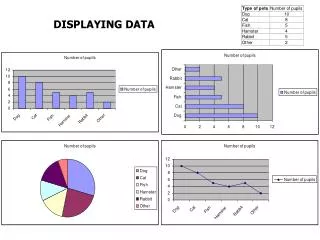
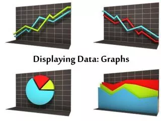
Why include charts in your report? • Charts are diagrams which are used to present statistical information (4) • Diagrams used to present statistical information include tables, line graphs, bar charts, histograms, and pie charts (4) • Text or narrative alone should not be used to convey more than three or four numbers in your report (5). In these circumstances, diagrams should be used instead to enable numerical information to be presented clearly. • Diagrams are usually found in the ‘Results’ section of the report • Computer statistical analysis software can be used to easily generate diagrams based on survey data
Using tables • User survey reports almost always include tables (6) • “The simplest tables arising from surveys, or from coded qualitative information, are of counts or frequencies.” (5) • “Their purpose is to describe respondents and their environment, show relationships, and describe changes and combinations of relationships and changes” (6) • “If relatively large counts are to be compared in a table with several rows and columns, it is often helpful to present them as percentages” (5) • Their contents usually include the number of respondents and their stated preferences or opinions. (6)
Example of a table (1) Example taken from (7)
Example of a table (2) Example taken from (8)
Tables: Top tips • “Tables display columns and rows of numbers, percentages, and scores. You must decide how many columns and rows you can include and still keep the table readable” (6) • “Each table should have a title that summarises it purpose and content” (6) • “If you have any additional information to help with an interpretation of the data, such as statistical significance, place it after the body of the table” (6) • “Select a table format and use it consistently” (6) • Present your data in a logical order (e.g. from the most frequent to the less frequent or vice versa) (6)
Using bar graphs • “A bar chart or graph uses rectangles (bars) to represent different amounts” (4). • “Bar graphs are commonly used to display survey data because they provide an overview of several kinds of information at one glance” (6). • However, “they are not generally useful for large amounts of structured information” (5). • Bar graphs should always have a title, a key to the bars, and an explanation of the scores (6) • “Bar charts can be displayed horizontally or vertically and they are usually drawn with a gap between the bars” (9)
Example of a bar graph (1) Example taken from (7)
Example of a bar graph (2) Example taken from (10)
Using histograms • Histograms look similar to bar graphs except the individual bars have no spaces in between them (9) • They are often used in data analysis to illustrate the major features of the distribution of the data (9) • Histograms divide up the range of possible values in a data set into classes or groups. (9) • For each group, a rectangle or bar is constructed with a base length equal to the range of values in that specific group, and an area proportional to the number of observations falling into that group. (9) • Histograms are generally used when dealing with large data sets (>100 observations) (9) • A histogram can also help detect any unusual observations or any gaps in the data set (9)
Example of a histogram Example taken from (7)
Using pie diagrams • “A pie chart is in the shape of a circle, divided into slices like the slices of a pie. Each slice represents a share of the whole, and the bigger the slice, the bigger the share.” (4) • Pie diagrams visually show the proportions of the responses (6) • Ensure that you keep the pie diagram sections to fewer than six or the pie will look too cluttered (6)
Example of a pie diagram Example taken from (7)
Using line graphs • “Line graphs are drawings that allow you to compare groups, show trends, and discern patterns” (6). • “They show trends in data clearly, meaning that they visibly show how one variable is affected by the other as it increases or decreases” (11). • When using line graphs, you should be careful not to make a one-point score look like a major trend (6).
Example of a line graph Example of a line graph (taken from 12)
Further information For more guidance on using charts and graphs, please see the following resource: • University of Coventry, 2002. Using charts and graphs to present data effectively: E-learning module. [Online] [Accessed May 2006]
Examples of library survey results • Reports: • Hull College. 2005. User survey results report. [Online] [Accessed May 2006] • University of York. 2004. University Library Survey 2004. [Online] [Accessed May 2006] • University College London. 2005. Library services satisfaction report 2005. [Online] [Accessed May 2006] • Summaries and overviews: • Chesterfield Royal Hospital. 2005. Survey results overview. [Online] [Accessed May 2006] • Leeds Metropolitan University. 2005. Library survey 2005: Summary report. [Online] [Accessed May 2006] • PowerPoint presentation: • Alison Bremner. 1999. Students and Libraries Project. Open university. [Online] [Accessed May 2006]
References • Alan O’Rourke. 2005. Analysing and applying the results of an audit PACINA FOLIO Course [Online] [Accessed May 2006] • Glasgow Caledolian University. 2004. Chapter 7: Evaluating E-Learning [Online] [Accessed May 2006] • John Whitman. 2002. Presenting survey results. Survey Tools. [Online] [Accessed May 2006] • Andrew Roberts. 2000. Word to help you think about pictures, shape and design. Middlesex University. [Online] [Accessed May 2006] • University of Reading. 2003. Statistical good practice guidelines: Informative presentation of tables, graphs and statistics. [Online] [Accessed May 2006] • Arlene Fink and Jacqueline Kosecoff. How to conduct surveys: A step-by-step guide. London: SAGE Publications; 1996 • Hull College. 2005. User survey results report. [Online] [Accessed May 2006] • University College London. 2005. Library services satisfaction report 2005. [Online] [Accessed May 2006] • Valerie Easton and John McColl.1997. Presenting data. University of Glasgow. [Online] [Accessed May 2006] • University of York. 2004. University Library Survey 2004. [Online] [Accessed May 2006] • Office for Mathematics, Science, and Technology Education (MSTE). 1997. Line graphs. University of Illinois. • Ian Cambata. 2005. Library survey data graphs. Bentley College. [Online] [Accessed May 2006]