Displaying Data
Displaying Data. Objectives: Students should know the typical graphical displays for the different types of variables. Students should understand how frequency tables are constructed and how to read absolute and cumulative frequencies from the tables. Frequency Distributions.

Displaying Data
E N D
Presentation Transcript
Displaying Data Objectives: • Students should know the typical graphical displays for the different types of variables. • Students should understand how frequency tables are constructed and how to read absolute and cumulative frequencies from the tables.
Frequency Distributions Tables or graphsthat show the number of occurrences of values in a specified category (nominal and ordinal data) or interval (numerical data). Frequency tables and graphs can show either values (counts), percentages (of total number), or both. For quantitative data, cumulative frequencies and percentages can also be shown.
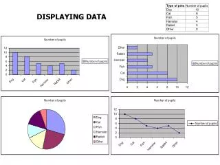
Medical specialties chosen by a sample of graduating medical students (n=614) in 2002 A frequency table for a nominal variable
Graphic Displays for Categorical Variables The most common graphical ways of displaying the data are with bar and pie charts For Nominalvariables, the categories can be listed in any order. Ordinal variables are usually listed in order from lowest to highest category (or vise versa). Bar charts plot the categories on the x-axis, and the frequencies (or percents) for each category on the y-axis (bars can be horizontal or vertical). Pie charts display the relative frequencies for the categories as sections of a circle.
Medical specialties chosen by graduating medical students (n=614) in 2002 Bar graph
Medical specialties chosen by graduating medical students (n=614) in 2002 Pie chart
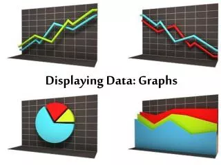
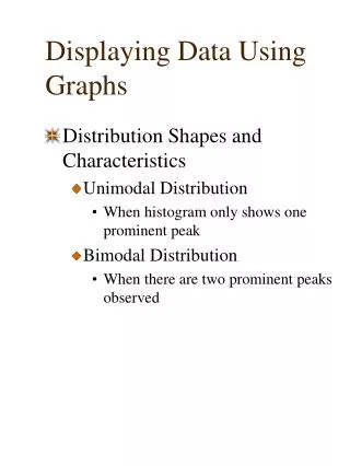
Graphic Displays for Quantitative Variables • Graphical displays for quantitative/numerical data: • stem and leaf plots • histograms • frequency polygons • box plots • dot plots • line graphs • scatter plots (used for graphs of two characteristics)
Frequency tables for quantitative variables Example: Resting heart rates (bpm) for 42 males and 42 females collected during a research study In this format, it’s difficult to draw any conclusions about the heart rates in the sample.
One way to present a summary of the data is to construct intervals of heart rates, and count the number of observations that fall in each interval: This is essentially “collapsing” a continuous variable into an ordinal variable
We can easily see (for example) that: • a little more than half (52.4%) of the subjects have HRs <74 bpm • 21/84 subjects (25%) have HRs between 70 and 74 bpm • <5% (3.6%) of the subjects have HRs <60 bpm
A frequency distribution of a quantitative variable displayed in graphic form is called a histogram:
Another type of graph is a frequency polygon, useful for displaying 2 or more quantitative distributions on the same graph:
Scatterplot of two quantitative variables, age and heart rate:
Misleading Graphs Warning:When interpreting graphs in the literature, make sure to look at the scales of the axes: different scaling can exaggerate or minimize comparisons