Displaying and Analyzing Data
Displaying and Analyzing Data. Vocabulary & Examples. Frequency Table. Lists each item in a data set with the number of times it occurs. Line Plot. Shows the shape of the data by stacking symbols above each data value to represent quantity. Green Red Blue Black White Silver Other. Dot Plot.

Displaying and Analyzing Data
E N D
Presentation Transcript
Displaying and Analyzing Data Vocabulary & Examples
Frequency Table Lists each item in a data set with the number of times it occurs.
Line Plot Shows the shape of the data by stacking symbols above each data value to represent quantity. Green Red Blue Black White Silver Other
Dot Plot Green Red Blue Black White Silver Other
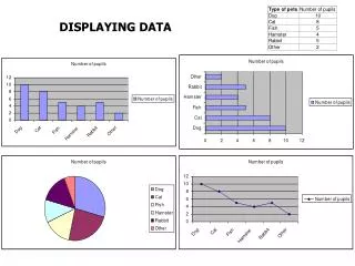
Histogram A bar graph that show the frequency of data. 10 8 6 4 2 0 Green Red Blue Black White Silver Other
Venn Diagram Venn Diagrams show the distribution of data using shapes that often overlap GLMS students Band Baseball 13 5 15 77 Track 17 8
Spreadsheet & Cell Spreadsheet: A tool for organizing and analyzing data arranged in lettered columns and numbered rows Cell: A box in a spreadsheet designated with a column letter and row number
Spreadsheet & Cell • A1? • 1996? • 3D?
Double Bar Graph A graph using bars to compare 2 sets of data
Double Line Graph A graph using lines to compare 2 sets of data, usually over time
Circle Graph • Also known as a pie chart. • Divides data into fractions of a circle to show relative size.