Organizing and Displaying Data
Organizing and Displaying Data . Warm Up. Lesson Presentation. Lesson Quiz. Holt McDougal Algebra 1. Holt Algebra 1. Warm Up Write the equivalent percent. 1. 2. 3. Find each value. 4. 20% of 360 5. 75% of 360 6. 20% . 12.5%. 25%. 72. 270 . 24. Objectives.

Organizing and Displaying Data
E N D
Presentation Transcript
Organizing and Displaying Data Warm Up Lesson Presentation Lesson Quiz Holt McDougal Algebra 1 Holt Algebra 1
Warm Up Write the equivalent percent. 1.2. 3. Find each value. 4. 20% of 360 5. 75% of 360 6. 20% 12.5% 25% 72 270 24
Objectives Organize data in tables and graphs. Choose a table or graph to display data.
Vocabulary bar graph line graph circle graph
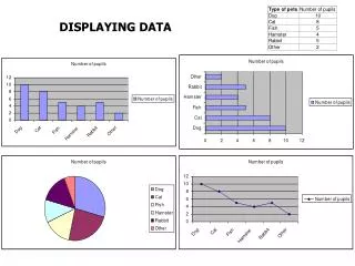
Bar graphs, line graphs, and circle graphs can be used to present data in a visual way. A bar graph displays data with vertical or horizontal bars. Bar graphs are a good way to display data that can be organized into categories. Using a bar graph, you can quickly compare the categories.
Example 1: Reading and Interpreting Bar Graphs Use the graph to answer each question. A. Which casserole was ordered the most? lasagna B. About how many total orders were placed? 180 C. About how many more tuna noodle casseroles were ordered than king ranch casseroles? 10 D. About what percent of the total orders were for baked ziti? 10%
Check It Out! Example 1 Use the graph to answer each question. a. Which ingredient contains the least amount of fat? bread The bar for bread is the shortest. b. Which ingredients contain at least 8 grams of fat? cheese and mayonnaise The two longest bars.
A double-bar graph can be used to compare two data sets. A double-bar graph has a key to distinguish between the two sets of data.
Example 2: Reading and Interpreting Double Bar Graphs Use the graph to answer each question. A. Which feature received the same satisfaction rating for each SUV? Cargo Find the two bars that are the same. B. Which SUV received a better rating for mileage? SUV Y Find the longest mileage bar.
Check It Out! Example 2 Use the graph to determine which years had the same average basketball attendance. What was the average attendance for those years? 2001, 2002, and 2005 Find the orange bars that are approximately the same. The average is about 13,000.
A line graph displays data using line segments. Line graphs are a good way to display data that changes over a period of time.
Example 3: Reading and Interpreting Line Graphs Use the graph to answer each question. A. At what time was the humidity the lowest? 4 A.M. Identify the lowest point. B. During which 4-hour time period did the humidity increase the most? 12 to 4 P.M. Look for the segment with the greatest positive slope.
Check It Out! Example 3 Use the graph to estimate the difference in temperature between 4:00 A.M. and noon. About 18°F Compare the temperatures at the two times.
A double-line graph can be used to compare how two related data sets change over time. A double-line graph has a key to distinguish between the two sets of data.
Example 4: Reading and Interpreting Double-Line Graphs Use the graph to answer each question. A. In which month did station A charge more than station B? May Look for the point when the station A line is above the station B line. B. During which month(s) did the stations charge the same for gasoline? April and July See where the data points overlap.
Check It Out! Example 4 Use the graph to describe the general trend of the data. Prices increased from Jan through Jul or Aug, and then prices decreased through Nov.
A circle graph shows parts of a whole. The entire circle represents 100% of the data and each sector represents a percent of the total. Circle graphs are good for comparing each category of data to the whole set.
Example 5: Reading and Interpreting Circle Graphs Use the graph to answer the question. 12.5% 12.5% 50% 25% Which ingredients are present in equal amounts? Lemon sherbet and pineapple juice. Look for same sized sectors.
Check It Out! Example 5 Use the graph to determine what percent of the fruit salad is cantaloupe. Find the cups of cantaloupe and divide that into total cups of fruit.
Reading Math The sections of a circle graph are called sectors.
Flowers in an Arrangement Example 6A: Choosing and Creating an Appropriate Display Use the given data to make a graph. Explain why you chose that type of graph. A bar graph is good for displaying categories that do not make up a whole. Step 1 Choose an appropriate scale and interval. The scale must include all of the data values. The scale is separated into equal parts called intervals.
Example 6A Continued Step 2 Use the data to determine the lengths of the bars. Draw bars of equal width. The bars should not touch. Step 3 Title the graph and label the horizontal and vertical scales.
Degrees Held by Faculty Bachelor's: PhD: Master's: Example 6B: Choosing and Creating an Appropriate Display Use the given data to make a graph. Explain why you choose that type of graph. A circle graph is good for displaying categories that make up a whole. Step 1 Calculate the percent of total represented by each category.
Example 6B Continued Step 2 Find the angle measure for each sector of the graph. Since there are 360° in a circle, multiply each percent by 360°. PhD: 0.10 360° = 36° Master’s: 0.39 360° = 140.4° Bachelor’s: 0.51 360° = 183.6°
Example 6B Continued Step 3 Use a compass to draw a circle. Mark the center and use a straightedge to draw one radius. Then use a protractor to draw each central angle. Step 4 Title the graph and label each sector.
County Farms 248 Example 6C: Choosing and Creating an Appropriate Display Use the given data to make a graph. Explain why you chose that type of graph. A line graph is appropriate for this data because it will show the change over time. Step 1 Determine the scale and interval for each set of data. Time should be plotted on the horizontal axis because it is independent.
Example 6C Continued Step 2 Plot a point for each pair of values. Connect the points using line segments. Step 3 Title the graph and label the horizontal and vertical scales.
Check It Out! Example 6 Use the given data to make a graph. Explain why you chose that type of graph. The data below shows how Vera spends her time during a typical 5-day week during the school year.
Sports: Sleeping: Eating: Homework: School: Other: Check It Out! Example 6 Continued Use the given data to make a graph. Explain why you choose that type of graph. A circle graph is good for displaying categories that make up a whole. Step 1 Calculate the percent of total represented by each category.
Check It Out! Example 6 Continued Step 2 Find the angle measure for each sector of the graph. Since there are 360° in a circle, multiply each percent by 360°. Sleeping: 0.375 360° = 135° Eating: 0.067 360° = 24.12° School: 0.25 360° = 90° Sports: 0.083 360° = 29.88° Homework: 0.083 360° = 29.88° Other: 0.142 360° = 51.12°
Check It Out! Example 6 Continued Step 3 Use a compass to draw a circle. Mark the center and use a straightedge to draw one radius. Then use a protractor to draw each central angle. Step 4 Title the graph and label each sector.
Lesson Quiz: Part I 1. Which two apartments are about the same size? Lamar Place and Candlerun 2. In which week(s) did store B charge more than store A? Week one
Lesson Quiz: Part II 3. The table shows how many orders were placed for each type of muffin at a bakery in one week. Use the data to make a graph. Explain why you chose that type of graph. A circle graph is used to compare each type of muffin to total muffin orders.