Download
1 / 23
230 likes | 429 Vues
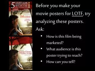
Before you make your movie posters for LOTF , try analyzing these posters . Ask: How is this film being marketed? What audience is this poster trying to reach? How can you tell?. First, some parodies to get you thinking!. Okay, now for the real thing! .

E N D
Before you make your movie posters for LOTF, try analyzing these posters. Ask: • How is this film being marketed? • What audience is this poster trying to reach? • How can you tell?
Aimed at a sophisticated adult audience, one probably interested in art films • Note the film festival awards on either side of her head • Note the fact that they say “Academy Award Nominee” Natalie Portman • Natalie Portman is almost unrecognizable here, so it is not really her popularity that this ad is trying to play up (this is not the Star Wars crowd we’re talking to) • This is sort of a disturbing image, with her tiara looking almost melted, her eyes red, and her makeup frightening. This is no happy, frilly ballet movie marketed to young girls. • Aronofsky’s name and other films are mentioned, so the quality is really what’s being pushed here, not the plot.
Aimed at a an audience who wants to see an action movie • Note that we have no clue about plot—just that it will involve lots of weapons and killing • The actors are all action-type actors, listed by last name only (so we assume you know who they are, and like their work) • A very blunt ad. If you like to see people shooting each other, this is the movie for you!
Sort of a combination of the previous two ads. This is an action movie that is also marketed as a sophisticated art film. • Note the emphasis on the rave reviews, the awards, etc. Note where the reviews come from. • This is not a picture of stuff blowing up or “cool” looking action or guns, so although it is a war movie, it’s not being marketed to quite the same crowd that the last movie was.
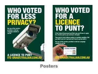
This poster is aimed at the people who saw and liked Ironman and Thor (look at the text at the top) • Captain America is clearly being linked to the rest of the avengers (just in case you weren’t too familiar with the character) • This looks like a cool action movie where the good guys are really good (look at that shiny, patriotic shield, and that handsome, determined Chris Evans rushing into danger, backed by his friends who look confident and capable! Look at the EVIL bad guy behind them! Look at stuff blowing up!) • Not being marketed to a sophisticated adult crowd, unless they just want a little escapist fun • And oooh, it is in 3D!
This poster, in contrast, is much darker. It looks like it is being marketed to those who want a gritty, complicated action movie. • Note how the shield is scratched and dented. Note all the debris flying around him. It doesn’t look like a fun 3D explosion movie anymore. He’s not running towards us looking determined; he’s standing, eyes downcast, looking pretty unhappy. • No mention of other movies, no title, just the word “Avenge”—which seems ominous. • I’m not so sure this looks like the kind of movie that ends with the good guys winning. This reminds me more of the mood of The Dark Knight.
Speaking of Batman, take a look at this! It’s appealing to the audience who wants to see Batman, of course, but this looks like a really depressing Batman movie, one where he might die at the end (The legend ends! Oh no!). • Look at the broken mask, on the ground, in the rain. That doesn’t bode well for our hero. • That guy in the back looks scary. Did he just kill Batman? • No color, slashing rain, this looks epic and depressing.
Now we are selling a very different movie with this poster. The stiletto, the lipstick, the XX (I love you, Batman!), this looks like a dark, sexy movie about Batman and Catwoman. • We’ve still got slashing rain, and a lot of black, but we’ve got some color (RED! The color of passion!), and a sort of cool but scary-looking metal spike heel stepping on the bat symbol. It might be a dark movie, but we’ve got no real sense that Batman might die here. • We look like we’re going to get some romance and some fighting.
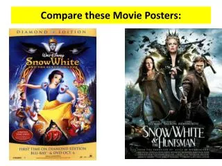
Okay, this sort of looks like Fast and the Furious with a little romance. • We’ve got Ryan Gosling in a car, in a soft almost glowing light. The title is in pink cursive. He looks a little pensive. Maybe he’s a bank robber? Is this a heist movie with some romance? • This whole poster looks slick and cool. Maybe a date movie with something for everyone? Fast cars, good looking Ryan Gosling, action, love, etc. • By the way, this was the American poster. It was pretty misleading!
Here’s the Italian poster—much closer to the real idea of the film. • Notice the disturbing, fractured road behind him. • He’s carrying a hammer and there is blood on his shirt. He has a scary, empty look on his face. • Where is the cool car? • The title is now in grainy block letters. Not so romantic anymore. This looks like some kind of scary, high concept action flick. • Note the film award in the top. This is definitely not The Fast and the Furious!
Let’s look at some alternate book covers for Lord of the Flies! Think about the audience they’re trying to reach.
Now, create your own posters. Two different posters for two different audiences. You can draw them, use the computer, whatever works best. They don’t need to be real poster size. They can be just the size of a regular sheet of paper. Put some thought into them! Use images, tag lines, symbolism, etc.