Creating a Scatter Plot in Excel on Mac: Step-by-Step Guide
Learn how to create a scatter plot using Excel on your Mac. This step-by-step guide covers inserting your variables for the x-axis and y-axis, highlighting data points, and creating the scatter chart. You'll also find instructions on adding axis titles, adjusting gridlines, changing colors, and deleting the legend. Additionally, discover how to enhance your chart with a trendline, display the equation of the line, and show the R-squared value for better data analysis.


Creating a Scatter Plot in Excel on Mac: Step-by-Step Guide
E N D
Presentation Transcript
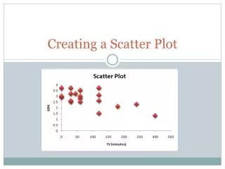
Creating a Scatter Plot On a Mac
Data in Excel Spreadsheet • Insert the variable you want on the x-axis in the left column • Insert the variable you want on the y-axis in the right column
Create the Chart • Highlight both variables, TV and GPA • Charts Scatter Marked Scatter
Add Axis Titles • Chart Layout Axis Title • Horizontal Axis Below Axis “TV (minutes)” • Vertical Axis Rotated Title “GPA”
Delete Gridlines • Chart Layout Gridlines Horizontal Gridlines None
Chart Title • Chart Layout Chart Title Above Chart
Change Colors • Click on any point in the scatter plot • Format Fill Choose color
Legend • Chart Layout Legend No legend
Add a Trendline • Chart layout trendline linear trend
Add the Equation of the Line • Chart Layout trendlinetrendline options • Click on options • Check display equation of the line
Add r-squared value • Chart Layout trendlinetrendline options • Click on options • Check display r-squared value
Line Color, Weight, etc. • Chart Layout TrendlineTrendline Options • Click on Line change color • Click on weights make thicker