Download
1 / 34
552 likes | 1.6k Vues
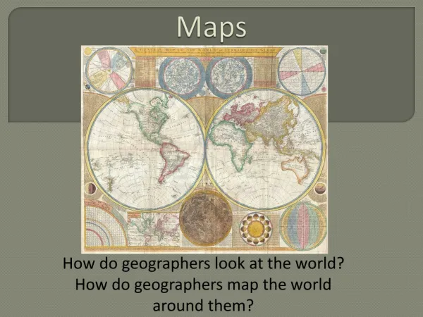
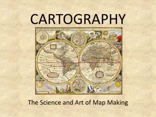
CARTOGRAPHY. The Science and Art of Map Making. SOME BASICS. A map is a two-dimensional or flat-scale model of the earth’s surface. Cartography is the science AND ART of mapmaking.

E N D
CARTOGRAPHY The Science and Art of Map Making
SOME BASICS A map is a two-dimensional or flat-scale model of the earth’s surface. Cartography is the science AND ART of mapmaking Map Scale is the relationship between the size of a feature on a map and the size of that same feature on the earth Scale is often represented in ratio/fraction, written or graphic (bar graph) form When comparing map scales, a small scale map means that a very big section of the earth is shown (above, top) and a large scale map means that a little area is show (above, bottom)
EARLY MAPMAKING ARISTOTLE AL-IDRISI ERATOSTHENES FEI XIU Earth’s shadow is circular Matter falls to center Stars move with travel Earth is spherical First coined “geography” Found earth’s circumference Prepared earliest map of world with five principle climate regions Produced detailed map of China in 267 BCE World map and geography text in 1154 CE Ibn-Battutah wrote a travelogue spanning 75,000 miles and 30 year
AGE OF EXPLORATION Columbus Magellan De Gama European geographic studies had died during the middle ages. It began to revive again towards the Renaissance. Europeans rediscovered Ptolemy’s maps and writings. Cartographers took explorer’s information to make better maps. 17th Century maps displayed accurate outlines of most continents and oceans.
TYPES OF MAPS Maps display information by location. Cartographers choose the type of information they want to choose and they way they want to display it. General maps (like road maps) display a variety of information. THEMATIC MAPS are designed to show a particular theme (type of information) that is associated with certain areas. Thematic maps can display physical, social, political, cultural, sociological, economic, agricultural, etc. aspects of a region. The above map displays shipping lanes in blue and the time it takes to deliver packages to various regions in shades of brown to yellow.
DOT DISTRIBUTION USES: Shows exact location of the chosen theme Shows distribution (concentration or dispersion) of the theme Shows patterns Often used to show number by location (population of a theme) at local scale WEAKNESSES: Poor differentiation in areas of high concentration US Cell Phone Tower Locations
CHOROPLETH MAPS WEAKNESSES USES Shows various classification levels of a chosen theme Shows theme at regional (not local) level Compares regions in terms of chosen theme Low number of classes causes distortion High number of classes causes confusion Causes induction due to regional emphasis
ISOLINE MAPS
ISOLINE MAPS Isoline maps attempt to show environmental factors that have height (ex: altitude) or that have increases and decreases in a measurable value (ex: temperature, barometric pressure). Each line on the map represents the intersection of the maps surface with a horizontal plane representing a thematic value (altitude, temperature, etc) at that point. The lines allow the reader to infer slope. ANY COLOR IS SIMPLY TO PROVIDE CONTRAST FOR CLARITY. USES WEAKNESSES Difficult to differentiate in areas of high concentration Low number of classes causes induction High number of classes causes confusion Connects points of equality with a chosen theme Good for displaying measured values (usually environmental factors) Temperature, elevation (relief), rain totals, weather patterns, etc.
ISOLINE MAPS Topographic Map HISTORY A topographic map (Topo) is a cross between a general map and an isoline map. They’ve been in existence since the 1600’s. THE United States Geological Survey (USGS) is responsible for making topos in the US. There are over 54,000 topo maps covering the entire US. Typical scale is 1:24,000 inches. USES Used to show both the human and the physical landscape. Various symbols denote the human landscape. Various colors, symbols and lines represent the physical landcape. Isolines are used to show elevation (relief) of the land.
GRADUATED SYMBOL MAP USES WEAKNESSES Shows amount (volume, size, number, etc. by class) Shows location (local, regional, etc.) Allows for comparison Overlapping symbols cause confusion Symbolization can trigger bias
MODERN CARTOGRAPHY Once a cartographer decides on the scale of his map (large scale or small scale) , he has to make some hard choices: what to leave out, how represent thematic data, and how many classes of data to represent. These decisions will make maps inherently inaccurate since they will not show the world as it really is. Maps can be inaccurate in four ways: SIMPLIFICATION INDUCTION CATEGORIZATION SYMBOLIZATION
SIMPLIFICATION Simplification occurs when a map omits details that aren’t relevant to the purpose of the map… roads, terrain features, etc. Simplification can also mean that curved roads get straightened and two points that are far apart get closer together. Check out the simplification in this map from the Dallas Airport to then site of a wedding.
INDUCTION Induction is a phenomenon associated ONLY with choropleth map. A choropleth map shades a region a certain color that corresponds to the dominant trait in that region. Even though not all of the people in the region display that trait, the map makes it appear as if everyone does. On choropleth maps, the minority is inducted into the majority trait. Consider the below maps of the 2004 presidential election. The first awards counties to the majority vote-getter. The second awards states to the majority of counties. The third awards the country to the majority electorate. Consider how induction works at each level.
CATEGORIZATION Categorization also occurs only with chorolpleth maps. When a cartographer chooses the maps theme (population density by state on the maps below) he chooses not only the number of classes to display, but also the dividing lines of the classes. The choice can radically alter the viewers perception and opinion. According to each map, where do people live? Map 1? Map 3? Map 2?
SYMBOLIZATION Symbolization occurs with basic and graduated symbol maps. The cartographer chooses the symbols that will represent various map features, and those symbols can distort the viewer’s opinions and perceptions. The map at left uses red dots to symbolize cholera victims. How would your perceptions change if he had chosen a skull and crossbones? A daisy?
PROJECTIONS Reality: Earth is a sphere Earth is a nearly perfect sphere, and a globe is an accurate, scale model of it. THE PROBLEMS A useful globe would be too large to manage A globe can’t fold for easy transportation A globe is too large to fit you your pocket, glovebox, etc.
PROJECTIONS The Solution: Make the world flat A projection is a method for taking the 3D earth and transferring its image onto a 2D (flat) surface. THE PROBLEMS A sphere is hard to flatten. The process of making the flat surface DISTORTS size, distance and direction on the flat map.
PROJECTIONS DISTORTION • All projections cause distortion: • SHAPE (more elongated or squat) • DISTANCE (between two objects increases or decreases) • RELATIVE SIZE (looks larger or smaller than it is) • DIRECTION (not accurate between two places)
PROJECTIONS DISTORTION SHAPE
PROJECTIONS DISTORTION Which is bigger, the US or Greenland? TOTAL LAND AREA (ACTUAL) SIZE GREENLAND 2,166,086 #12 in the world US 9,826,675 sq km #3 in the world
PROJECTIONS DISTORTION DISTANCE HOW FAR IS IT FROM SOUTH AMERICA TO AFRICA?
PROJECTION TYPES Equal Area Projections PROS CONS Relative size of landmasses is the same as in reality Most shapes are not distorted, but areas towards the north and south poles become distorted To preserve size and shape, map must interrupt eastern and western hemispheres Meridians do not converge on the map and do not form right angles with the parallels
PROJECTION TYPES Mercator Projections PROS CONS Very little shape distortion Direction is consistent Map is a nice, neat rectangle Area towards poles is grossly distorted (larger)
PROJECTION TYPES Robinson Projections PROS CONS Does not preserve area or directions Major distortion at poles and edges Land area is small and limited for displaying information Visually pleasing Good for displaying information across oceans
MODERN MAP TECHNOLOGY There are a number of tools that cartographers use to gather data to display on maps. Some methods are decidedly more high tech, and others are more traditional.
MODERN MAP TECHNOLOGY High Tech Methods High Tech methods tend to rely on computers in some way, shape or form. Rather than by hand, cartographers use computers both to gather data and to create maps.
Remote Sensing MODERN MAP TECHNOLOGY Geographic Information System (GIS) Global Positioning System (GPS)
MODERN MAP TECHNOLOGY Going Old School It’s important to remember the less high tech, more first person methods of gathering map data: Census: a complete, official enumeration of a population’s characteristics Polls and surveys: scientific questioning of a portion of the population used to determine larger trends Field observation: taking data by hand by observing it on location