Enhancing User Experience through Effective Design Principles
This document explores the critical balance between form and function in user interface design, emphasizing high usability and aesthetic appeal. It addresses the importance of clear error messages, consistency in visual formatting, and user-centric phrasing. Techniques to reduce display complexity and improve information grouping are discussed, aiming to create transparent systems that empower users rather than frustrate them. Empirical data highlights the effects of display density on performance, advocating for designs that prioritize user clarity and task efficiency.

Enhancing User Experience through Effective Design Principles
E N D
Presentation Transcript
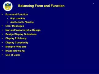
Balancing Form and Function • Form and Function • High Usability • Aesthetically Pleasing • Error Messages • Non-anthropomorphic Design • Design Display Guidelines • Display Efficiency • Display Complexity • Multiple Windows • Image Browsing • Use of Color
Balancing Form and Function • Error Messages • Capture errors as a basis for design enhancements to avoid errors • Error messages should provide constructive guidance in a positive tone • Specificity • Be specific and precise • Indicate what the user needs to do • Choose user center phrasing • SYNTAX ERROR vs. Unmatched left parenthesis • ILLEGAL ENTRY vs. Type first letter: Send, Read, Drop • INVALID DATA vs. Days range from 1 to 31 • BAD DATE vs. Drop-off date must come after pickup date • Maintain consistent grammatical forms, terminology and abbreviations
Balancing Form and Function • Error Messages • Maintain consistent visual format and placement • Mixed case • Avoid error codes, or place at the end of the message • Location • On the display near the error • On the bottom of the display • Dialog box • Solution: allow the user to customize the placement • Developing effective messages • Pay more attention to message design • Quality control with programmers, users and usability specialists • Develop guidelines • Usability tests • Record frequency of error messages
Balancing Form and Function • Examples
Balancing Form and Function • Non-anthropomorphic Design • Computers communicating like people • The user should feel they are in control • Such interfaces are distracting and create anxiety • The computer should be transparent • Is this guy annoying? • Computer messages • Poor: I will begin the lesson when you press RETURN • Better: You can begin the lesson by pressing RETURN • Better: To begin the lesson, press RETURN • Avoids overuse of pronouns http://www.youtube.com/watch?v=jQggTfZIstk&feature=related
Balancing Form and Function • Non-anthropomorphic Design • Interfaces should neither compliment or condemn users, but provide comprehensible feedback to assist users in achieving their goals • Human author to guide through training is sometimes acceptable to end users
Balancing Form and Function • Display Design Guidelines • Provide all necessary data in the proper sequence • Provide meaningful groupings with labels familiar to the users • Justifications (left/right) • Alignment of decimal points • Do not require the user to convert data • Order lists alphabetically if no other order applies • Left-justify columns of alphabetic data to permit rapid scanning • Of course there many more…
Balancing Form and Function • Empirical Results • Expert users may prefer dense displays • Performance times may be shorter with fewer but denser displays than with more numerous but sparse displays • This is especially true for tasks that require comparison of information across displays • Staggers (1993) • A study of nurses reading laboratory reports on three different screens • Three-screen version • Two-screen version • Densely packed one-screen version • Results: Search times dropped by half over five blocks for novice compared to experience users • Due to a strong learning effect • High cost of switching windows and reorienting
Balancing Form and Function • Display-complexity metrics (Tullis 1997) • Overall density – the number of filled character spaces as a percentage of total spaces available • Local density – the average number of filled character spaces in five degree visual angle around each character • At normal viewing distances from displays, this area translates into a circle approximately 15 characters wide and 7 characters high • Grouping – the number of groups of “connected” characters • Layout complexity – based on information theory, the distribution of horizontal and vertical distances of each label and data item from a standard point on the display • Studies indicate that effective display design contains a middle number of groups (6 to 15) that are neatly laid out, surrounded by blanks, and similarly structured • Grouping reduces scanning time
Balancing Form and Function • Display-complexity metrics – Bad Design
Balancing Form and Function • Display-complexity metrics – Good Design
Balancing Form and Function • Structure data based on relationship between objects • Minimize eye movements • Display-complexity metrics – Efficiency Initial Focus
Balancing Form and Function https://www.youtube.com/user/TheWebbyAwards • Webby Awards • Structure and Navigation • Visual Design • Functionality • Interactivity Columns
Balancing Form and Function • Window Design • If window-housekeeping actions can be reduced, users can complete their tasks more rapidly, and with fewer mistakes • Coordinating multiple windows • Example: Insurance Claims Processing • Agent retrieves information for a patient • Primary window: patient address, TN, MRN • Second window: patient’s medical history • Third window: the record of previous claims • Synchronous scrolls across related windows • E.g., medical history window with the previous claims window • When finished, data in all windows is saved and all windows closed
Balancing Form and Function • Coordinating multiple windows • Coordination: objects changing on user actions • Synchronized scrolling: scroll bars from two different windows are synchronized • Hierarchical browsing: e.g., one window contains a table of contents, and a second window the chapter is displayed
Balancing Form and Function • Coordinating multiple windows • Opening/closing of dependent windows • Saving/opening of window state • “Save screen layout as…” 2nd window Primary Window 3rd window 4th window
Balancing Form and Function • Image Browsing • Hierarchical view: users see an overview in one window and details in the second window • Zoom Factor: Magnification from the overview to the detail view (often the zoom factor is between 5 and 30) Overview
Balancing Form and Function • Image Browsing - Map View to Street View
Balancing Form and Function • Image Browsing • Fisheye views http://www.youtube.com/watch?v=EECi-OYXQqw
Balancing Form and Function • Image Browsing • The design should be governed by the user’s task • Open-ended exploration: browse to gain and understanding of the image • Diagnostic: scan for flaws • Navigation: seeking details (e.g., highway) • Monitoring: watch in overview mode, then zoom in on details
Balancing Form and Function • Personal Role Management • Different views for different roles • Example: • Student • Faculty
Balancing Form and Function • Color – Form and Function • Soothe or strike the eye • Make a display more interesting • Evoke emotion • Provide discrimination of objects in a complex display • Facilitate the logical organization of information • Use to indicate abnormal conditions • Principles regarding the use of color • Use color conservatively: overuse can lead users to seek relationships that do not exit • Limit the number of colors: between 4 and 7 • Consider the power as a coding method: e.g., red = warning, green = stable state
Balancing Form and Function • Principles regarding the use of color • Match color coding to the task • Accounting: if accounts overdue are red • Design for monochrome first • Forces to layout the information in a logical pattern • Color deficiency • 8% of males have some type of color-blindness • Use double encoding • Use for formatting • Police cars responding to emergencies coded red • Be consistent in color coding
Balancing Form and Function • Principles regarding the use of color • Consider problems with color pairings • Red on Blue • Blue on Red • Yellow on Purple • Yellow on White lacks contrast • Eye muscles are strained attempt to create a sharp focus Very difficult to read Difficult to read Difficult to read
Balancing Form and Function • Principles regarding the use of color • Use color to indicate status changes • Applications to process control systems • User color for graphic data displays
